Gallery Visits
Radical Eye
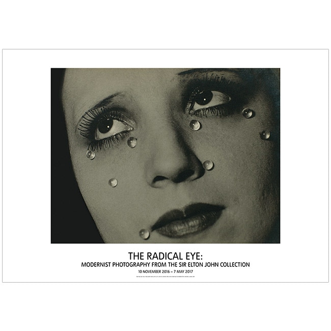
The Radical Eye exhibited a collection of the world's greatest private collections of photography gathered from the modernist period of the 1920s-50s. It brought together a group of Man Ray portraits exhibited together having been brought together by Sir Elton John over the past 25 years. It contained over 70 artists and nearly 150 rare vintage prints on show from seminal figures including Brassai, Imogen Cunningham, André Kertész, Dorothea Lange,Tina Modotti, and Aleksandr Rodchenko; it provided an opportunity to look into Elton John's home and gather some ideas for the "Structure" project.
|
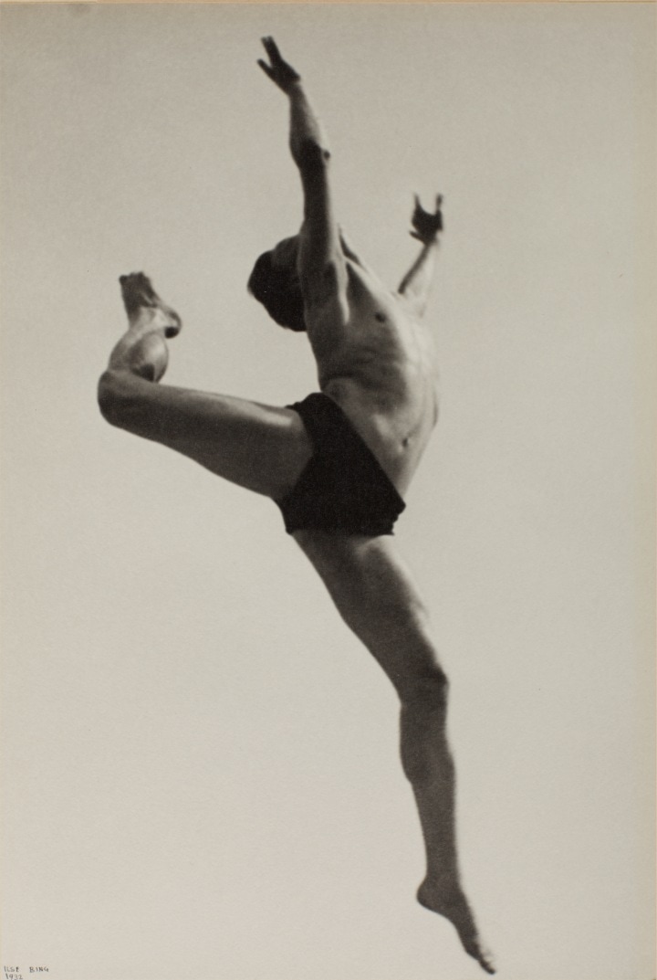
I liked the image on the left because it was captured in the motion of a ballet leap, the body is in no connection to the ground and because of this the eye is focused onto the shape of the body and the positioning of each limb creating a structure that can only be appreciated within this still shot image.
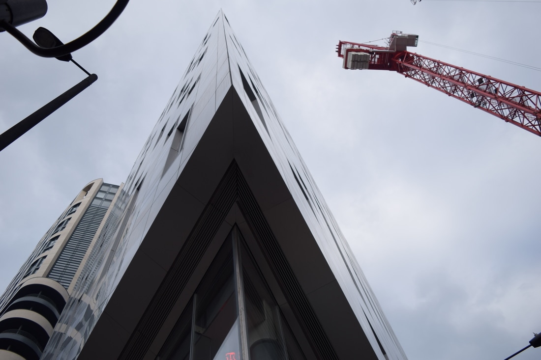
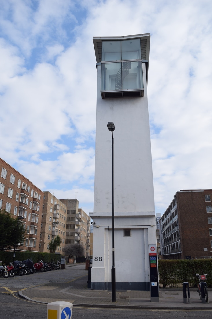
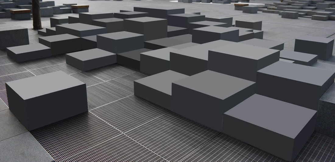
The image below takes on the idea of structure of architecture which is hollow and consists of various beams creating a geometric effect; however, it experiments with a low angle looking up which adds a more interesting element to the image. Psychologically the effect is that the subject of the image looks strong and powerful and this is accentuated by the physical height of the structure itself. 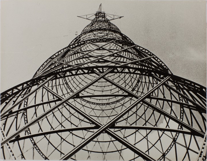
|
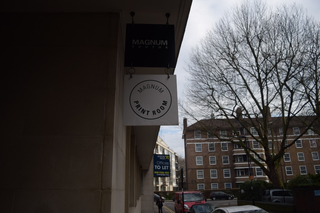
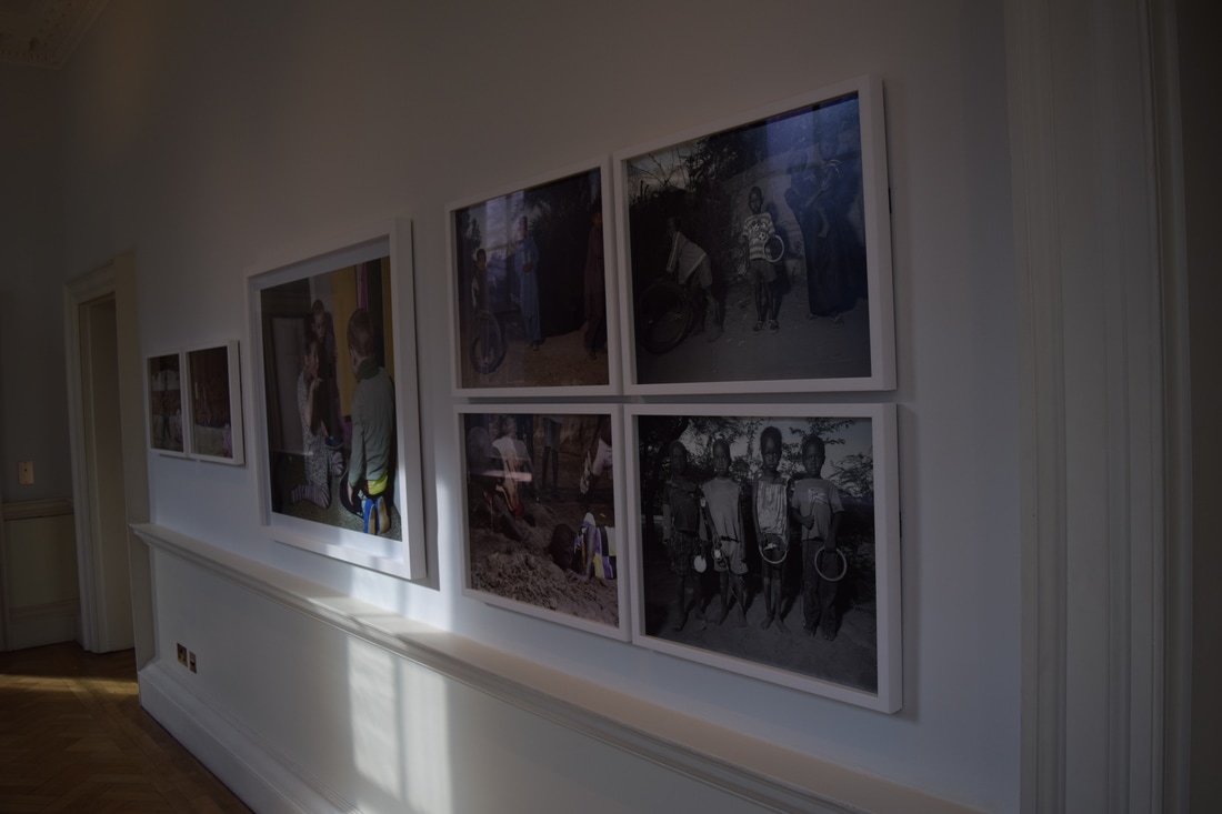
Magnum Print Room
|
|
The Magnum Print Room contained images and documentations of several children's lives and the structure within which they live. The children ranged from a very upper class city girl who was an aspiring ballerina and spent much of her time practising and having her make-up heavily caked on, to a boy who lived in outback Texas and lived on a farm in which he worked on tirelessly whilst also factoring in travel to school hours away from his home. This contrast in lifestyle was particularly interesting as it shaped their lifestyles and the way their time was spent was structures completely differently.
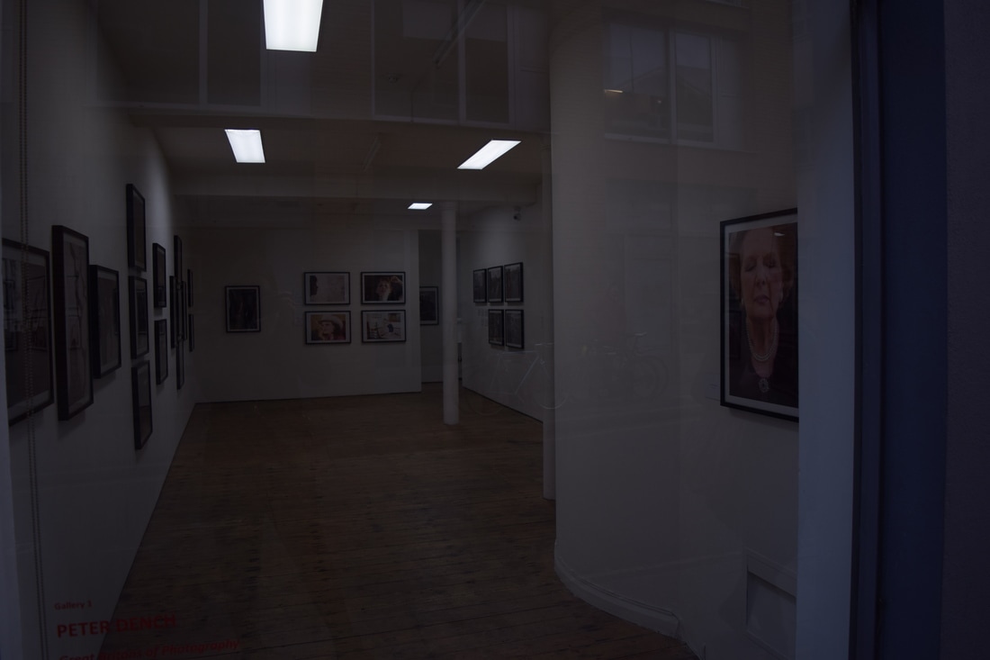
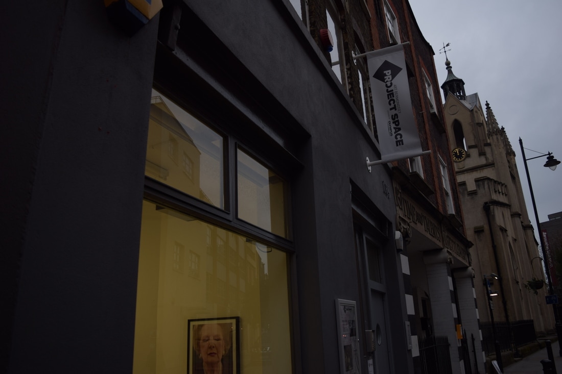
Project Space
|
|
One of the exhibitions was created by Minnie Weisz, a Photographic Artist interested in the identity of spaces, recording and documenting buildings in areas of transience in London to forgotten interiors in remote locations in Europe. Her approach is both documentary as well as her own attempt to turn these spaces into a camera obscura. Exterior and interior worlds collide and merge through her own editing of the photograph with double exposure of interior and exterior as well as cracks and holes of interiors being filled with images of skylines of modern buildings. projections of light open up a conversation between the present and the past; traces of memory and time bordering a threshold between the real and the imagined, dream and reality? These rooms are witness to history and the passage of time, to memories past and present; family and home, space and connection.
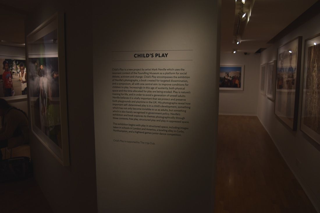
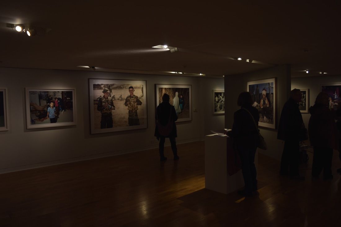
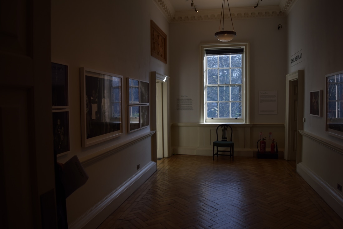
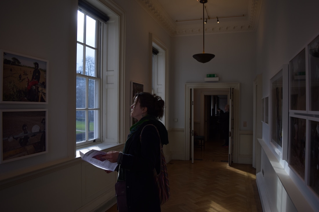
The Foundling Museum - Child's Play
|
|
|
|
|
This exhibition explored the variety of how play time was used by children from all across the world; comparing the MEDC and LEDC lifestyle and the objects they make their toys. Most MEDC children had specifically designed toys like water guns, bubbles and skipping ropes whilst the LEDC and war-zone children took advantage of discarded tyres, wires and lids and created toys from sticks.
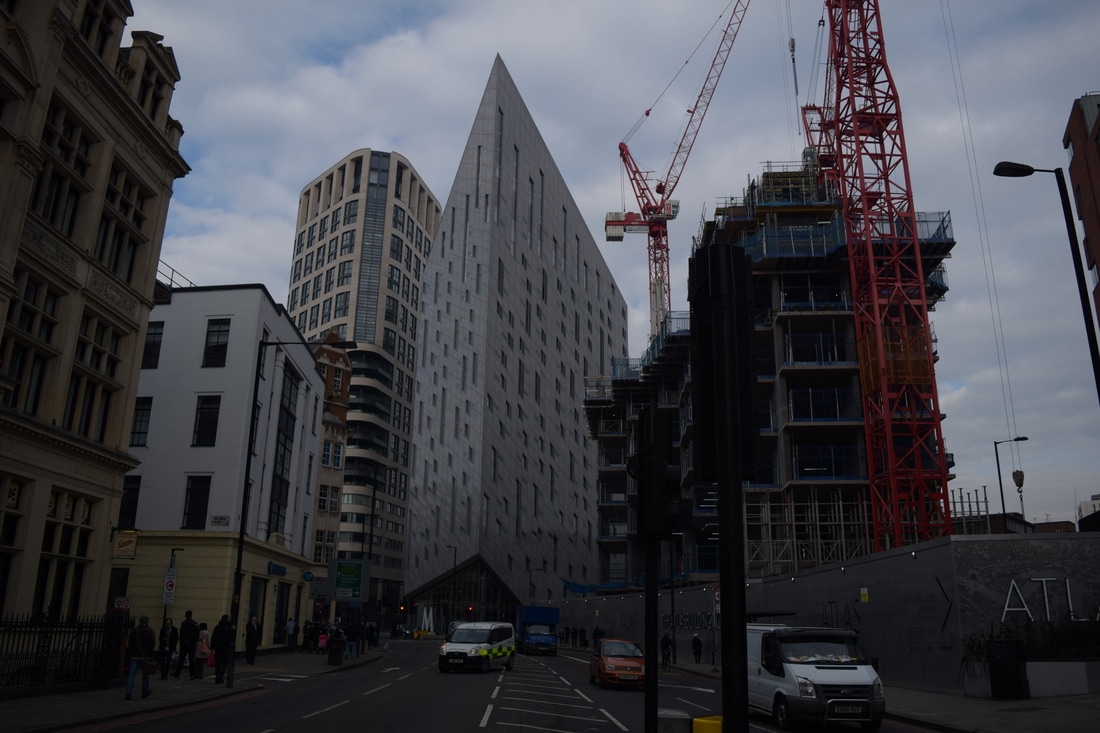
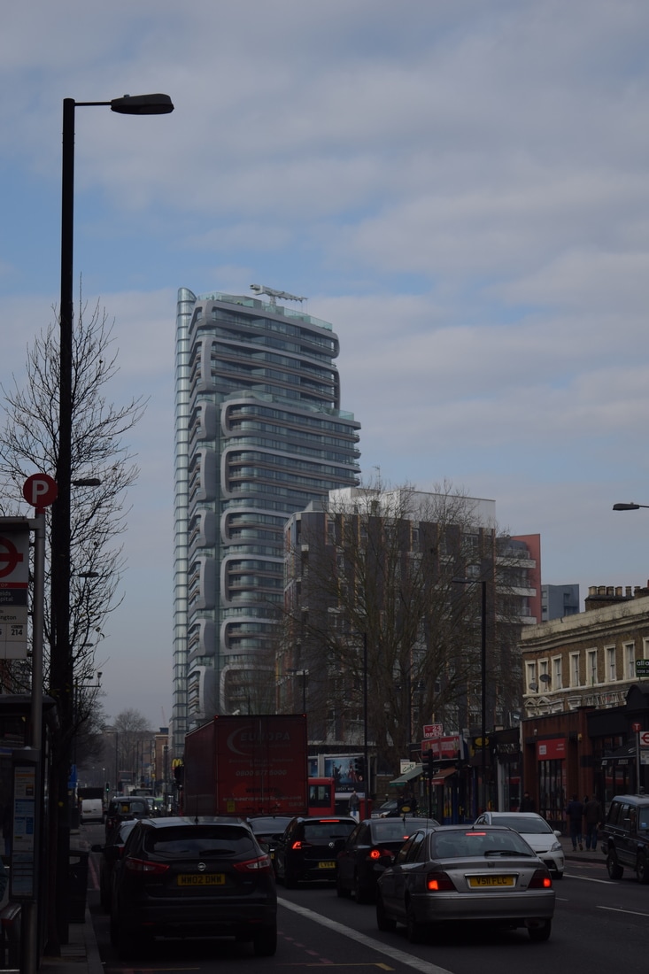
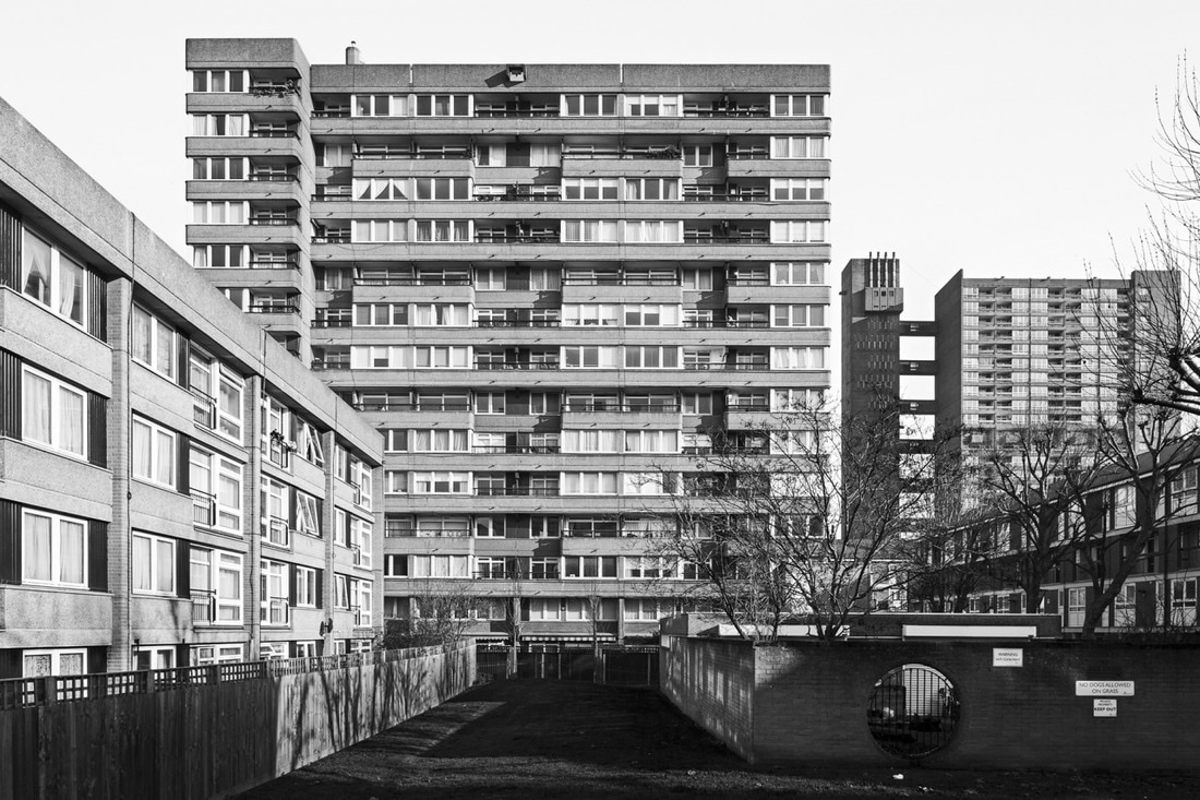
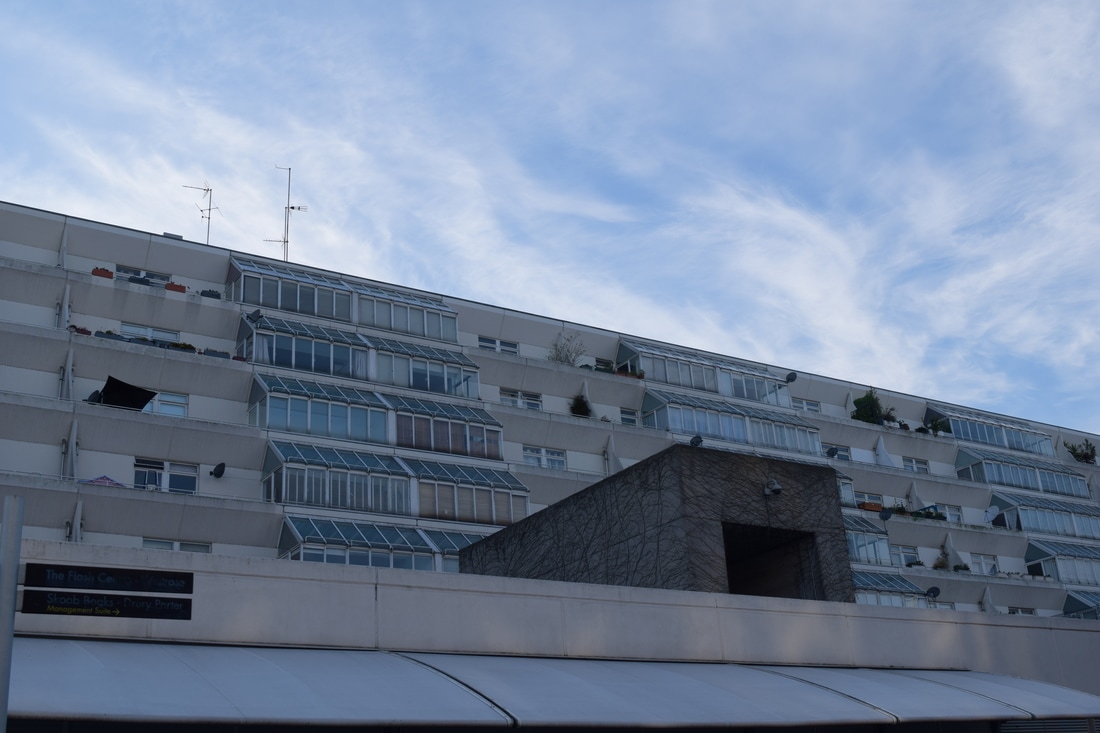
Structure in Buildings
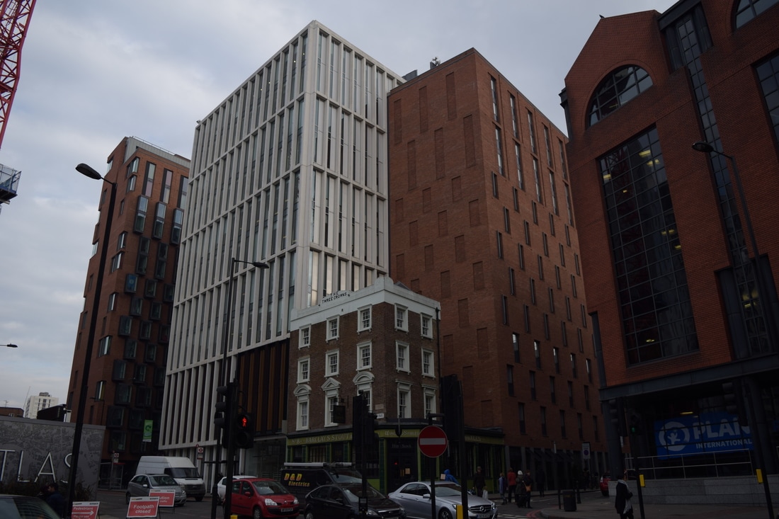
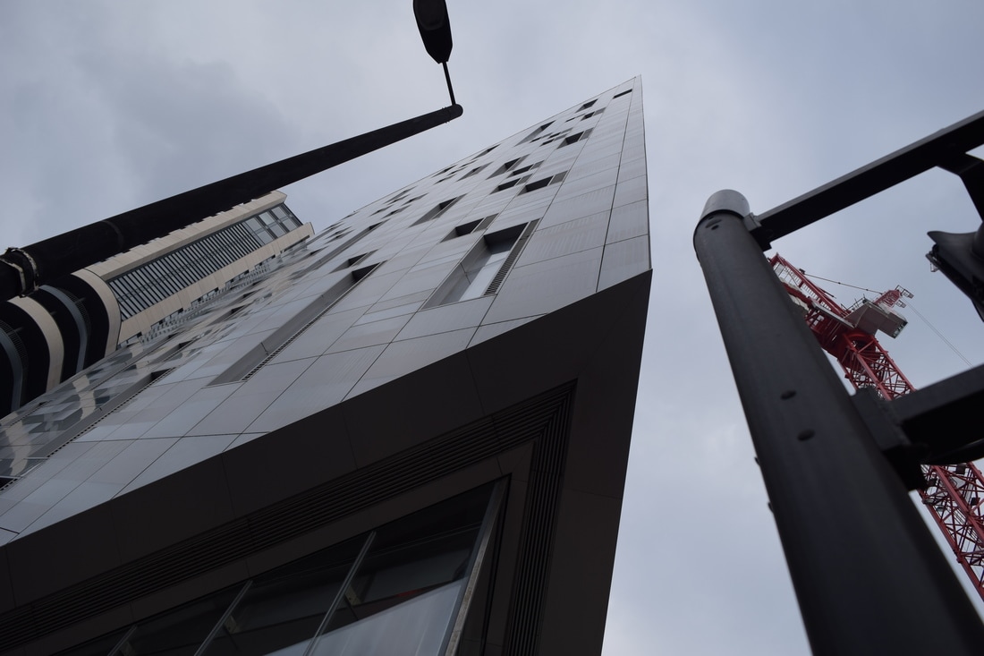
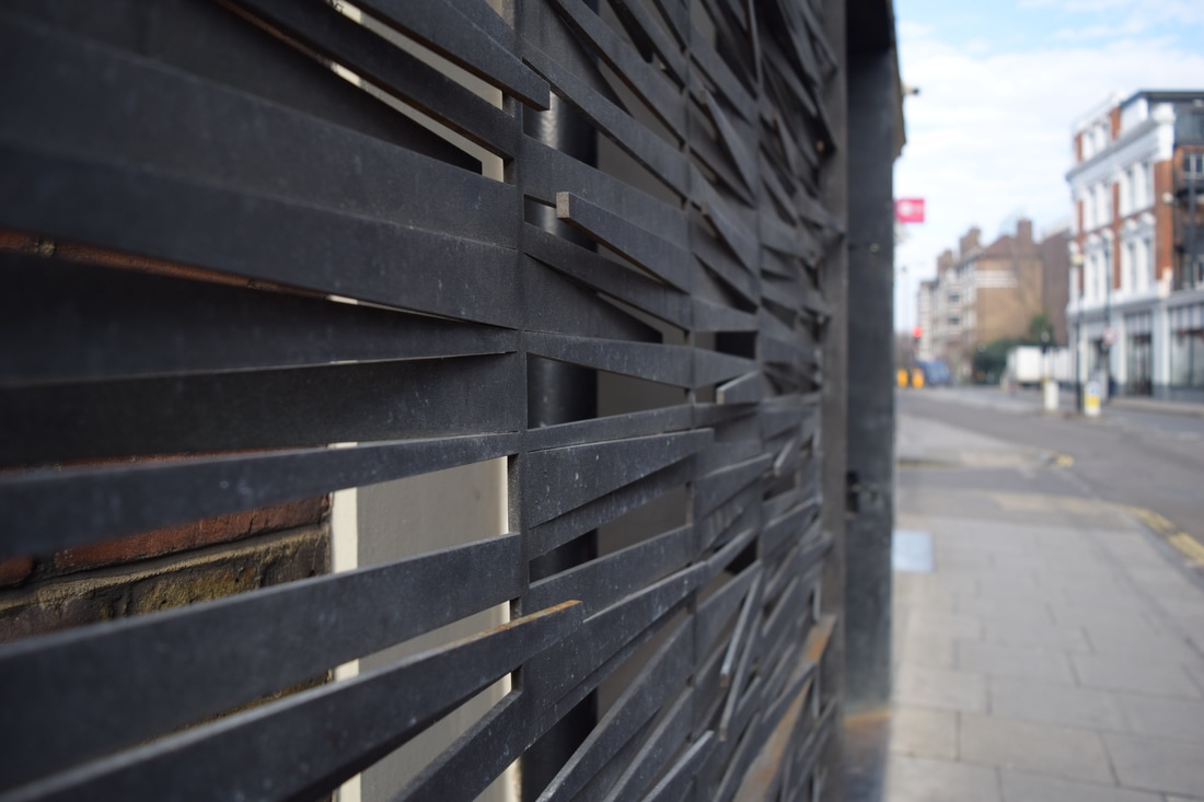
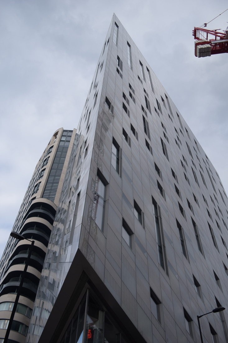
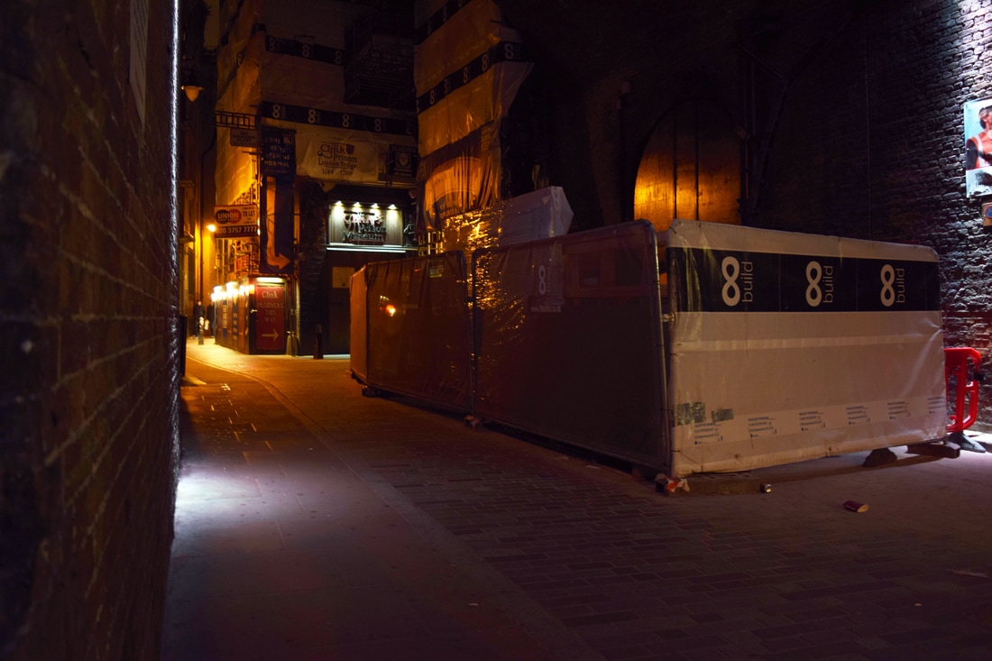
Buildings in London are increasingly focusing on shapes in their architecture in order to create a new dynamic against the typical block structure of many buildings which I wanted to photograph and experimented with different angles to convey the structure and shape of the building similar to the work I had seen in the Radical Eye exhibition.
|
|
|
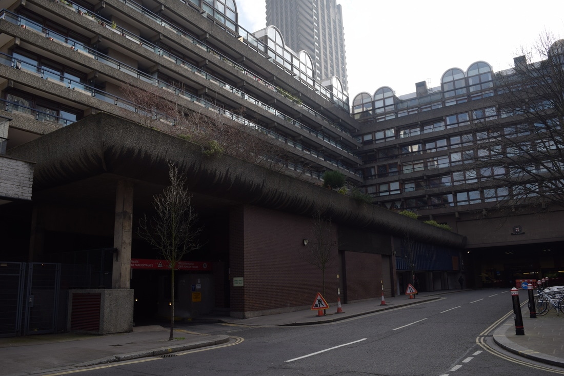
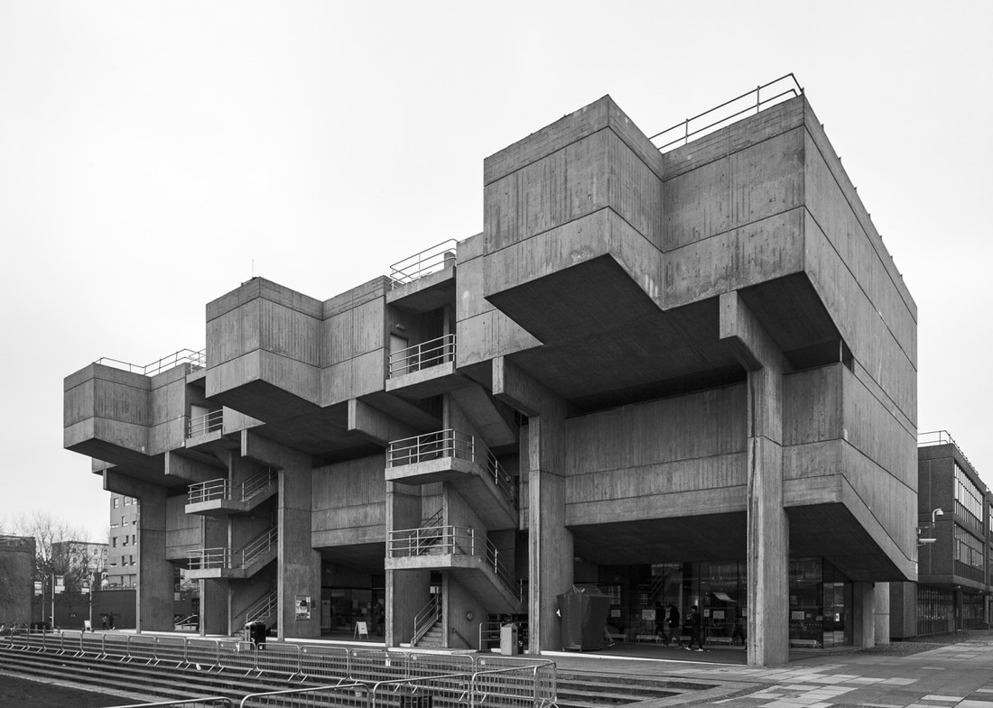
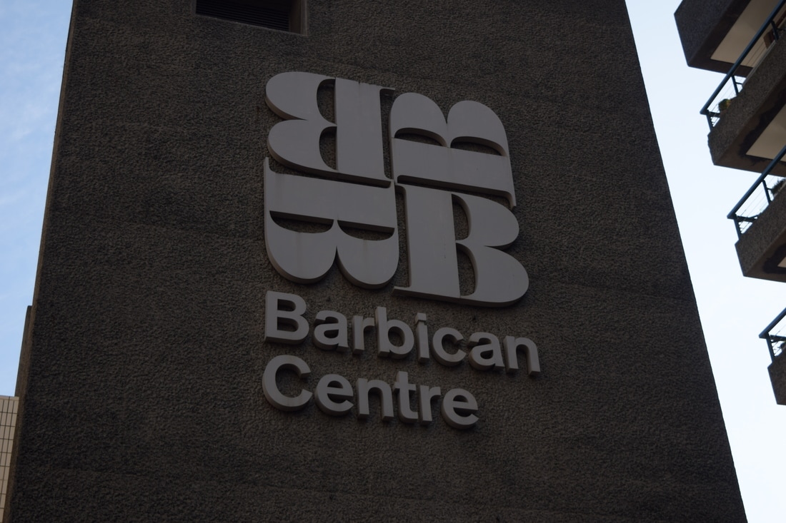
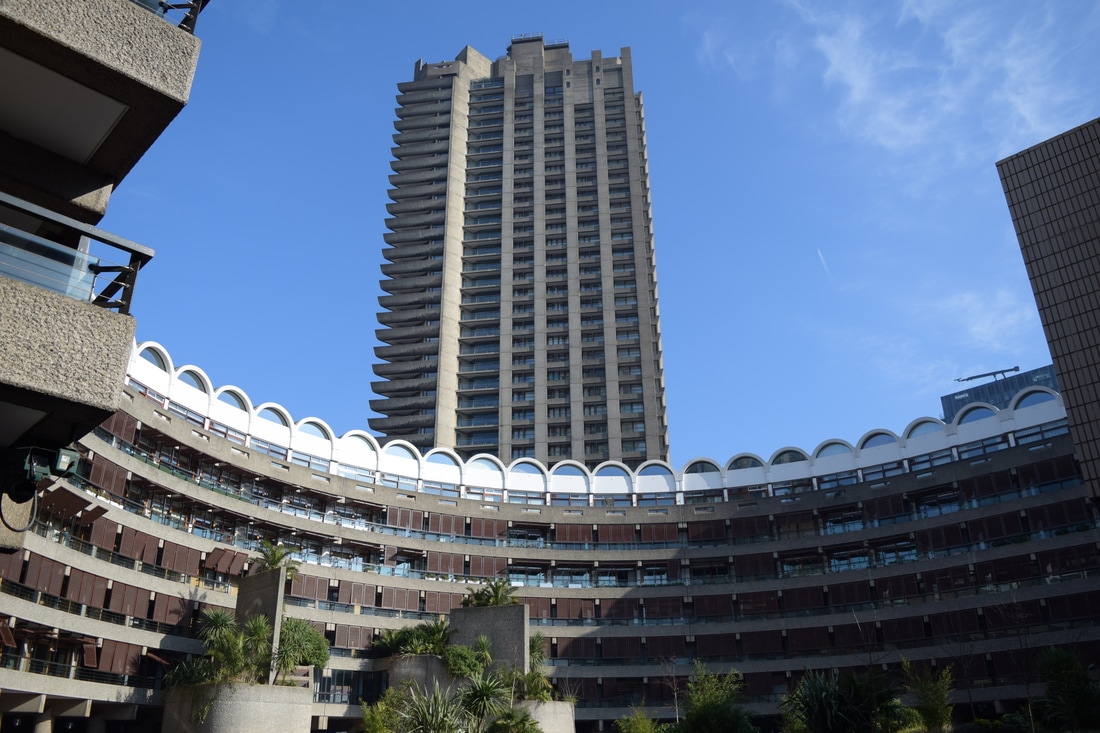
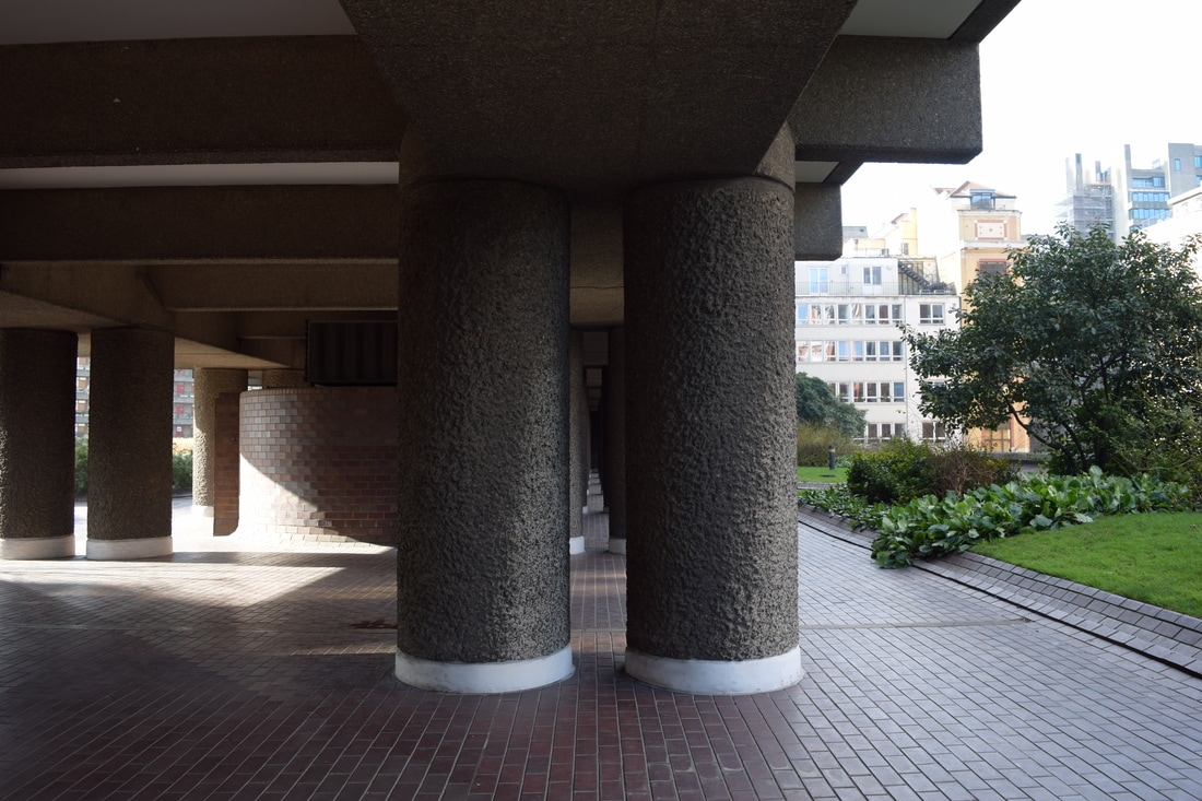
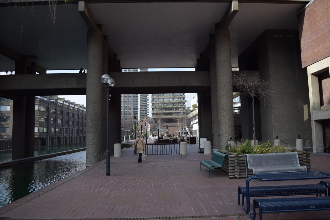
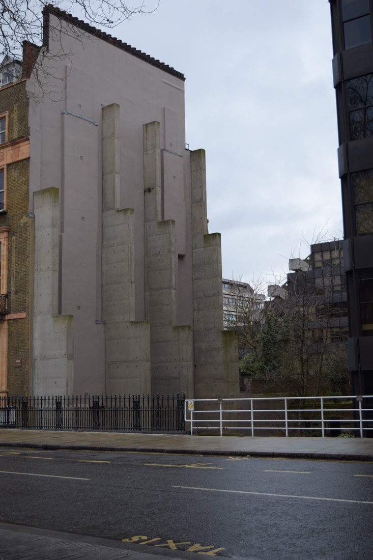
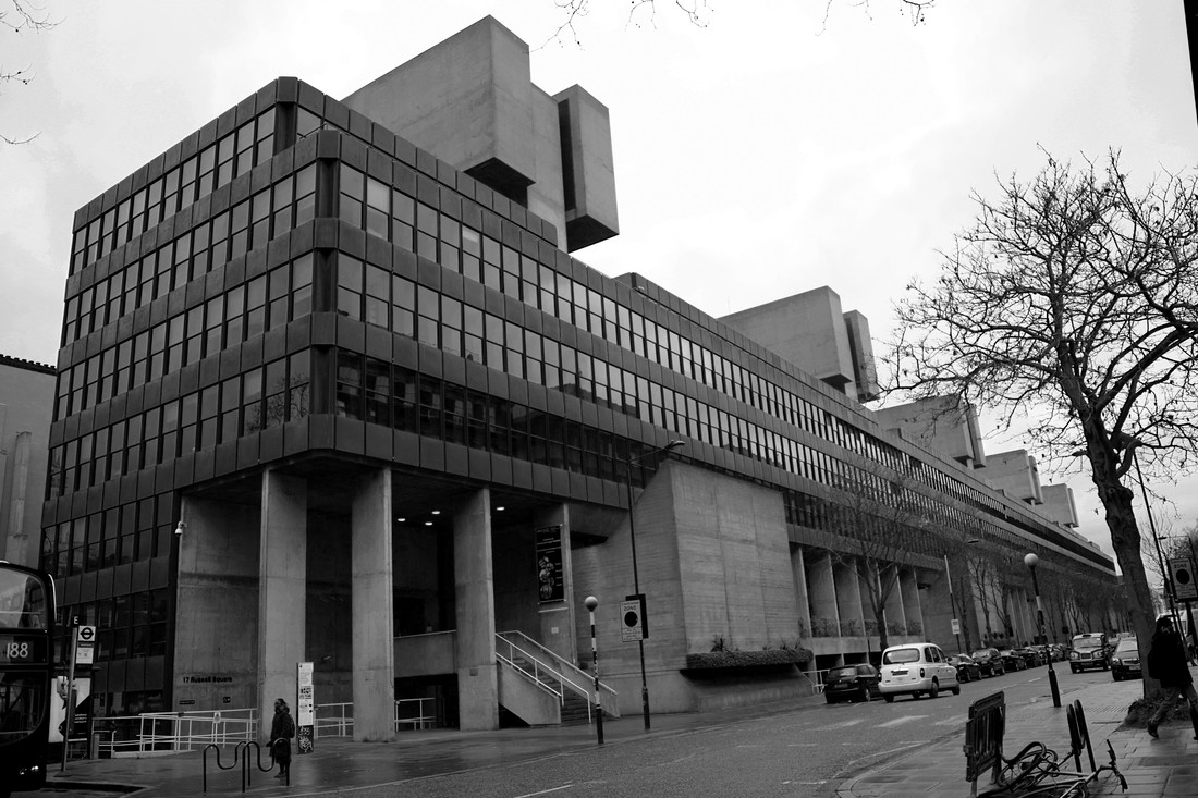
Brutalist Structure
The term Brutalism was derived from the French ‘Béton brut’, or raw concrete, and the expression became associated with a movement emerging in postwar British architectural offices which the artist Simon Phipps used in his photography work. Simon Phipps photographed a number of buildings that sit within a loose Brutalist principle and rather than present them as photographic prints have produced them as monochrome images printed directly onto an aluminium substrate.
|
|
|
|
My Response
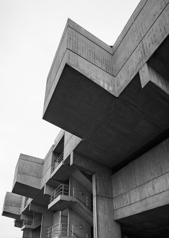
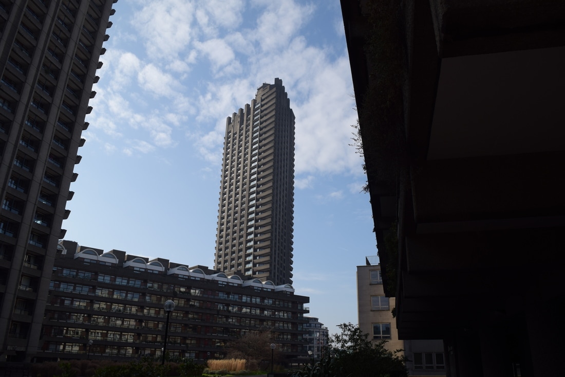
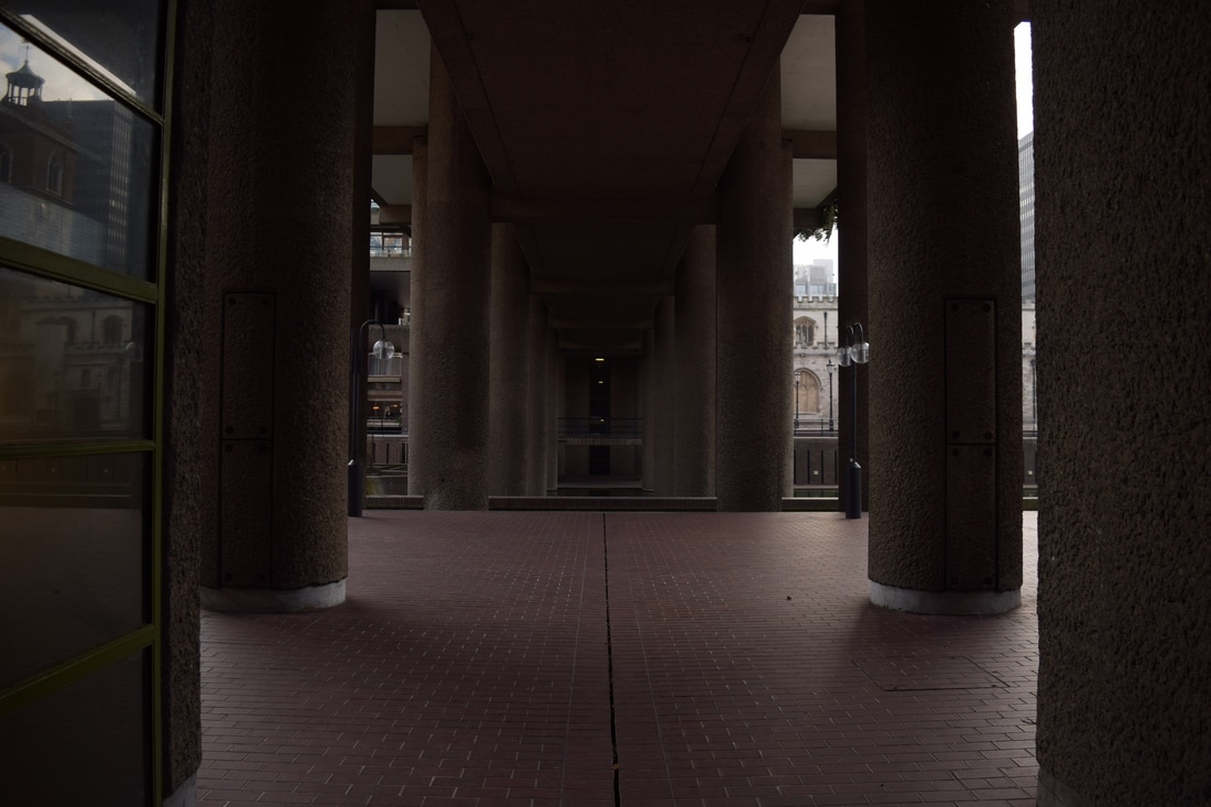
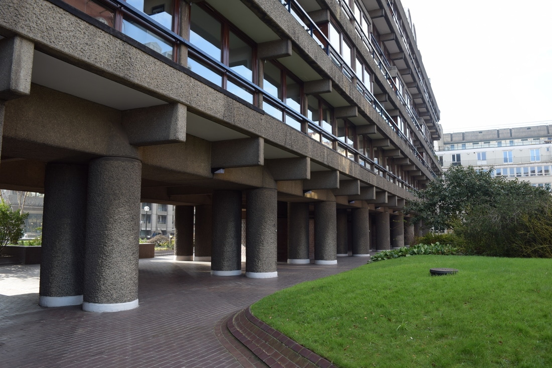
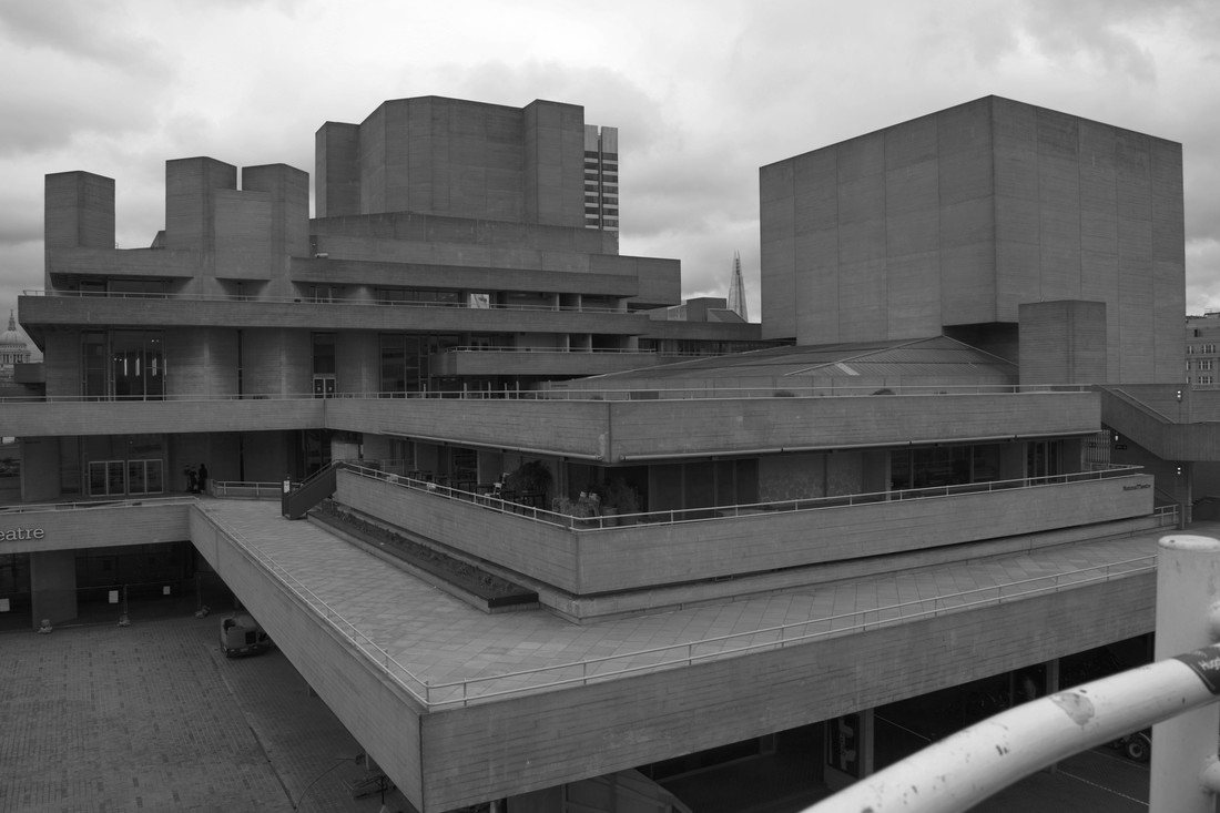
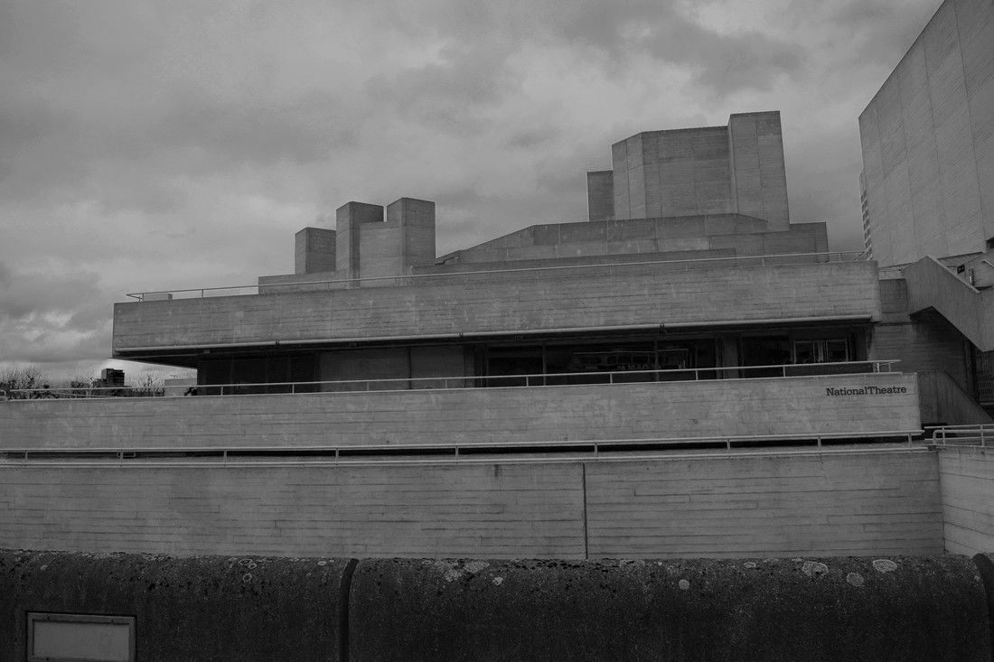
My intention was to achieve a straight-on image and aligned to enhance the effect of the harsh lines of a brutalist building and to further the conception that the structure was bold and strong.
The below images were taken at the Barbican Centre. Some images did not achieve the straight-on effect due to their height and the height at which I could photograph.
The below images were taken at the Barbican Centre. Some images did not achieve the straight-on effect due to their height and the height at which I could photograph.
|
|
|
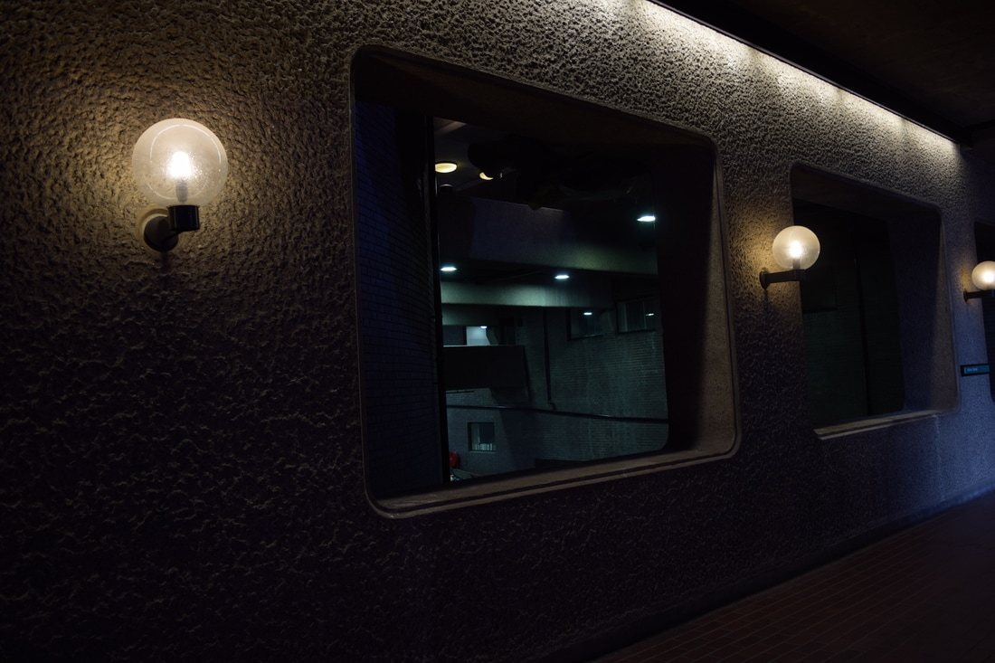
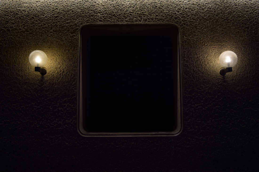
The below image was within the Barbican complex and I thought it would make a powerful image as the lights on either side of the window space created a strong structure. There was a brick wall in the gap however I lowered the aperture to restrict the light exposure which resulted in a black, blank space being created which is both intriguing and a harsh image that strikes the viewer. The lack of detail highlights the structure and shape of the square space/ window.
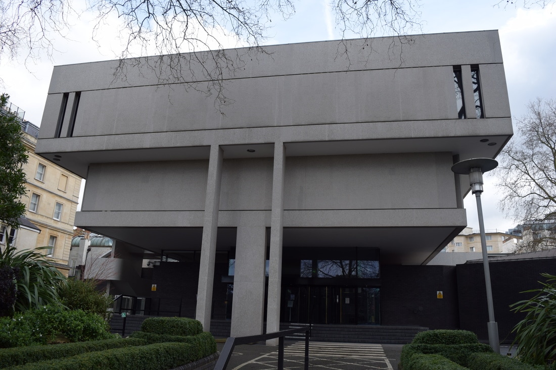
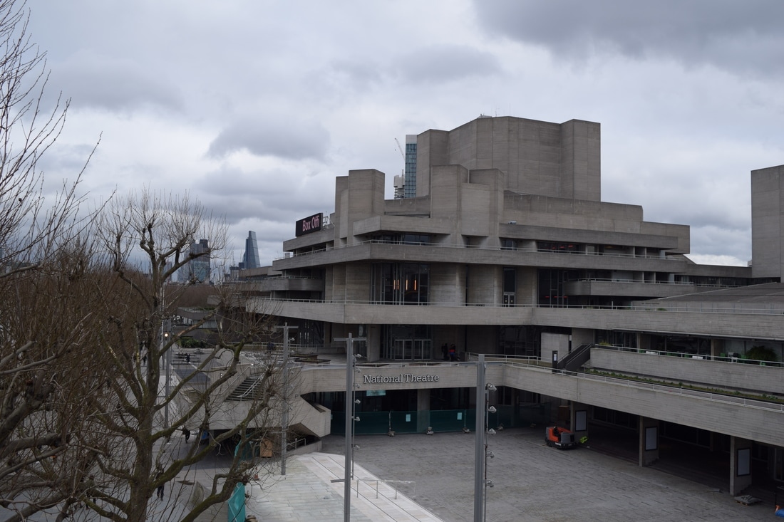
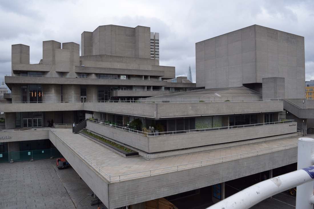
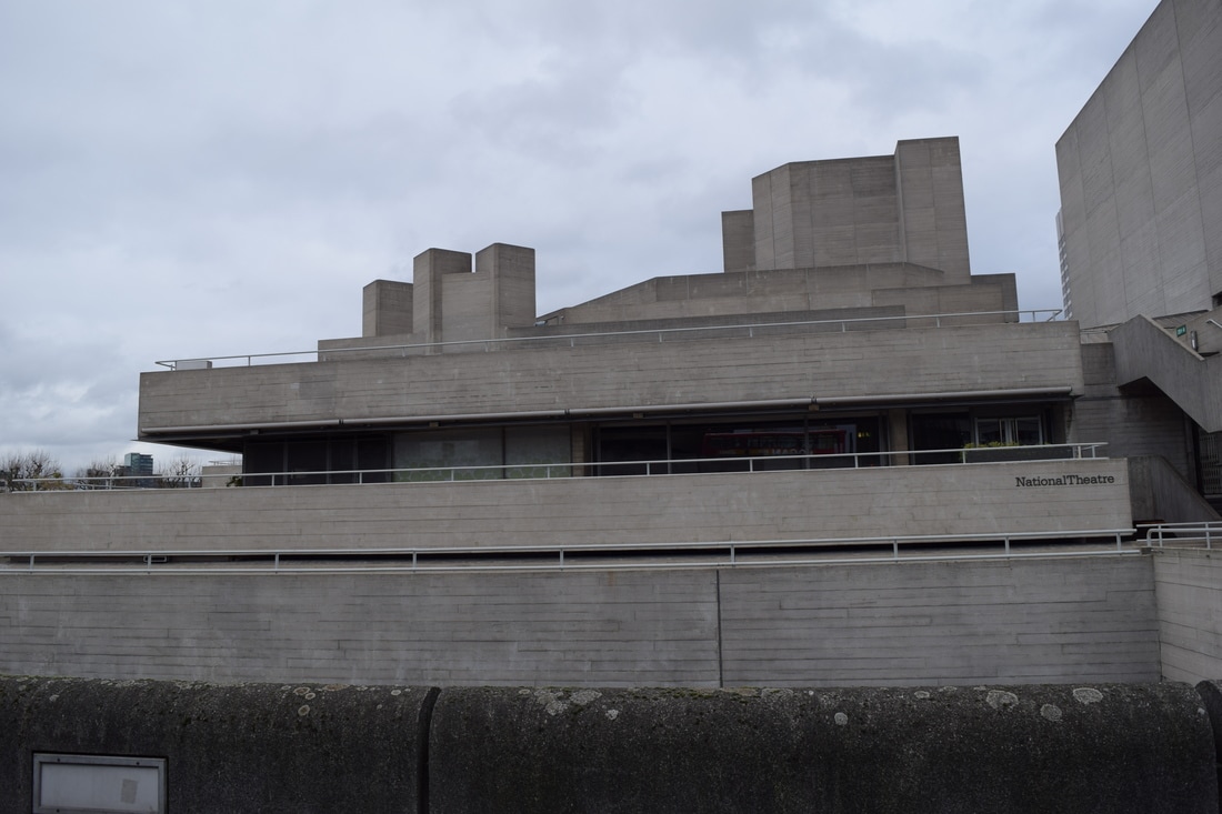
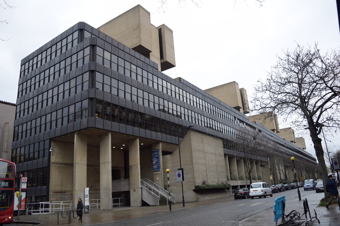
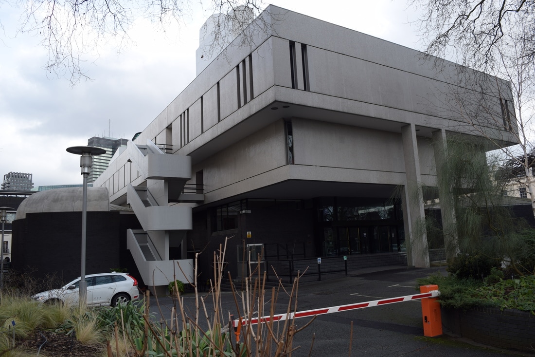
These next images were taken at a variety of places: The National Theatre; The Royal College of Physicians; Bedford; The Brunswick Centre, whilst some were random discoveries.
|
|
|
|
|
|
|
Monochrome
Simon Phipps' work was monochrome and so I took my best images and edited them in photoshop to achieve this effect.
This was successful in recreating Phipps work and the blandness of the monochrome edit highlighted the attention of the image onto the shapes and harsh lines of the buildings; it also enhanced the idea of concrete as concrete is a bland colour.
This was successful in recreating Phipps work and the blandness of the monochrome edit highlighted the attention of the image onto the shapes and harsh lines of the buildings; it also enhanced the idea of concrete as concrete is a bland colour.
|
|
Extension - Cutout
|
One development of brutalism is an effect known as "cutout" where the details of the image are simplified to emphasise the shape and structure of the building or structure photographed.
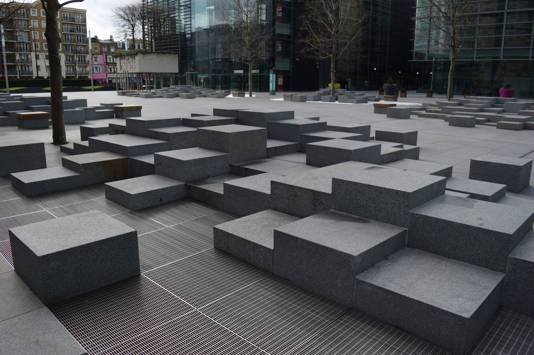
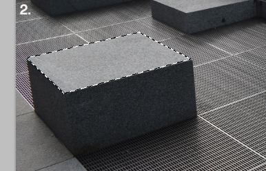
The typical editing process for this is to go to Filter --> Artistic --> Cutout whereby the entire image is simplified. However, when I did this - due to the other details in my image - it became very abstract and the image itself lost structure. So I decided to use a different method that would isolate areas I wanted to simplify and I could leave the background in detail so the contrast between lots and little detail would highlight the structure better. The image on the right is the image I took into Photoshop. |
|

First select the polygonal lasso tool as shown above to select the area you want to average.
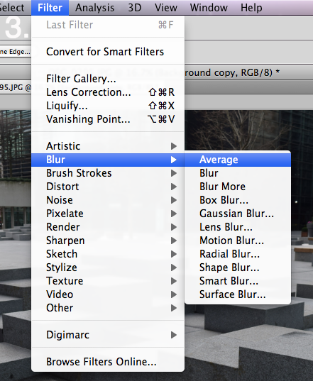
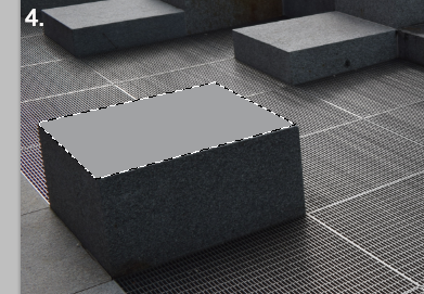
Once the area was selected I went to Filter --> Blur --> Average which then took all the colours within the section and decided the mid range colour and filled the entire selection with that colour. I did this for every face of each box like structure to achieve the final effect. |
|
|
Final Edit
The effect of juxtaposing a lot and a little detail in the image worked out well and creates a very abstract image as the eye is not sure what it should be drawn to within the image.
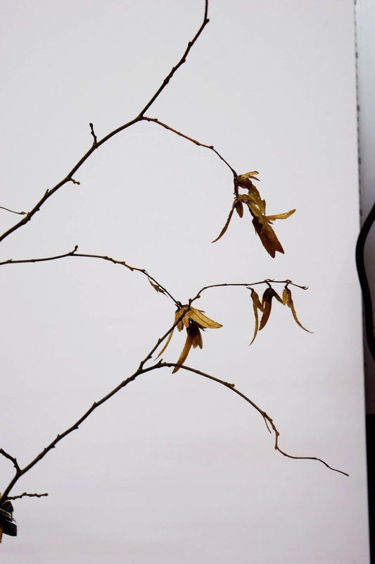
Structure in Nature
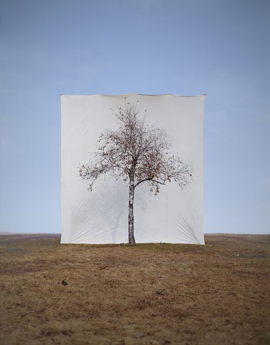
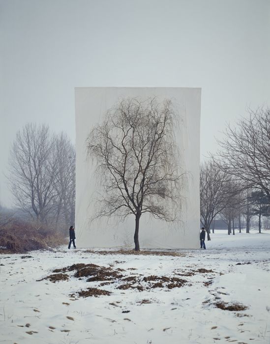
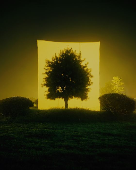
Myoung Ho Lee
Myoung Ho Lee is an artist from South Korea known for his photography of trees isolated by a white canvas backdrop suspended by cranes. It is a process that involves much planning and participation and hence is difficult to recreate.
"Simple in concept, complex in execution, he makes us look at a tree and its structure in its natural surroundings, but separates the tree artificially from nature by presenting it on an immense white ground, as one would see a painting or photograph on a billboard."
"Simple in concept, complex in execution, he makes us look at a tree and its structure in its natural surroundings, but separates the tree artificially from nature by presenting it on an immense white ground, as one would see a painting or photograph on a billboard."
|
|
|
My Response
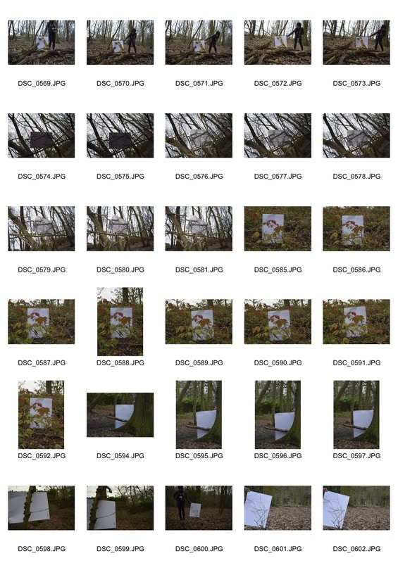
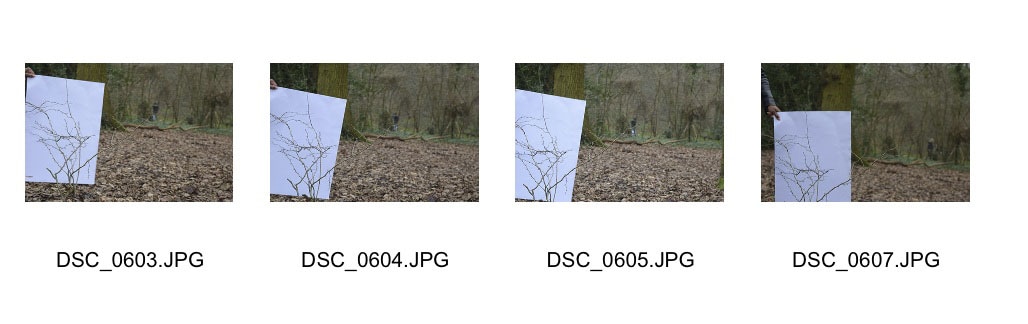
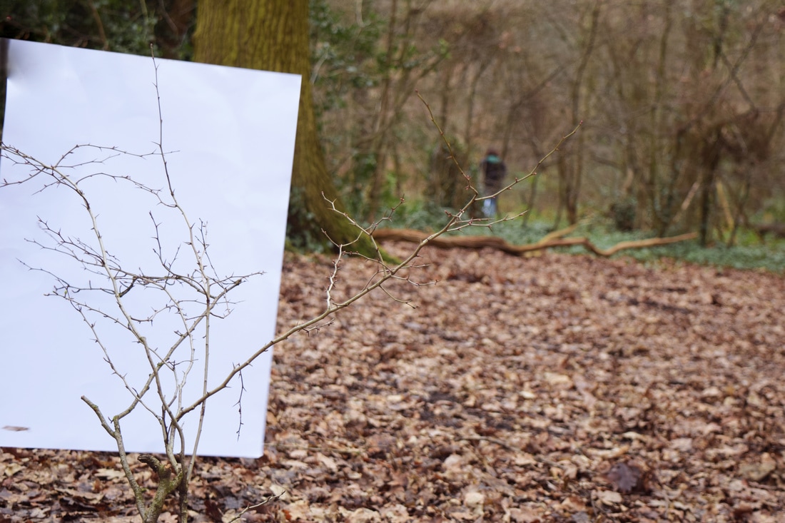
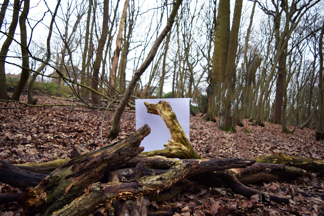
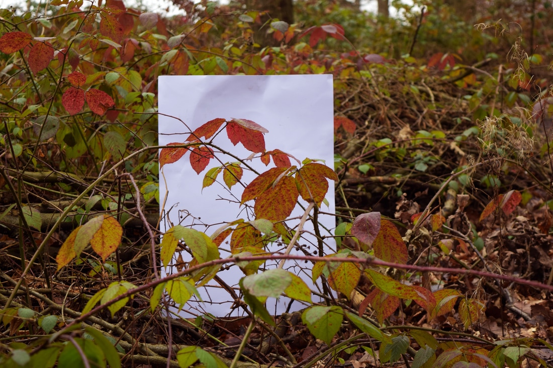
In order to recreate this I used white card however the nature I took pictures of was limited due to the size of the card. Therefore my images are on a much smaller scale that Myoung Ho Lee's but still recreate the essence of isolating nature from its surroundings; simplifying the image and the focus is more directly defined onto the nature's structure, undistracted by its surroundings but still having its source identity as the image does not have a soul focus on the canvas but includes the surroundings past it.
Below is my contact sheet.
Edited Final Images
|
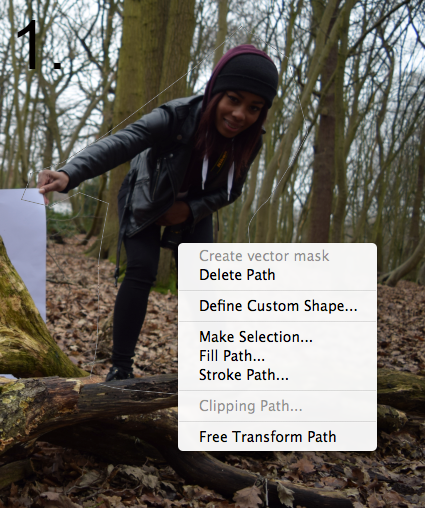
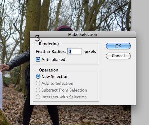
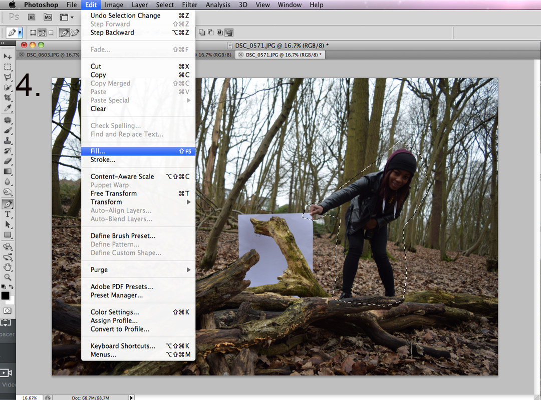
In photoshop I had to use the (1.)Pen Tool to select around my assistant who was holding the card.
2. Then I clicked the selection and selected "Make Selection" 3. A window then appeared and I ensured the Feather Radius was at 0 pixels. 4. Now that the area around my assistant had been selected I went to Edit --> Fill which then took surrounding areas to attempt to fill in my selection area. |

|
|
|
|
Final Edits
Following the removal of my assistant I edited the images by adjusting Brightness, Contrast, Levels and Colour Balance to produce the images below. They achieved the desired effect of isolating the structure within nature however they were on no par with Ho Lee's work as his was a much larger scale highlighting the strength of a large structure, for example a tree.
|
|
This image is my favourite and one branch of the bush is brought out of context and the red leaves have a stark and effective contrast with the white paper. It is interesting to see the difference between the branch over the paper - which is clear and easy to focus on - opposed to the multitude of branches amongst the bush that blurs the focus and makes it difficult to see the branches separately.
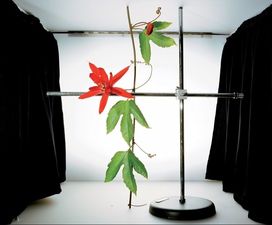
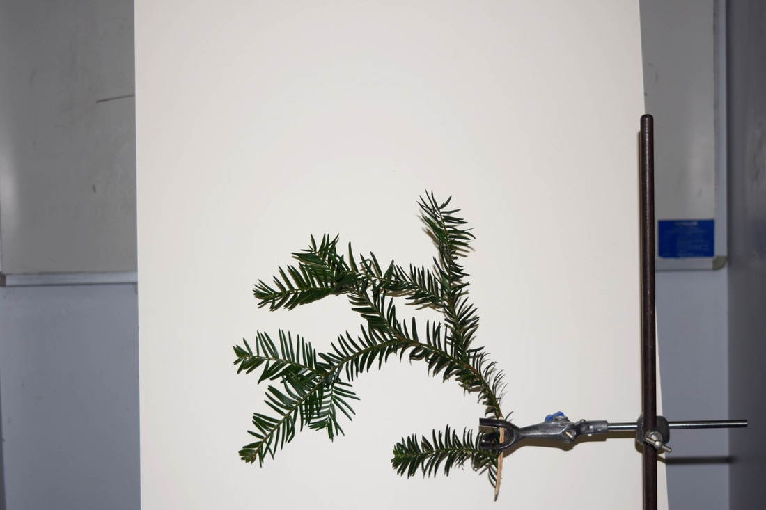
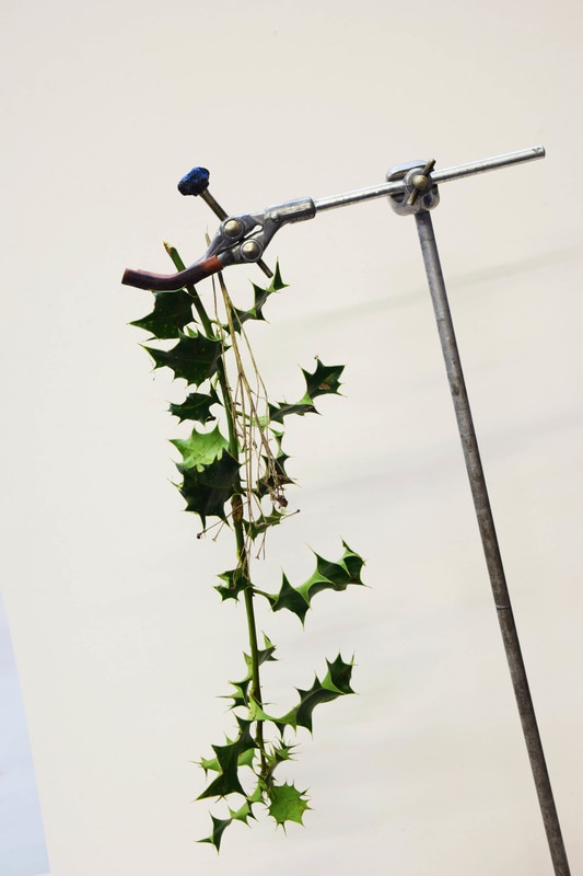
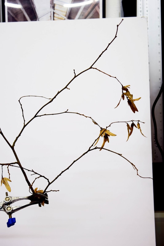
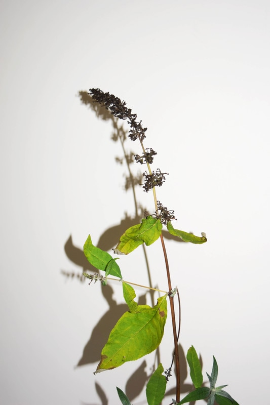
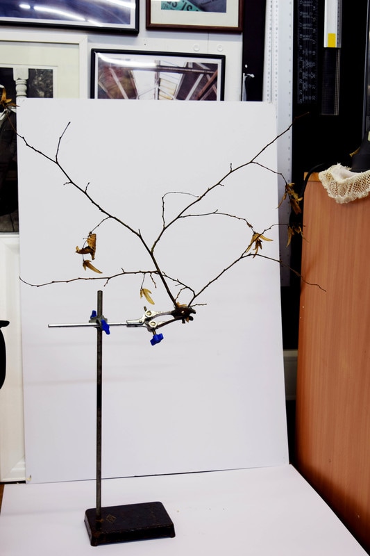
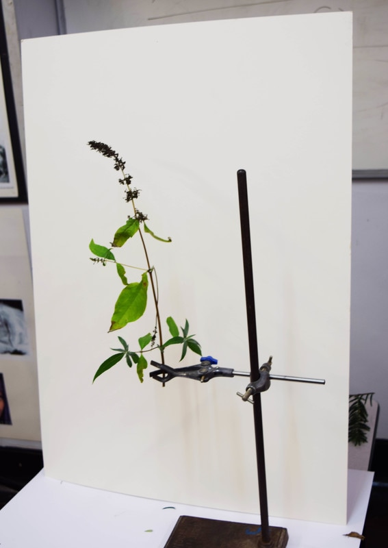
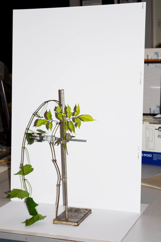
Sanna Kannisto
Sanna Kannisto is a Finnish artist and explores in her photography the theories and concepts with which we approach nature in art and science. Plants and animals are studied, staged, and photographed in stage-like portable “field studios.” As soon as the object is removed from its original context—nature, in this case—our attention is directed toward specific characteristics and movements. The white backdoor of the “field studio” which serves of the backdrop for her stagings further amplifies this effect.
|
|
|
My Response
I set up pieces of card and a clamp stand to hold the plants that had been collected for the project and I experimented with and without flash - with flash the plant was brighter and better contrasted however it resulted in a shadow behind the plant which was not intended and did alter the exactness of my response. Below is my contact sheet.
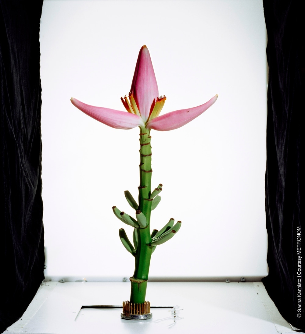
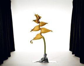
Edited Best Images
The editing I used was adjusting the Brightness and Contrast until I reached the desired effect. The plants were clearly isolated and their structures were well outlined as well as the colours being bright and attention drawing.
|
|

|
Final Analysis
Overall the response went well and some of the plants made a very aesthetic image against the contrasting white background which allowed their individuality to be highlighted which would not necessarily be noticed should the be in their typical environment as they would be drowned out by the many other branches and plants. However, Kannisto tended to show her entire set up in her images which I did for some of them but for most I zoomed in on the plant to emphasise that more. Although this was a nice effect which I personally like it does not directly correlate to Kannisto's work and could limit the effectiveness of my response; but it could be interpreted as my own development of Kannisto's work.
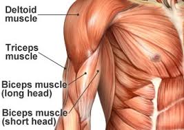
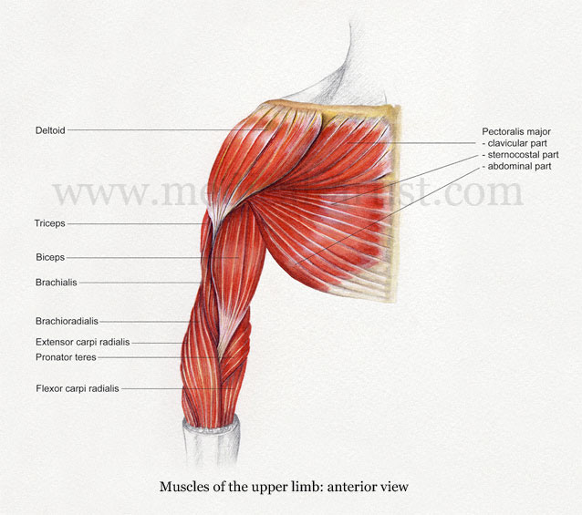
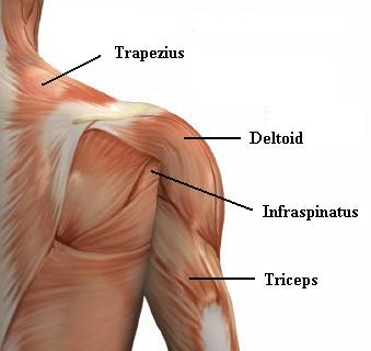
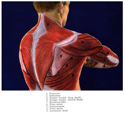
Structure of the Body
The complexity of the body is something explored by many artists who examine the intricate detail of muscle, nerves and bone to demonstrate in their own work.
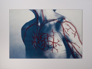
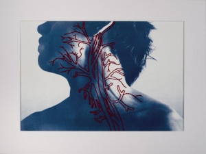
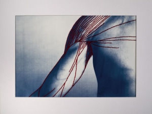
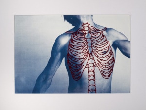
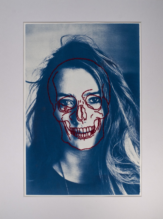
Patrick Hickley
Patrick Hickley creates a series of hand printed cyanotypes on watercolour paper and then hand stitched thread that represent the different muscle structures of the body.

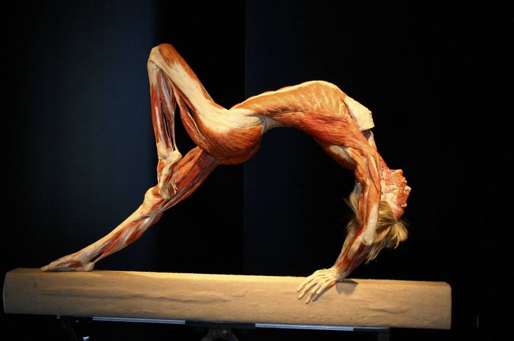
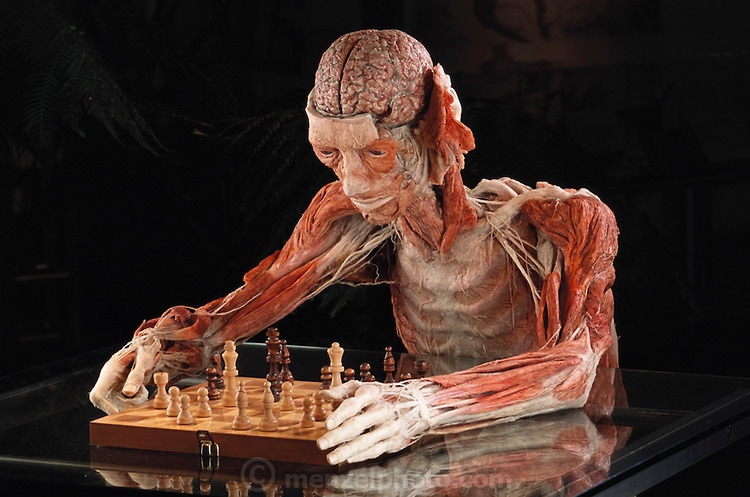
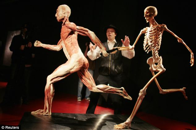
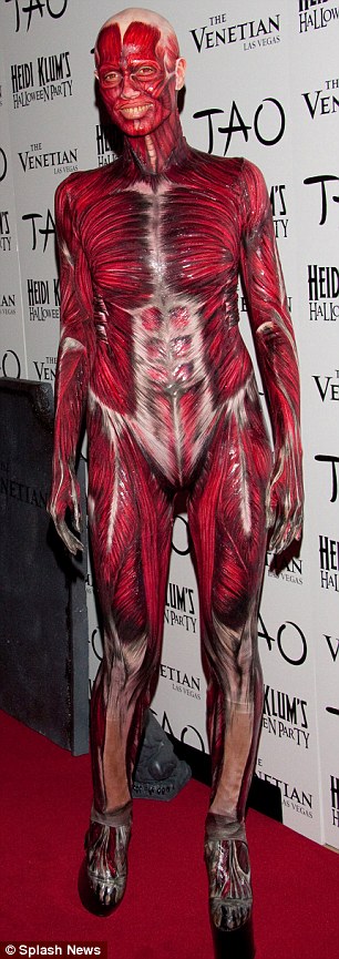
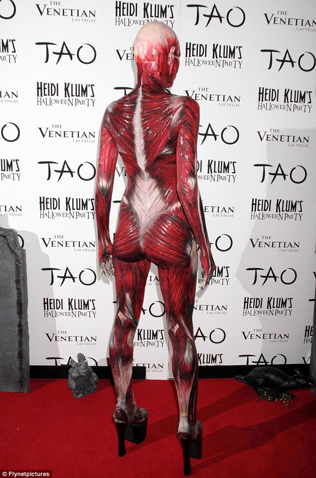
Dr. Gunther von Hagens
German anatomist Dr. Gunther von Hagens uses a process of plastination to preserve real bodies to structure and position them in a pose that he uses for his artwork. Plastination is a five-step-process. The first step is called fixation. This simply means that the body is embalmed, usually in a formaldehyde solution, in order to halt decomposition. After any necessary dissections take place, the specimen is then placed in a bath of acetone. In the third step, the specimen is placed in a bath of liquid polymer, such as silicone rubber, polyester or epoxy resin. At the end of this particular process, each cell is filled with liquid plastic. The body is then positioned as desired. Every single anatomical structure is properly aligned and fixed with the help of wires, needles, clamps and foam blocks.
|
|
My Response - a Combination of Hagens and Hickley
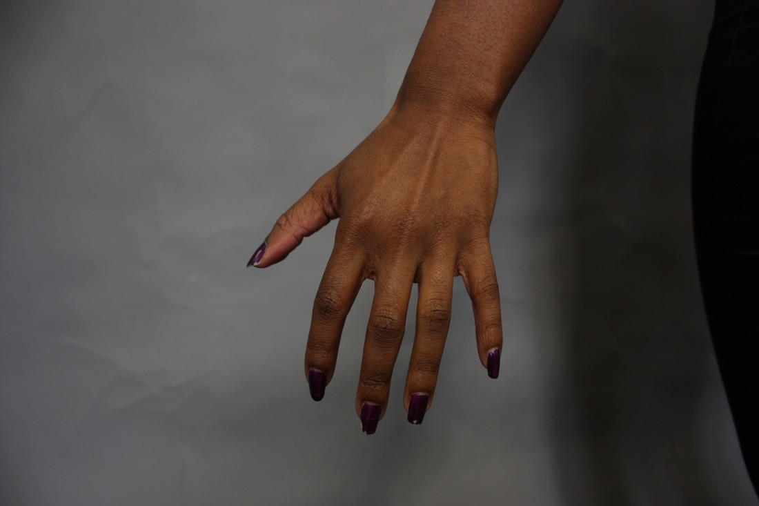
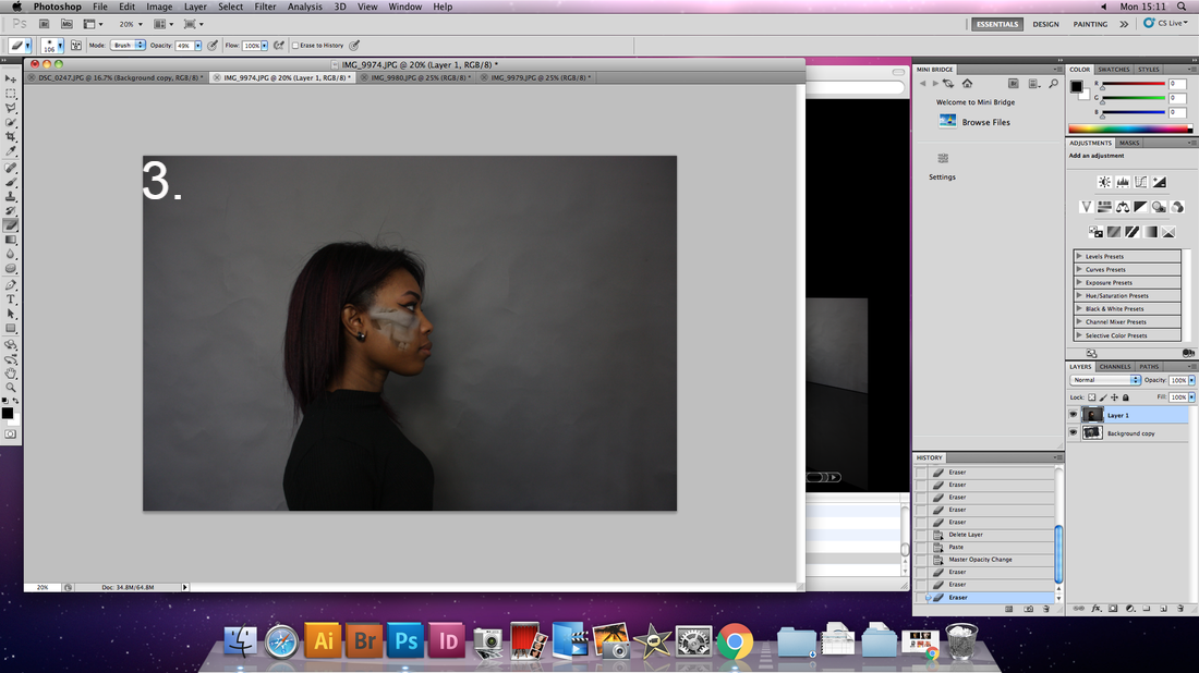
For my response I took pictures of a skeleton and a biological model of a humans organs, I then got my model to take resembling pictures of her to layer on top of the skeleton/organs in photoshop so that it could appear as if her skin had been torn away to reveal the muscle/organ/skeleton structure underneath.
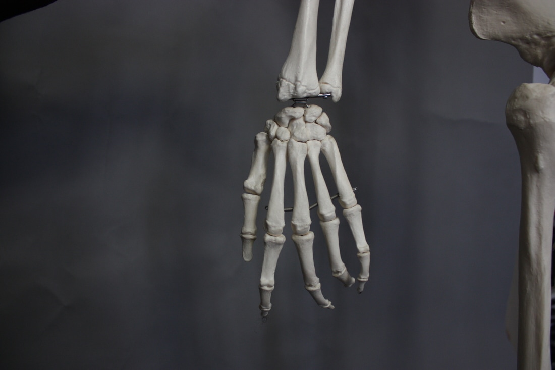
First Edit - Hand
|
|
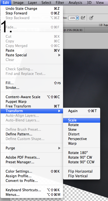
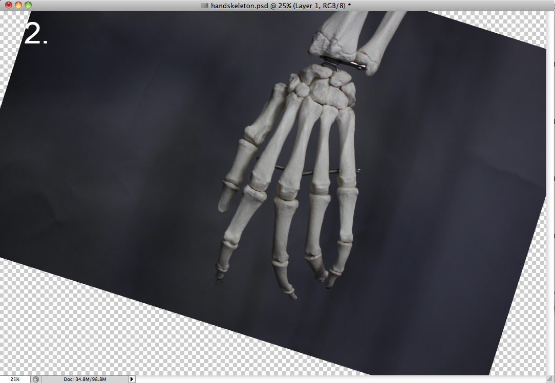
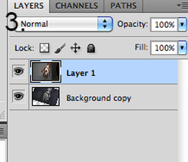
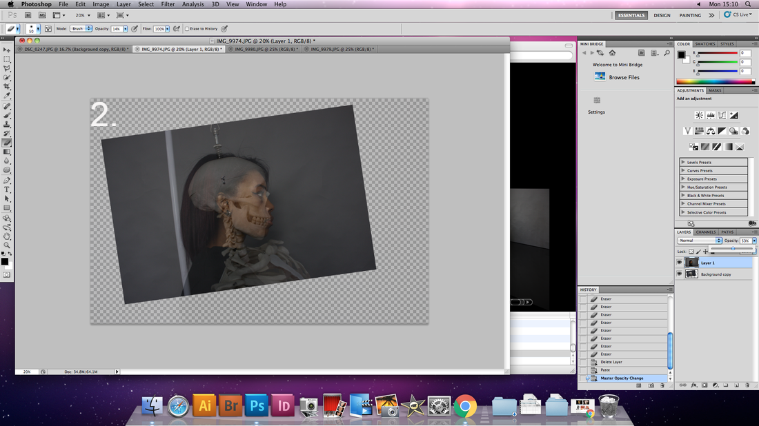
I brought both of my images into photoshop and after selecting my models hand and layering it via copy and paste over my skeleton I then changed the opacity of my top layer (real hand) so that I could align the skeleton structure to the shape of her hand. To do this I selected the bottom (skeleton) layer and went to edit --> transform --> scale which meant I could resize and rotate the bottom layer to have the most complementary fit to my models hand.
|
|

Final Edit
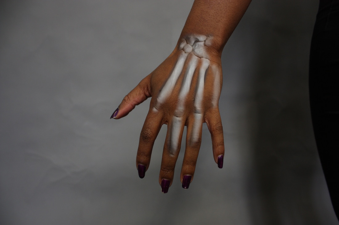
Unfortunately there were differences in the skeleton structure compared to my models hand which meant that I could not erase the fingers to show the skeleton there like I had planned and had to remain in the central hand and wrist area. However, I think this resulted in a nice effect as not all the skeleton is visible but the sections that are visible hint at where the rest of the bone structure would lie which makes it more intriguing.
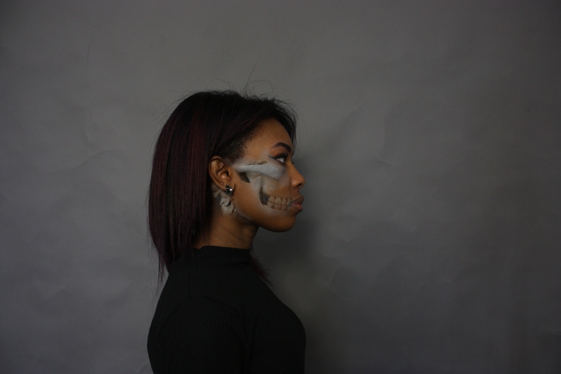
Second Edit - Head
1. I began by selecting my model image and layering it via copy and paste.
2. I then adjusted the opacity of the top layer to reveal the skull partially underneath and then selected the bottom (skull) layer and used edit --> transform -> scale to rotate and resize the skull to fit my model.
2. I then adjusted the opacity of the top layer to reveal the skull partially underneath and then selected the bottom (skull) layer and used edit --> transform -> scale to rotate and resize the skull to fit my model.
|
|
|
3. I then selected the top layer and readjusted the opacity so that the skull was no longer visible. Then I selected the eraser tool and began to rub away the top layer to reveal parts of the skull underneath whilst frequently adjusting the opacity to avoid too harsh of an effect.
|
|
Final Edit
The Photoshop process here was very successful and I managed to align as much of the skull as possible and left out any areas that were unsuccessfully aligned. By decreasing the opacity around the edges of the areas I erased to reveal the skull I created an x-ray effect except the skin was "removed" in certain areas and the underlying structure was revealed.
Strand One
How the time of day changes the place
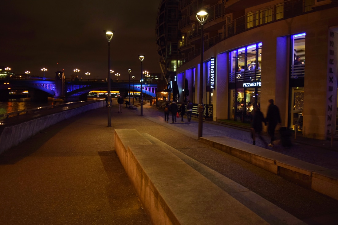
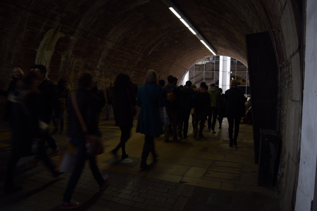
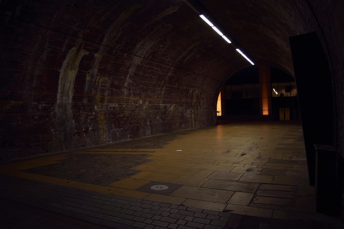
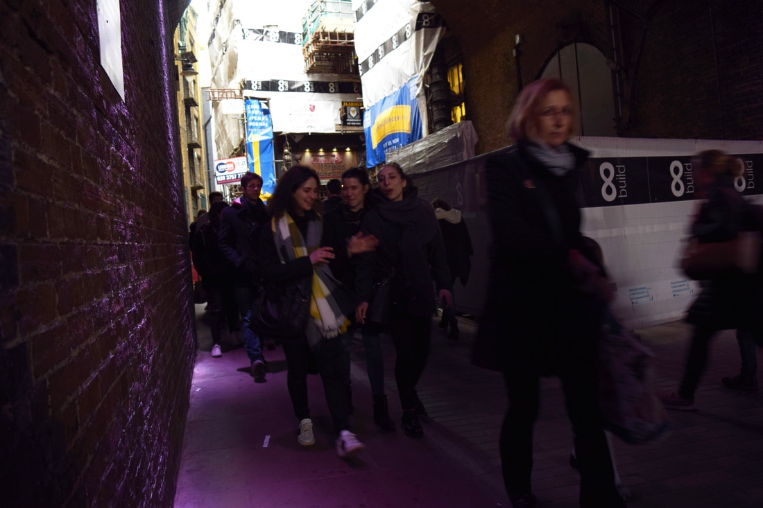
In order to explore the idea of structure I wanted to experiment with how the presence of people change the structure of a place. When an area is very busy the connotations are drastically different to that of an empty area which seems desolate and eerie. The focus within the image also changes as the presence of many people can detract from the structure of the surrounding buildings to the structure of the crowd. I wanted to explore how the interpretation of the same place changed depending on the time of day and therefore how busy it was.
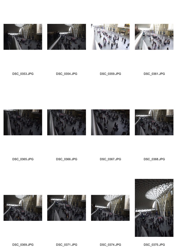
King's Cross - Contact Sheet
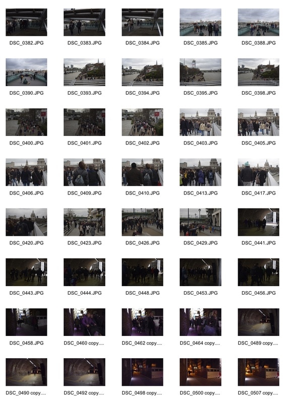
Southbank - Contact Sheet
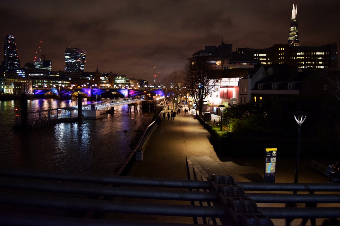
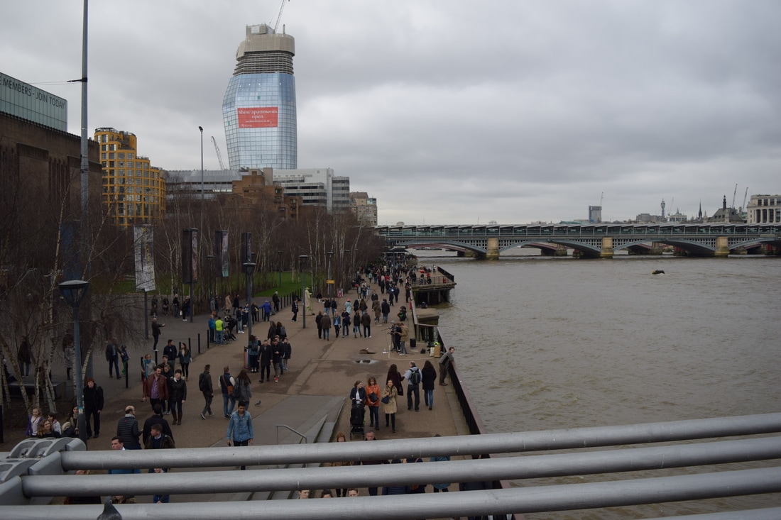
Same Place; Different Time
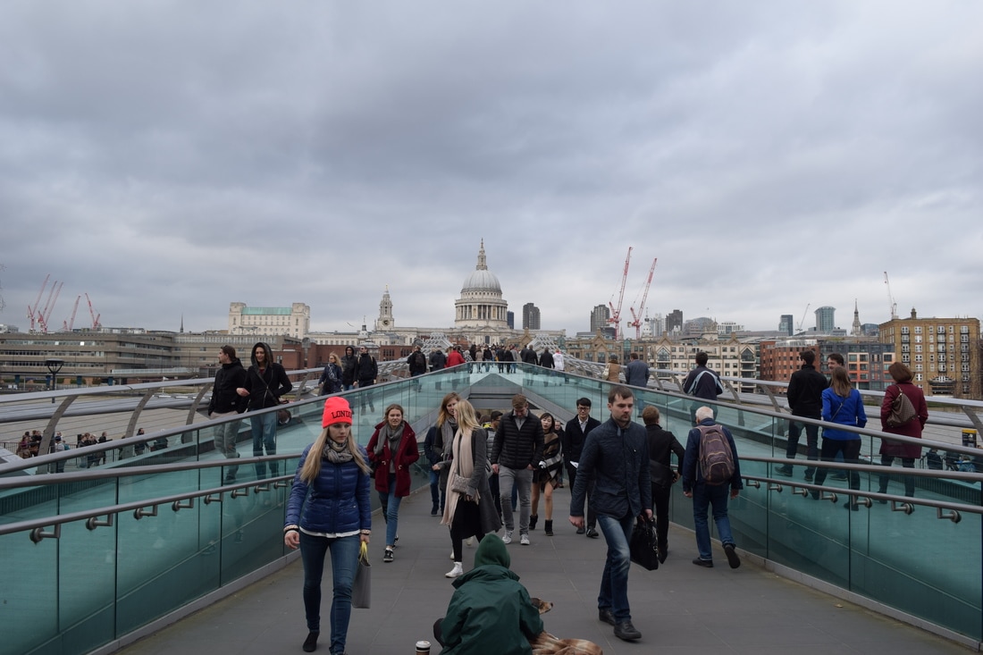
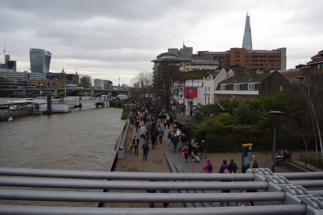
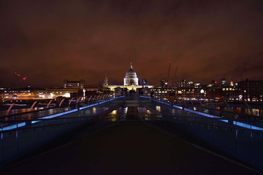
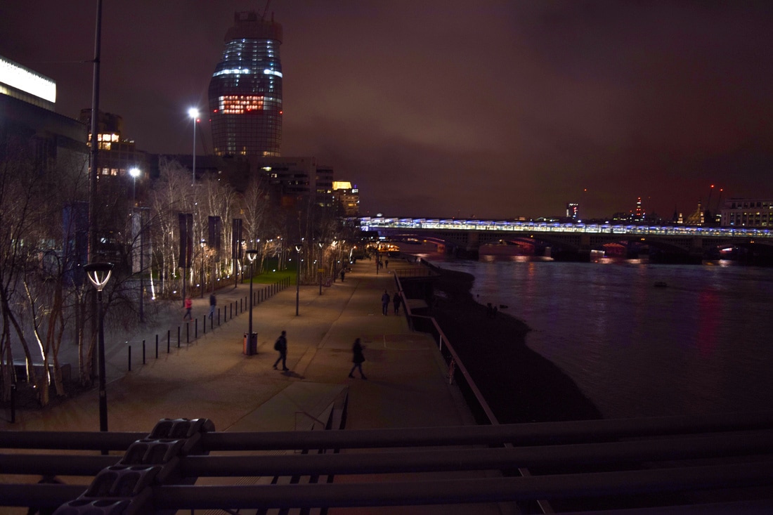
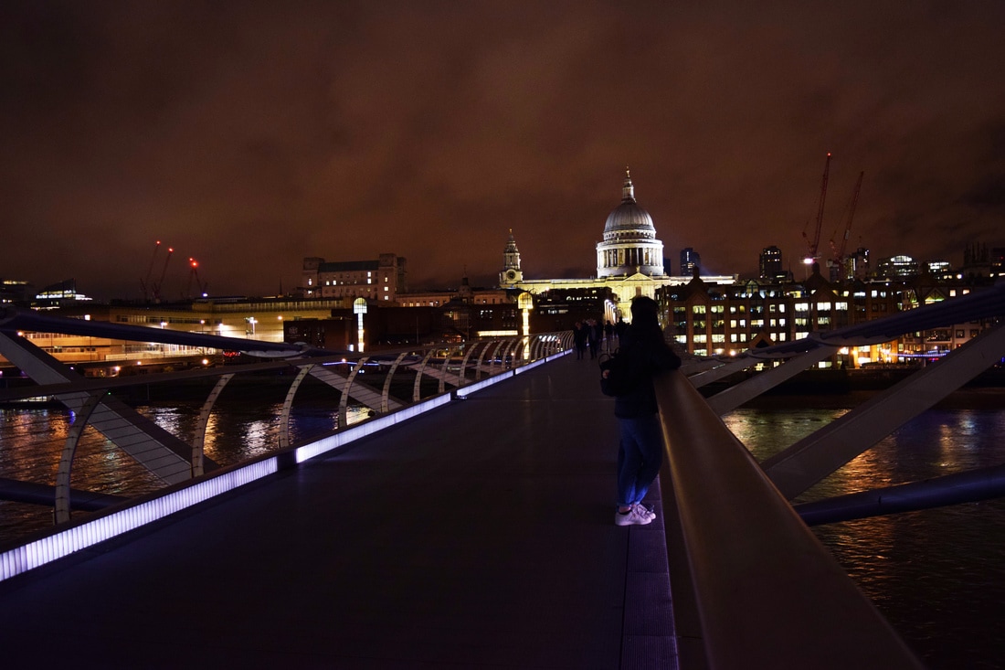
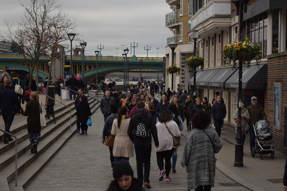
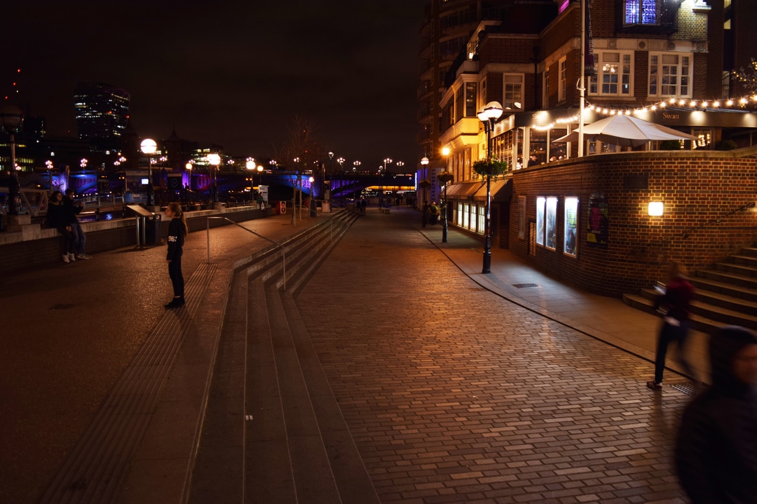
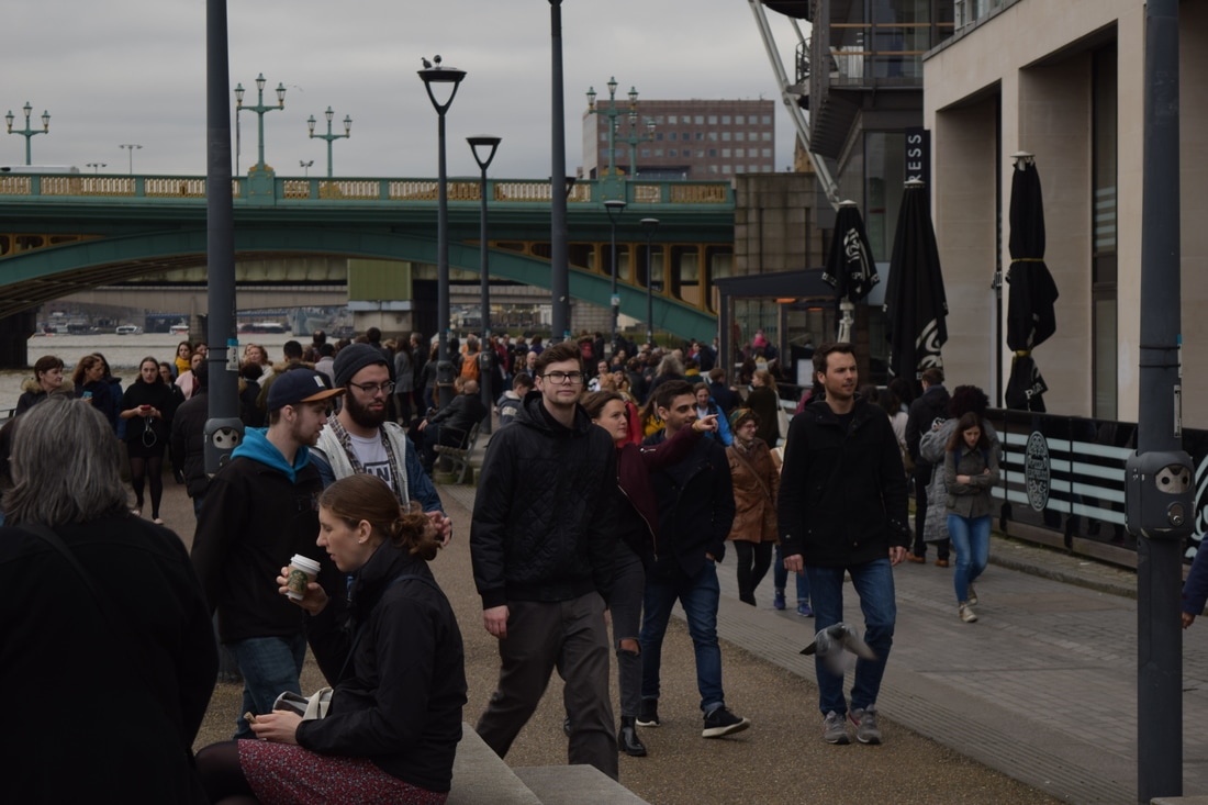
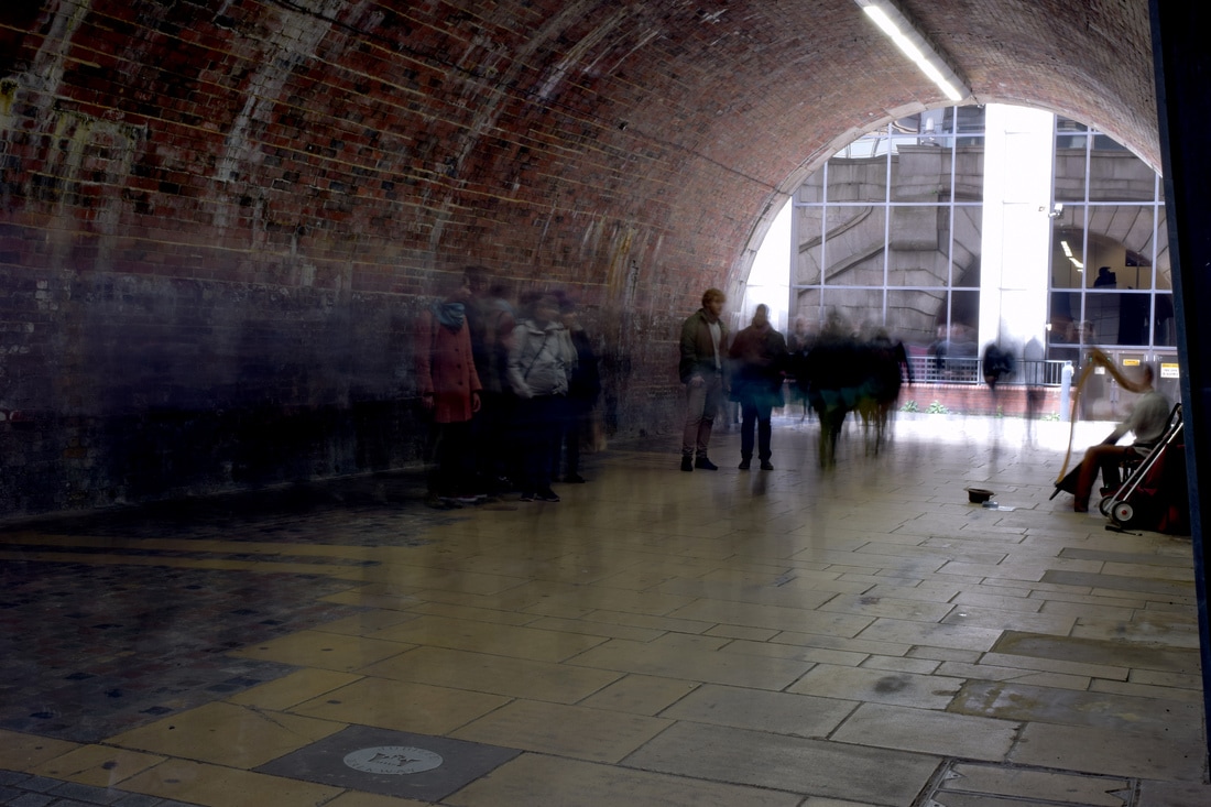
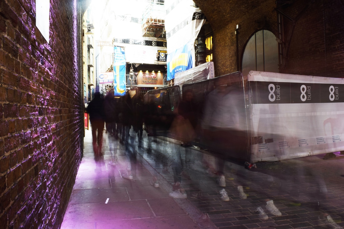
The images below are a comparison of areas in London along the Southbank with the left image taken around midday and onwards containing many people and the right image being taken from the same place at 11pm where very few people were. With the popularity of London, there was a requirement to wait this long in order to have none to few people in the comparison photograph. Because of this, the experiment partially became a comparison between day and night as well as busy and empty which was also effective as the lighting of London at night brought extra attention to the buildings and their structure which achieved the intended idea.
|
|
|
|
|
|
|
|
|
|
|
|
|
|
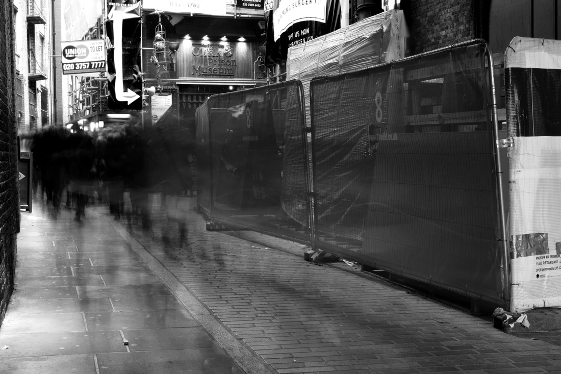
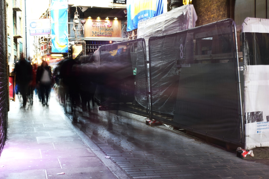
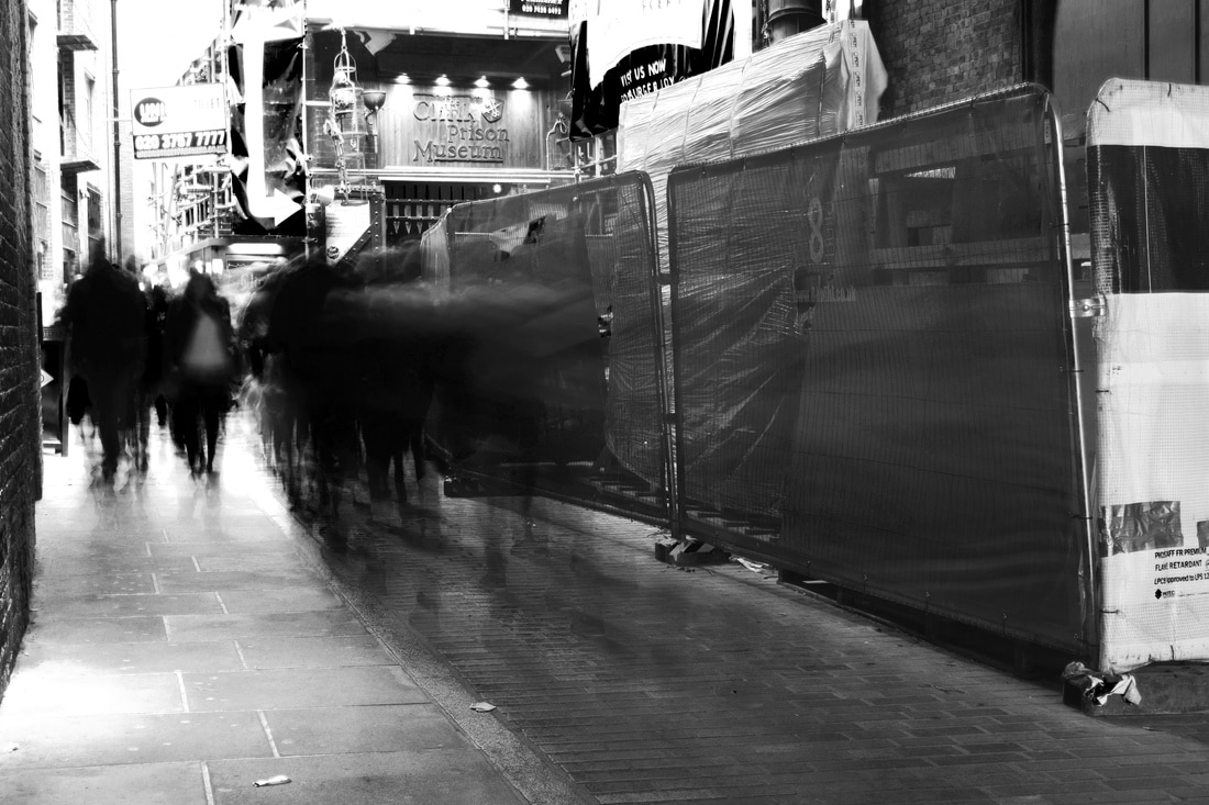
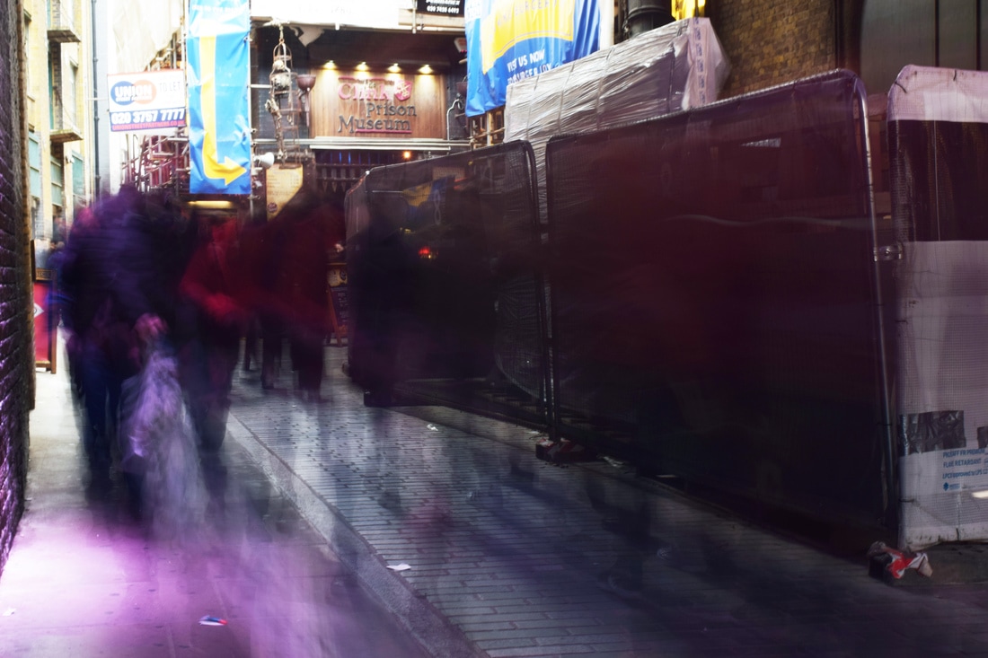
DEVELOPMENT - Slow Shutter Speed
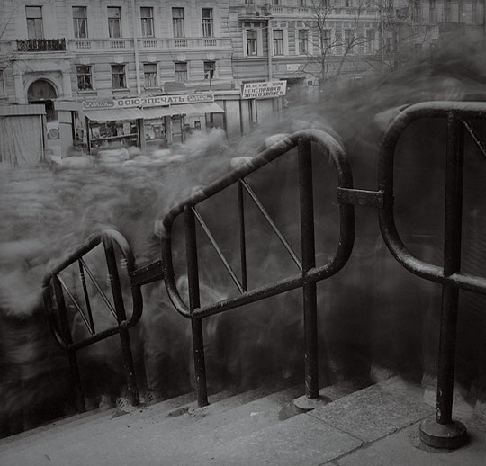
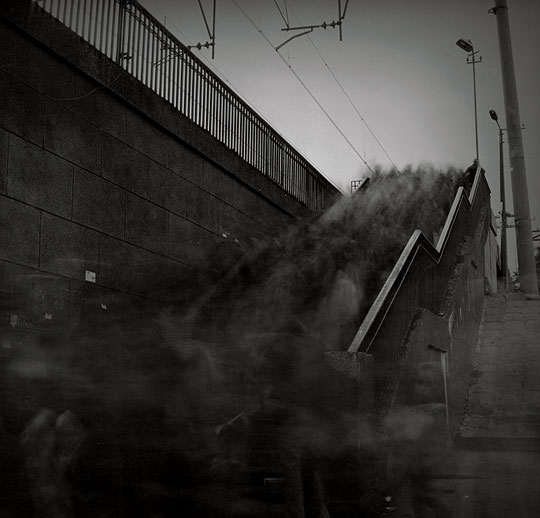
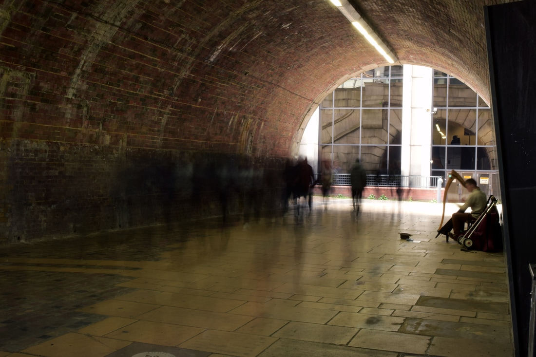
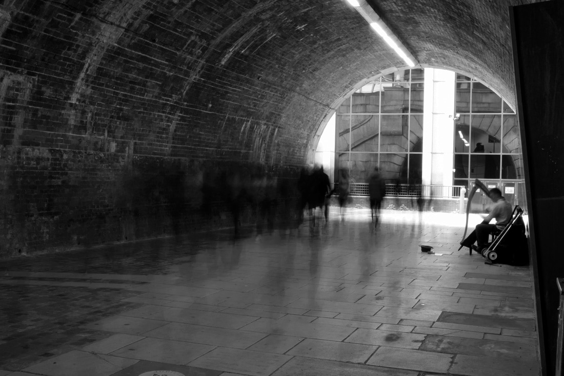
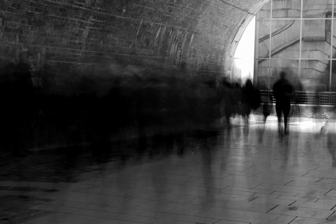
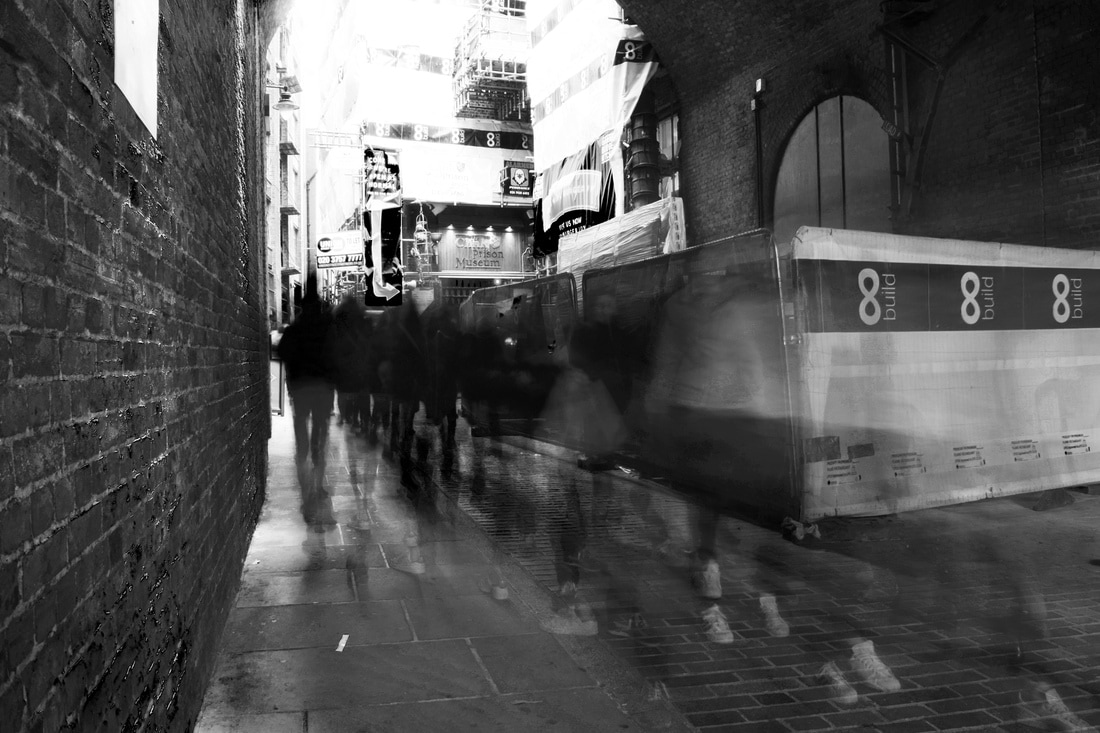
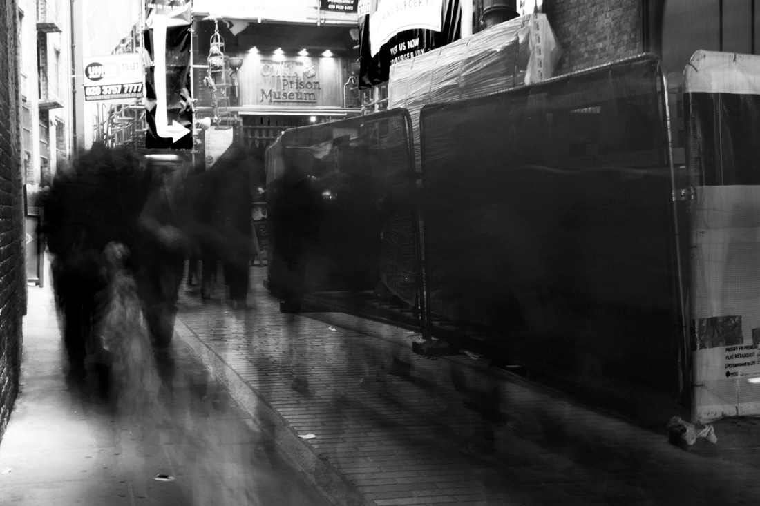
Inspiration - Alexey Titarenko
I developed this idea of busy places further taking inspiration from Alexey Titarenko where he used a slow shutter speed in order to convey a sense of movement during the rush hour in certain places. Titarenko wanted to portray the bleakness and hardship of living in Russia and often used the black and white effect to convey a dull life and struggle in poverty. His images also demonstrate how immense a large crowd of people can be. The final effect is ghost-like as no-one has a distinct shape and all their identifying facial features are blurred; the entire crowd becomes part of one body. Titarenko edits his images to be black and white which creates the sense of the crowd being like a body of smoke and enhances focus on the movement of the image as it takes away any colourful clothing that could distract the focus; although the intention behind this effect was to display dissatisfaction with living conditions and monotonous lifestyle. The images are effective in accentuating the both the harsh structure of the city juxtaposed against the soft, blurred and moving structure of the crowd.
|
|
Editing Process
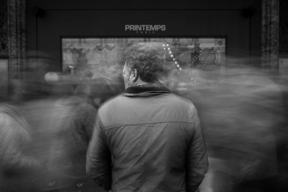
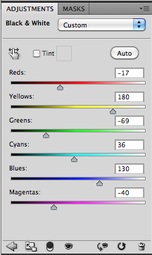
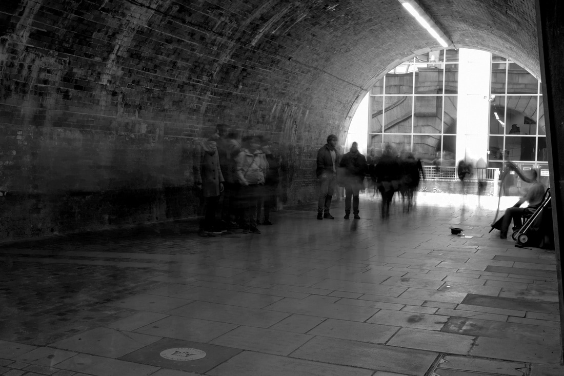
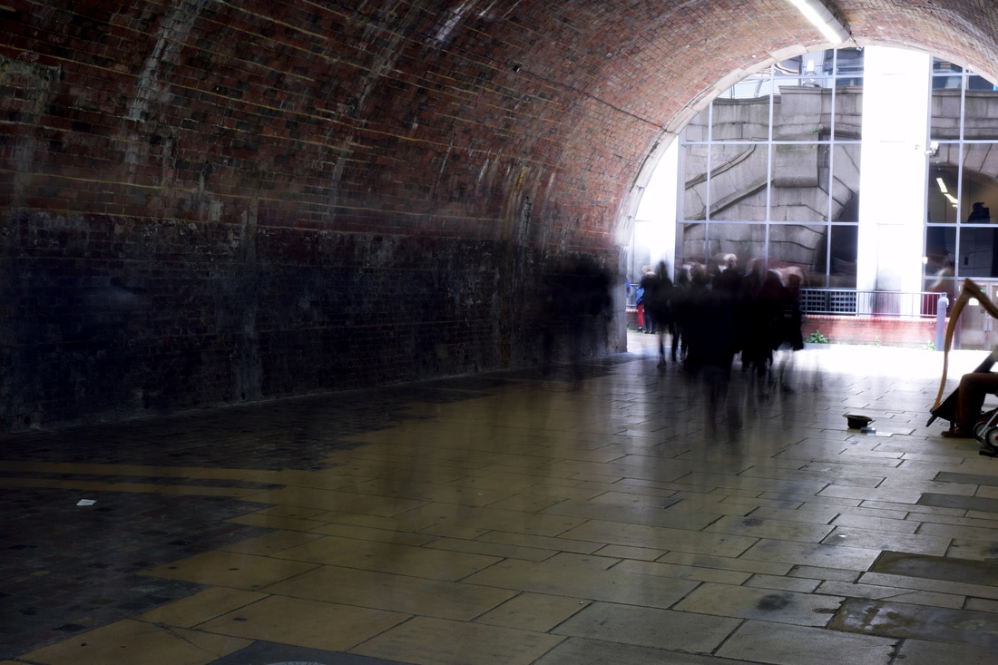
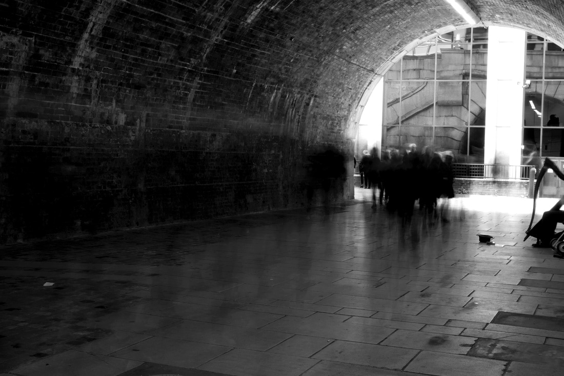
Alexey Titarenko's slow shutter speed work is in black and white which creates a dramatic atmosphere and simplifies the array of blurred people into a substance that somewhat resembles smoke.
I wanted to recreate this within my own work and so after adjusting the brightness, contrast and levels within photoshop I then selected the black and white option and adjusted the colour levels underneath.
I wanted to recreate this within my own work and so after adjusting the brightness, contrast and levels within photoshop I then selected the black and white option and adjusted the colour levels underneath.
|
The table shown on the right is a screenshot from photoshop of one of the examples of the adjustment Colour Levels I used to change the way the black and white image was conveyed.
I worked on deepening the crowd of people to enhance the smoke effect that Alexey Titarenko used. The outskirts of the images I worked on by brightening them so that there could be an enhanced contrast between the crowd and the structure that surrounded them. |
|
Final Edits
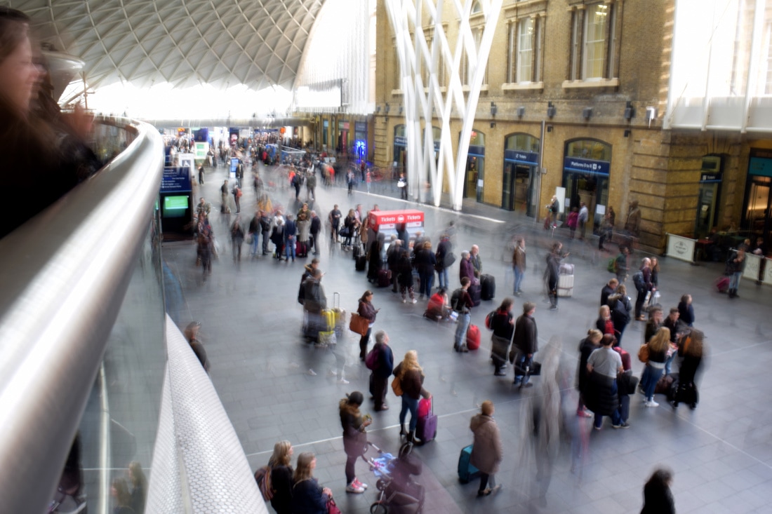
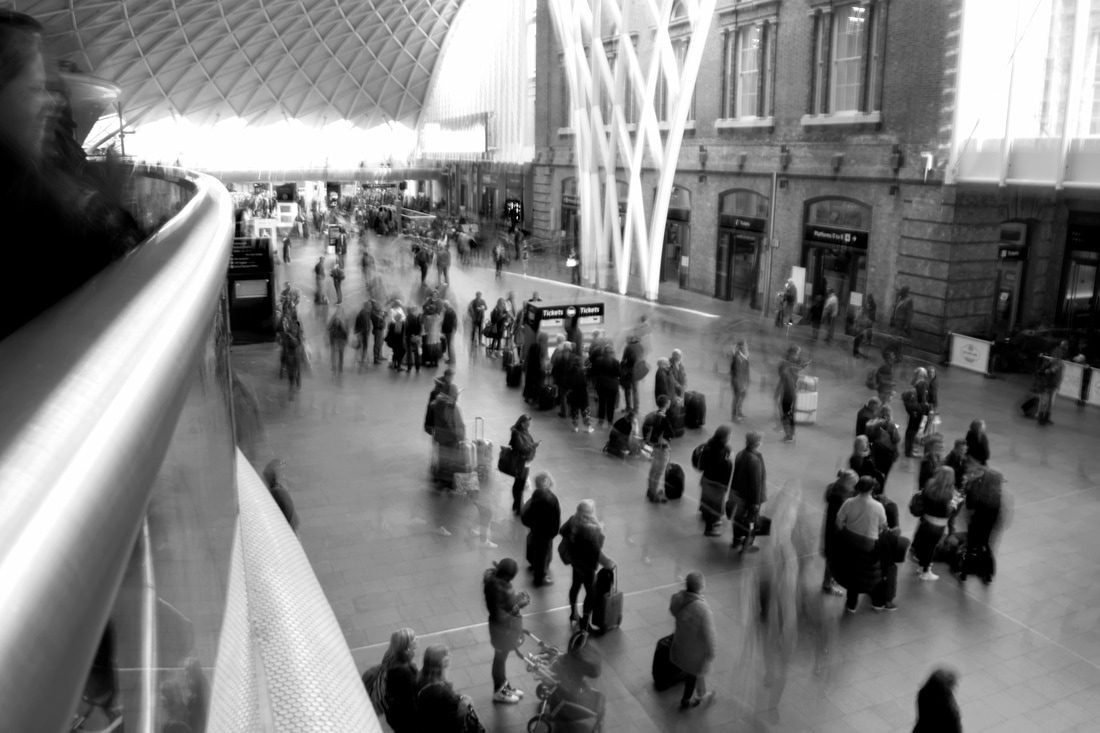
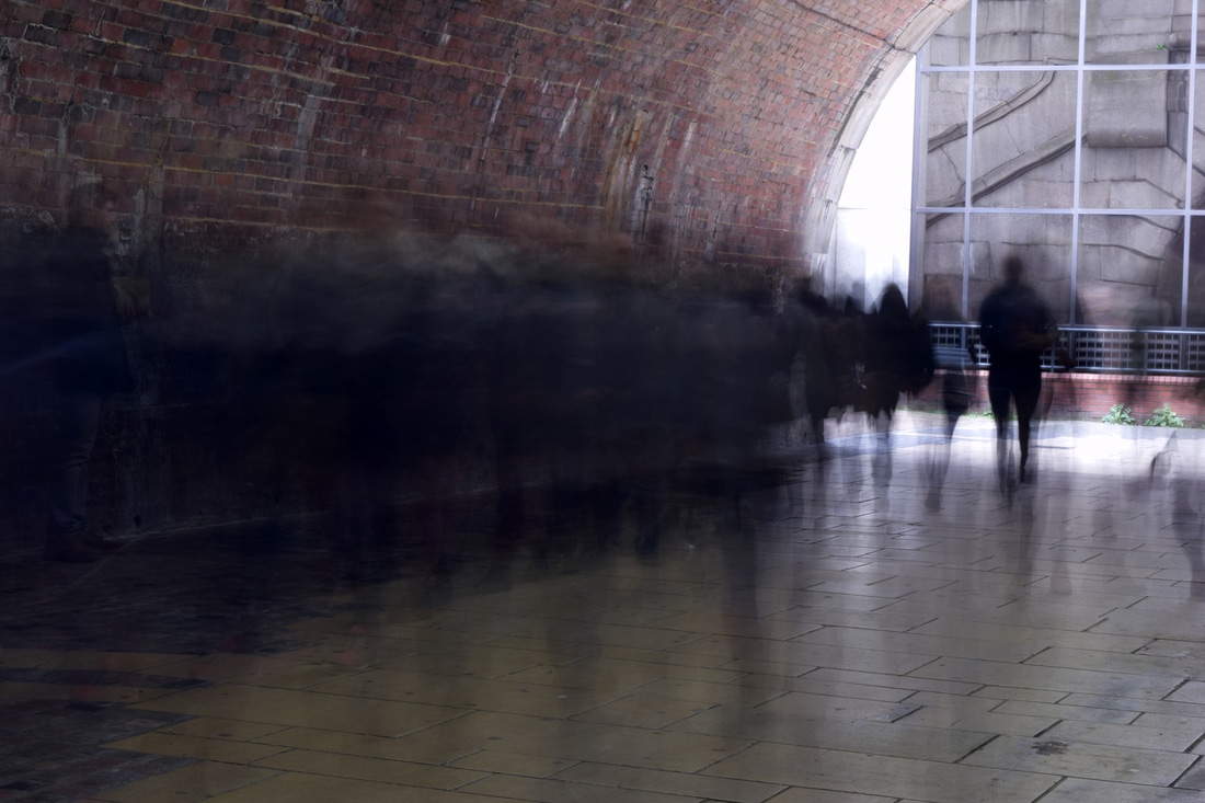
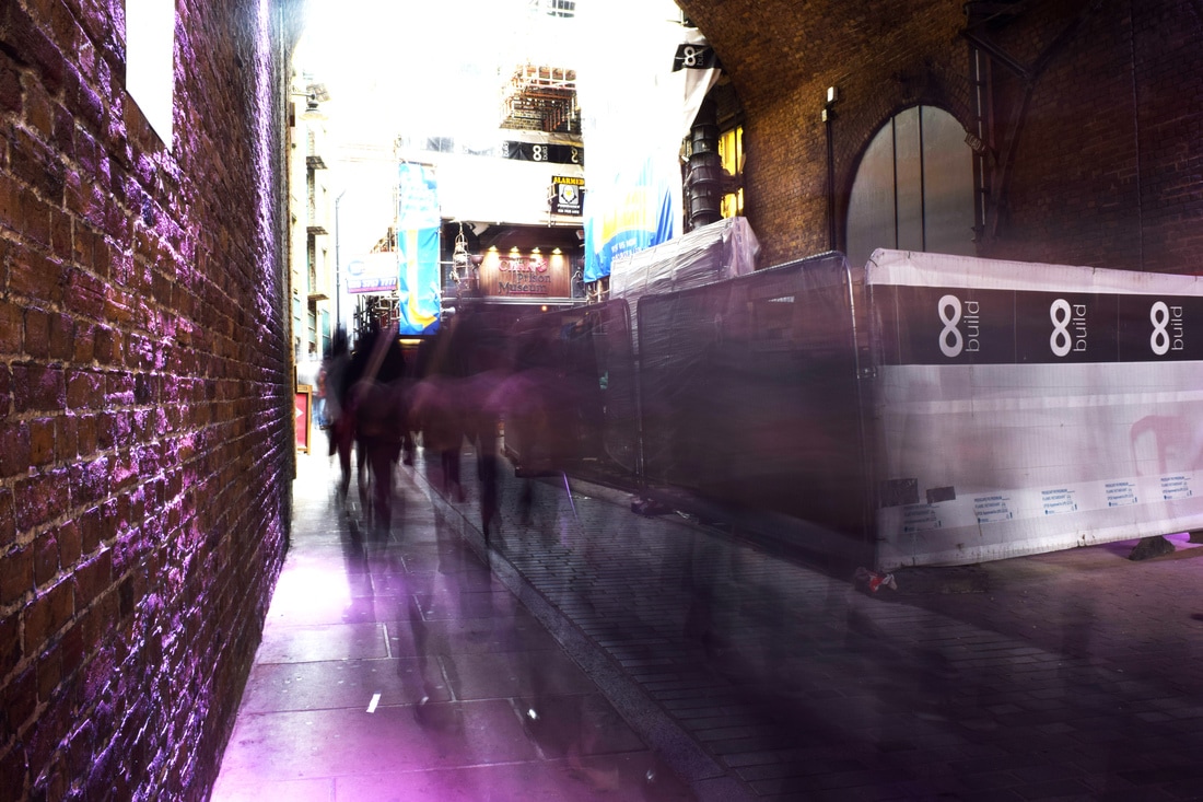
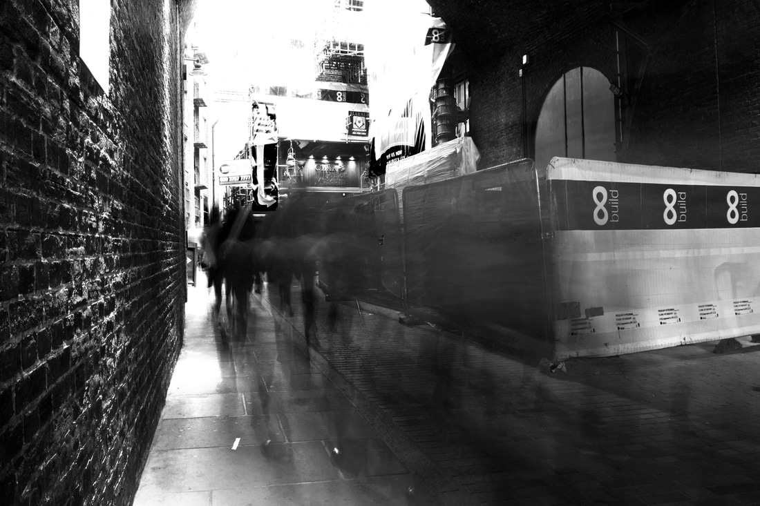
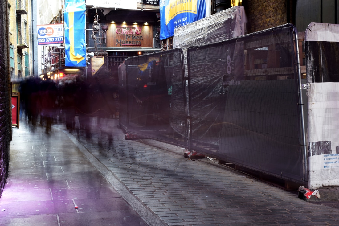
Below are my final edits that I have as a comparison between coloured and black&white images to demonstrate the atmospheric effect that Titarenko's images had. Unfortunately there was little movement at Kings Cross because however the Southbank had a lot of movement and conveys Titarenko's work more accurately.
|
|
|
|
|
|
|
|
|
|
|
|
|
|
|
|
|
|
|
|
Strand Two - Muscle Anatomy
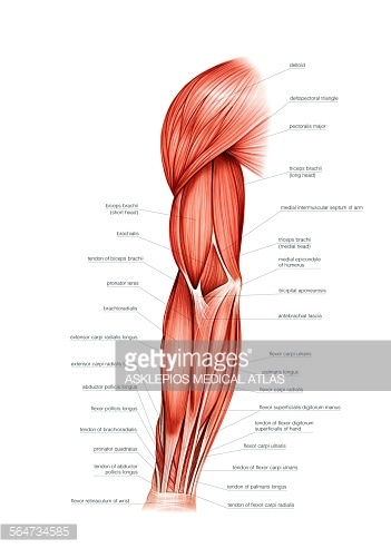
I wanted to explore further into the muscular anatomy of people following on from the skeletal and organ structure from the set tasks as the muscle is one of the most important structures in the body that we require for movement and co-ordination of the skeleton.
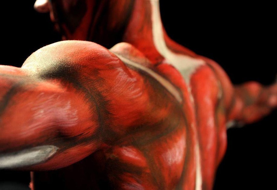
I looked into body painting on pinterest as well as muscle diagrams and selected some inspiration images.
I looked into body painting on pinterest as well as muscle diagrams and selected some inspiration images.
Inspiration
|
|
|
|
|
|
|

|
|
First Experiment
|
Like with the set tasks, I wanted to recreate the idea of looking under the skin and exposing the muscle and so I began by taking one of my inspiration images and took a picture of someone with a muscular back where there was already muscle definition so that the image would not only be more effective but also so that the other image was easier to overlay as the muscles were partially visible.
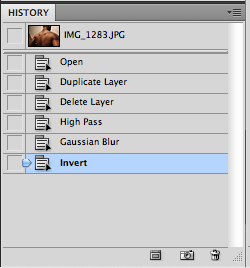
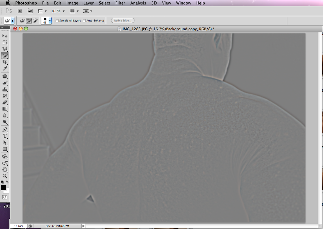
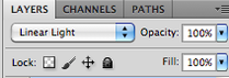
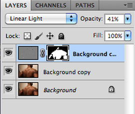
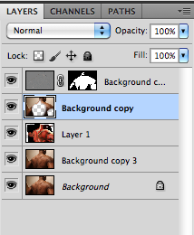
I began by layering the background then going to the Filter menu --> Other --> High Pass. When the High Pass dialogue appeared I entered 24 pixels as the picture was closely cropped. Then I went under the Filter menu again and under Blur --> Gaussian Blur and put in 8 pixels (1/3 of the High Pass pixels) and then went to the Image menu --> Adjustments --> Invert. During this time the image is grey and so I changed the blending mode to Linear Light as shown below. |
|
|
|
|
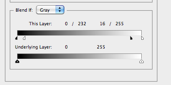
However after selecting Linear Light the image has halos around everything. In order to remove this I went to the bottom of the layers panel, clicked on Add a Layer Style icon and chose Blending Options from the pop-up menu.
The dialogue on the right then appears and I held down alt and clicked on the sliders to separate them into two and then adjusted them to the values shown. The result is shown below. |
|
Now I hid this layer from view so that I could maintain clarity in other parts of the image. To do this I held down the alt key and then clicked on the Add Layer Mask icon at the bottom of the Layers panel which hid the skin texture behind a black layer mask.
Next, I set the Foreground colour to white and then selected the brush tool (settings shown below - opacity and size adjusted throughout).
Next, I set the Foreground colour to white and then selected the brush tool (settings shown below - opacity and size adjusted throughout).

|
You can see here that this removed areas of the black layer to reveal the smoothened texture underneath in only the areas selected.
|
|
|
I took the image on the right in photoshop and made it a layer between two copies of the edited image so that when I rubbed away the top layer the unedited version would not show through underneath, defeating the purpose of editing it in the first place.
I flipped the image horizontally to match my image and then went to Edit --> Free Transform so that I could align the images to the best possible degree. Any parts that looked odd or did not quite match up where the areas I would leave as skin. I then selected the top edited background layer and selected the eraser tool, adjusting the size and opacity, to achieve the desired effect. |
|

|
|
This was the result and I achieved the softened edges by decreasing the opacity of the Eraser.
Final Edit
In order to highlight the details of the muscle I then took the above image into Photoshop and adjusted the Colour balance and Levels. This effectively demonstrated the underlying muscle structure.
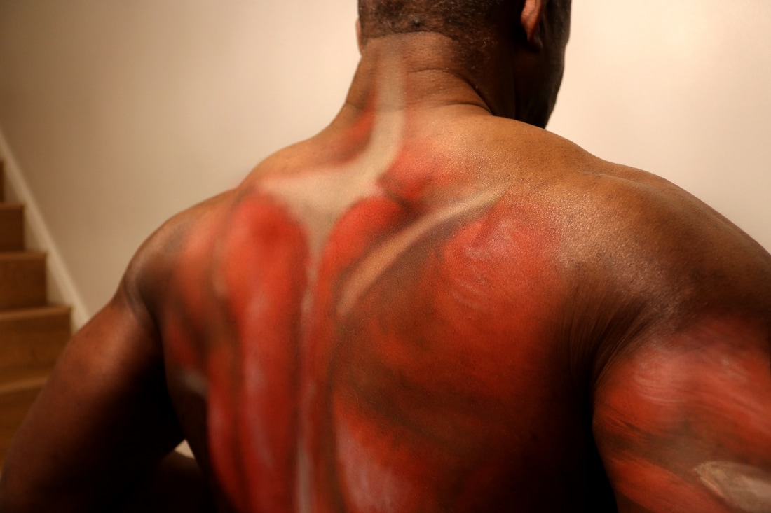
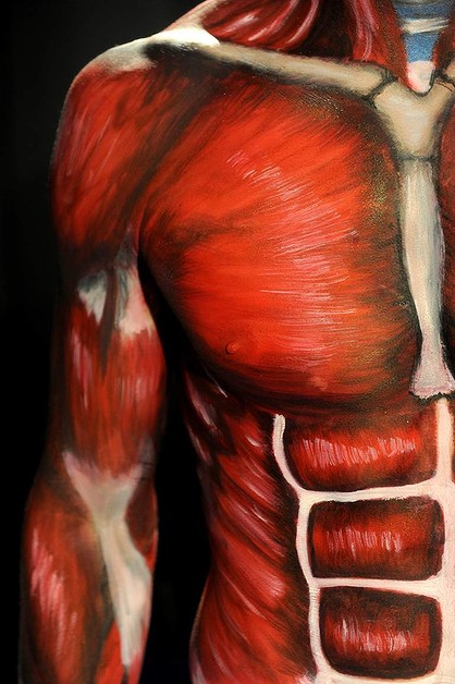
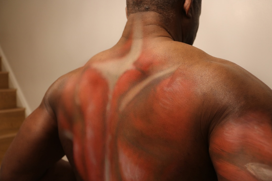
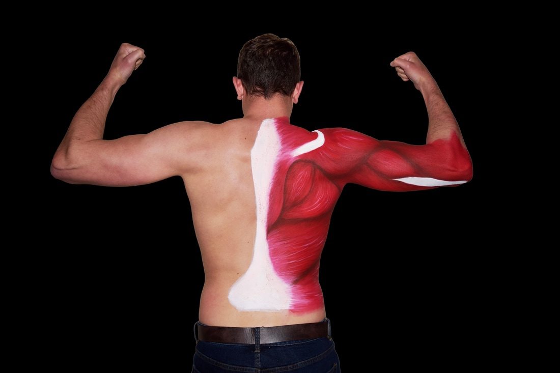
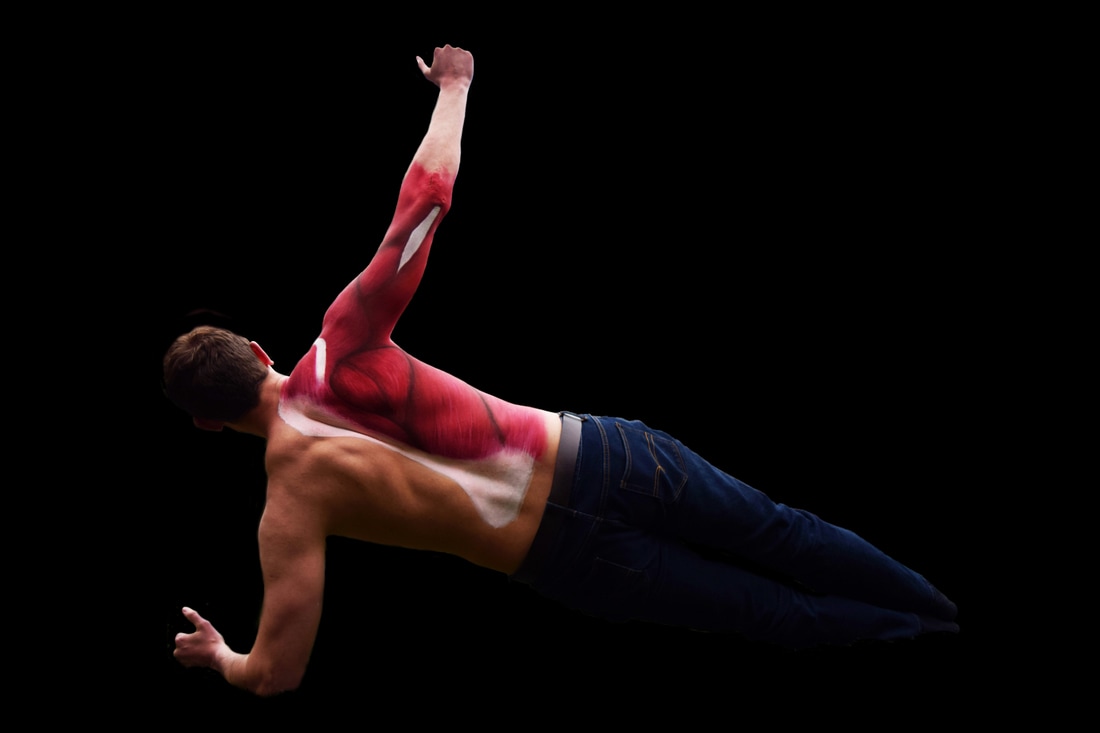
Body Painting
I developed my previous experiment by actually doing some body painting. I used various muscle anatomy images to gain a greater understanding of the back and upper arm muscles as well as my inspiration images where I compiled different styles of creating muscle structure through body painting until I came up with my own. I used a white eyeliner pen to mark out the muscles as a guide for my painting and to ensure the muscles I marked out were in the correct place.
Stage 1After marking out the muscles I filled in the areas with white and red and left spaces where I planned to fill in brown/black to add depth to the muscle.
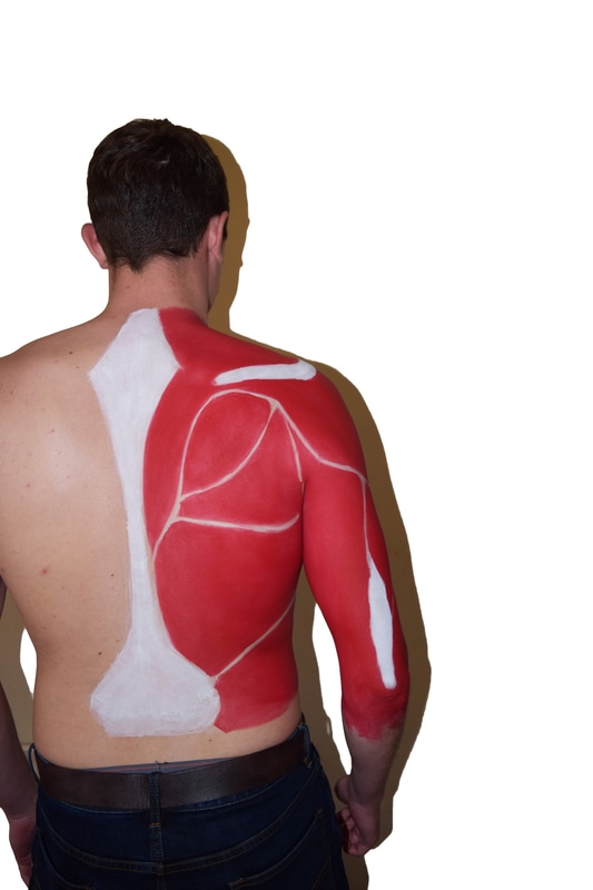
|
Stage 2At this point I had filled in all the gaps between the muscles with brown/black and began shading the infraspinatus, teres major and part of the latissimus dorsi.
|
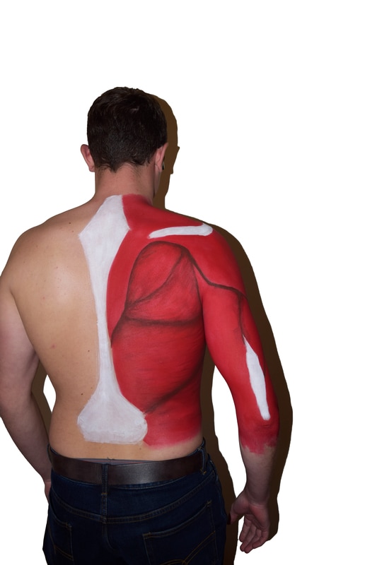
Stage 3
Below is the final stage. I had contoured the muscle with brown shading to create the illusion of muscle fibres and had used white to highlight the central areas of the muscle to create a sense of depth between the dark and light shading. I also used the white to blend in the central, spinal, white area into the muscle to reduce the harshness between the colours and to demonstrate how the muscle fibres are intertwined with this central structure.
|
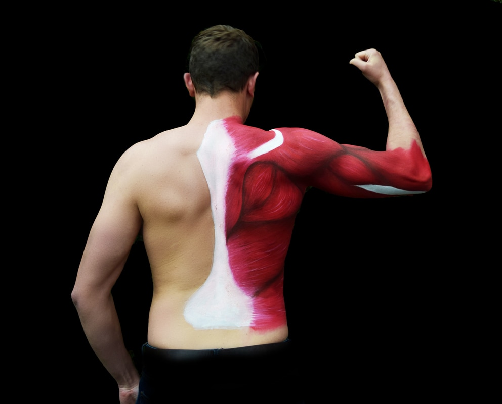
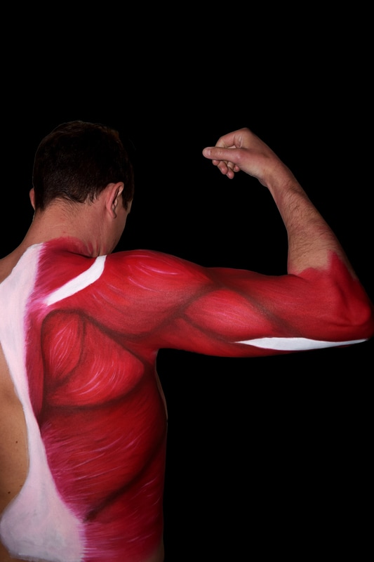
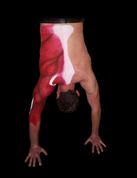
The below image of a handstand was effective in showing a direct comparison of muscle, particularly in the arms, due to the contraction of the muscle. There is a clear correlation between the painted muscle and the real muscle which is very effective in the image.
|
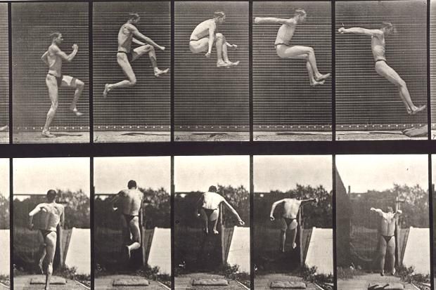
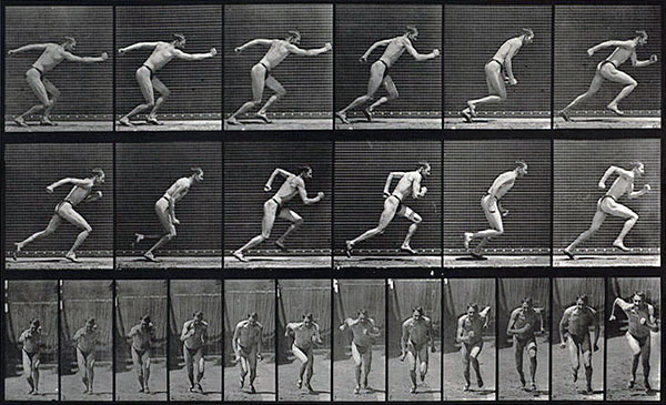
Eadweard Muybridge
Eadweard Muybridge was an English photographer in the 19th century who specialised in motion photography. One of his works was the human body in motion which depicted men, women and children variously running, jumping, falling and carrying out athletic or mundane activities. At the time he was exploring animal locomotion and demonstrating isolated movement through single frames using 2/1000 shutter speed. He demonstrated this movement using a zoopraxiscope to display the motion pictures. His interest in how the body moves is something I wanted to explore in relation to muscle structure co-coordinating the body and allowing athletic achievement.
|
|
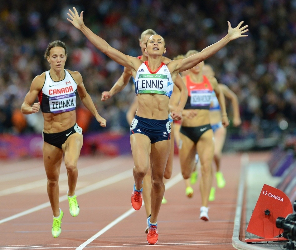
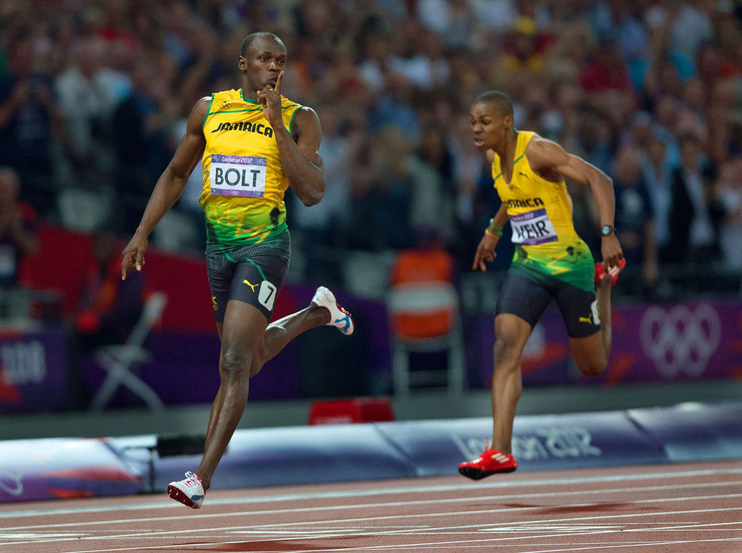
Mark Pain
Mark Pain is a modern, multi-award winning sports photographer with over 25 years experience and international recognition, and covering major events worldwide including the Olympic Games. I also took inspiration from his works combined with that of Muybridge as he is a modern photographer and his images are more representative of the work I can achieve.
His work below focuses on the runners to show definition of their muscle and the frozen motion of each stride which shows the shapes and angles that the legs form to perform successfully.
His work below focuses on the runners to show definition of their muscle and the frozen motion of each stride which shows the shapes and angles that the legs form to perform successfully.
|
|
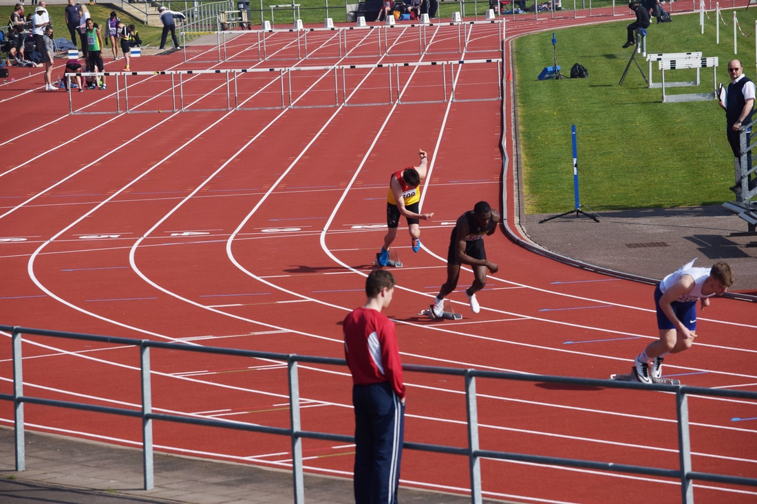
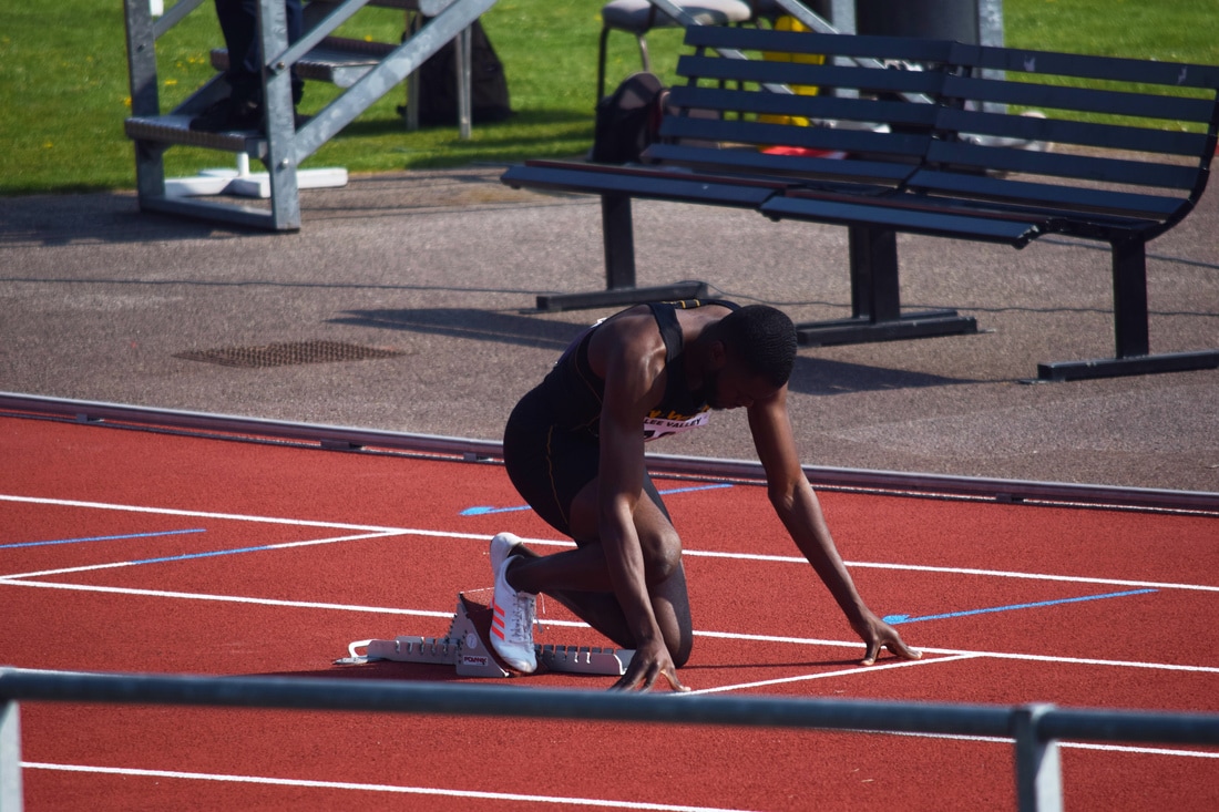
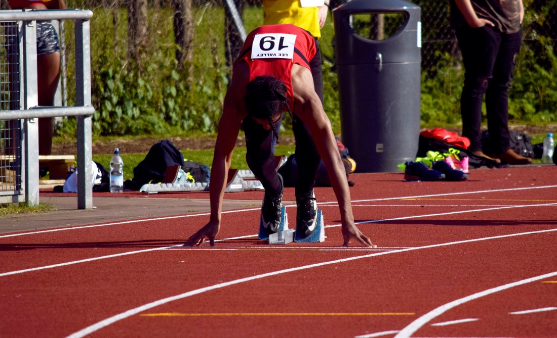
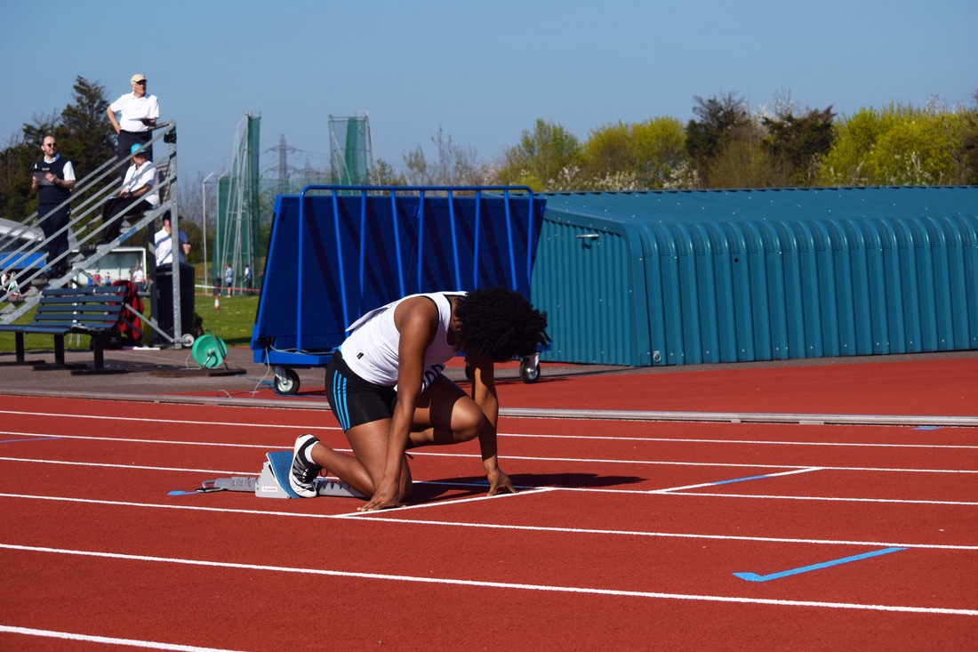
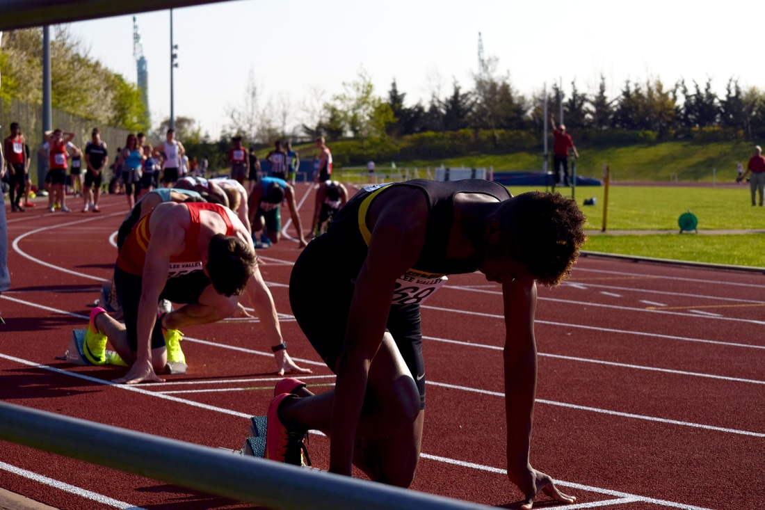
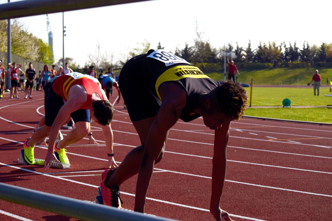
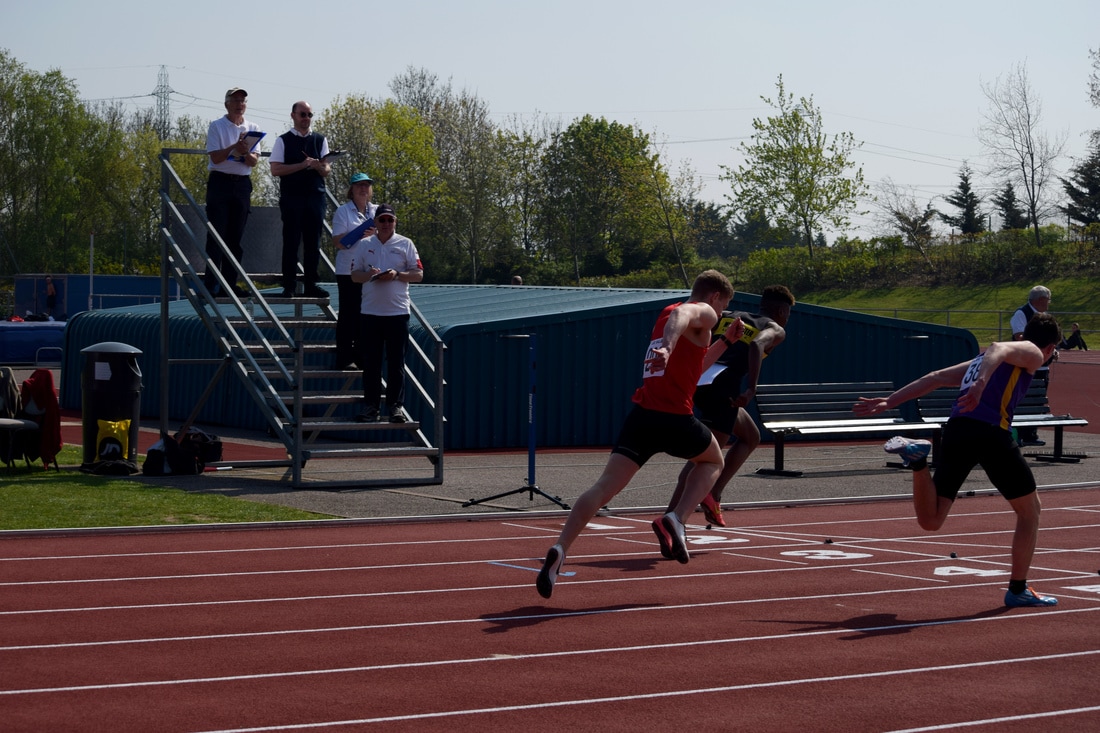
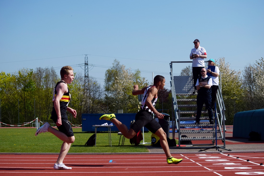
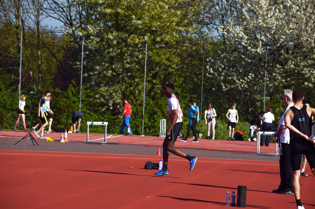
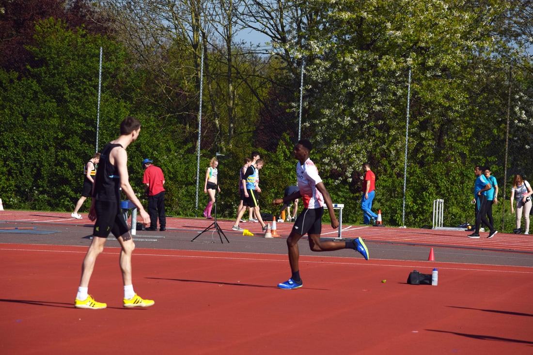
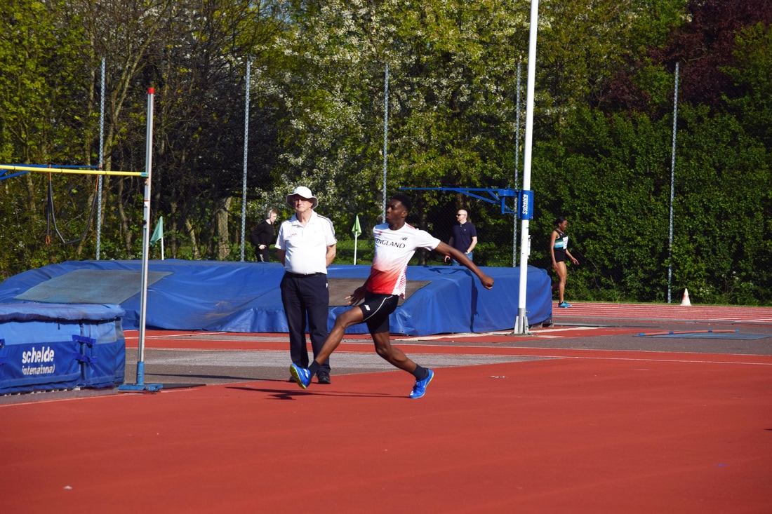
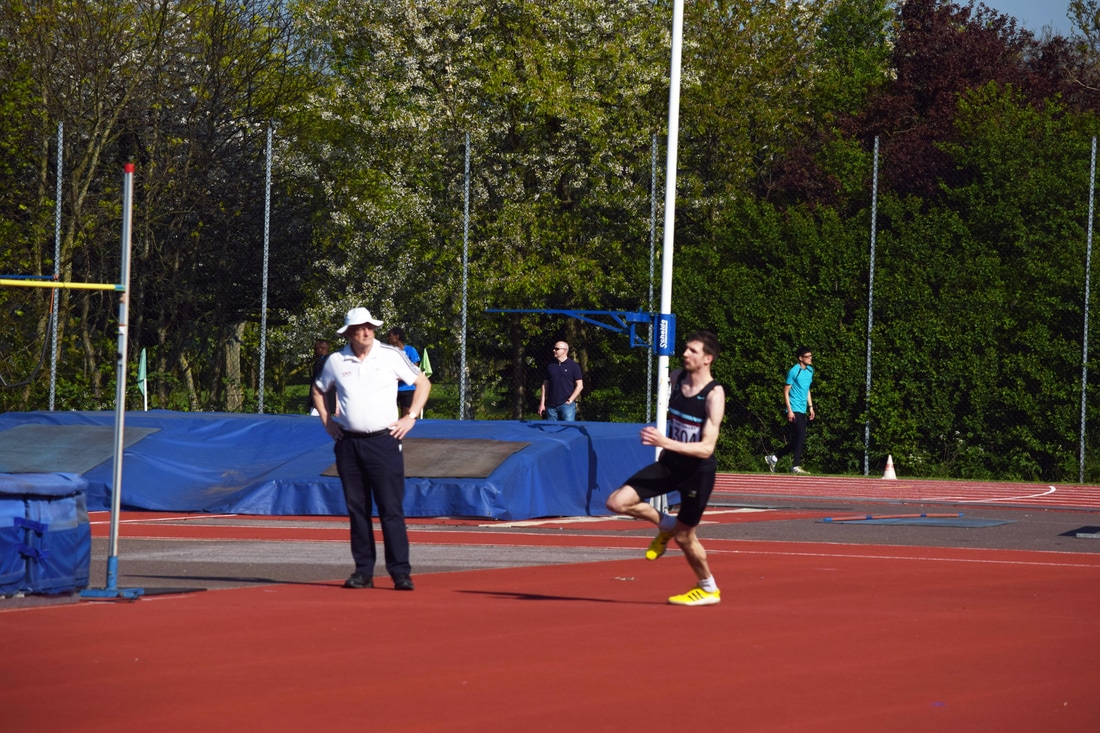
Competition at Lea Valley
To expand on my muscle development I attended a country competition at Lea Valley from 10am until 5pm to take pictures of muscle in action and how it supports and moves the body to achieve high technique and therefore high overall performance. Due to the high level of expectation, a lot of the athletes were very lean which allowed the muscle to show through the skin with far more definition than someone who barely trained athletically. This was a great opportunity to showcase muscles structure and the overall structures result in performance by coordination of said muscles.
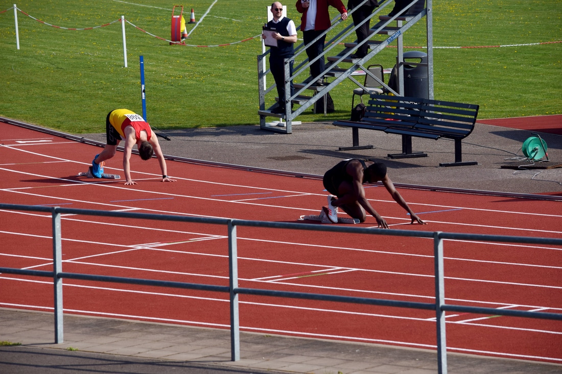
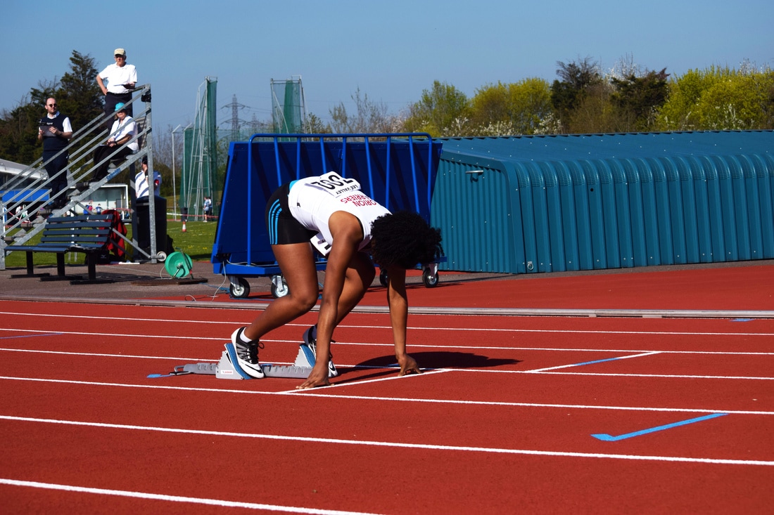
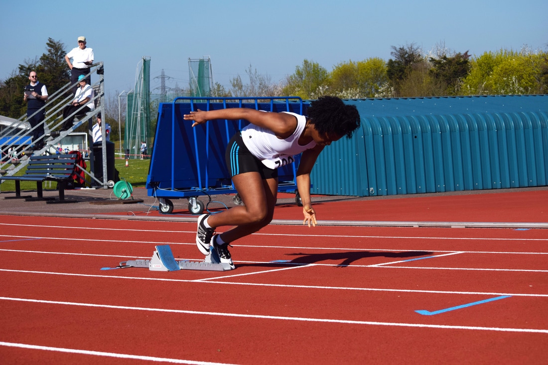
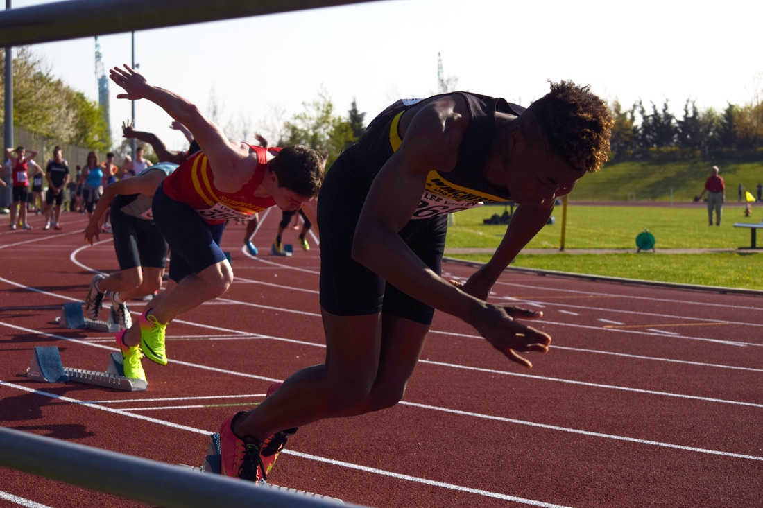
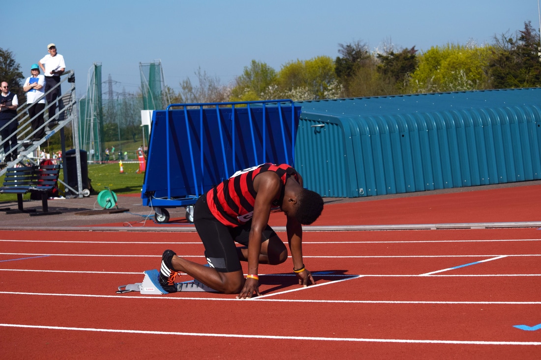
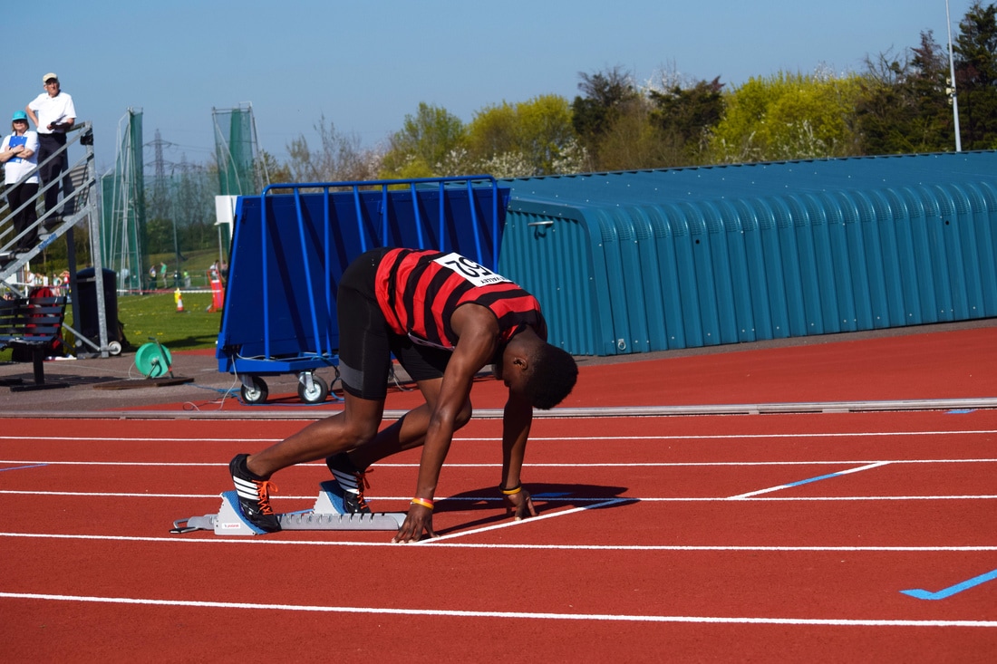
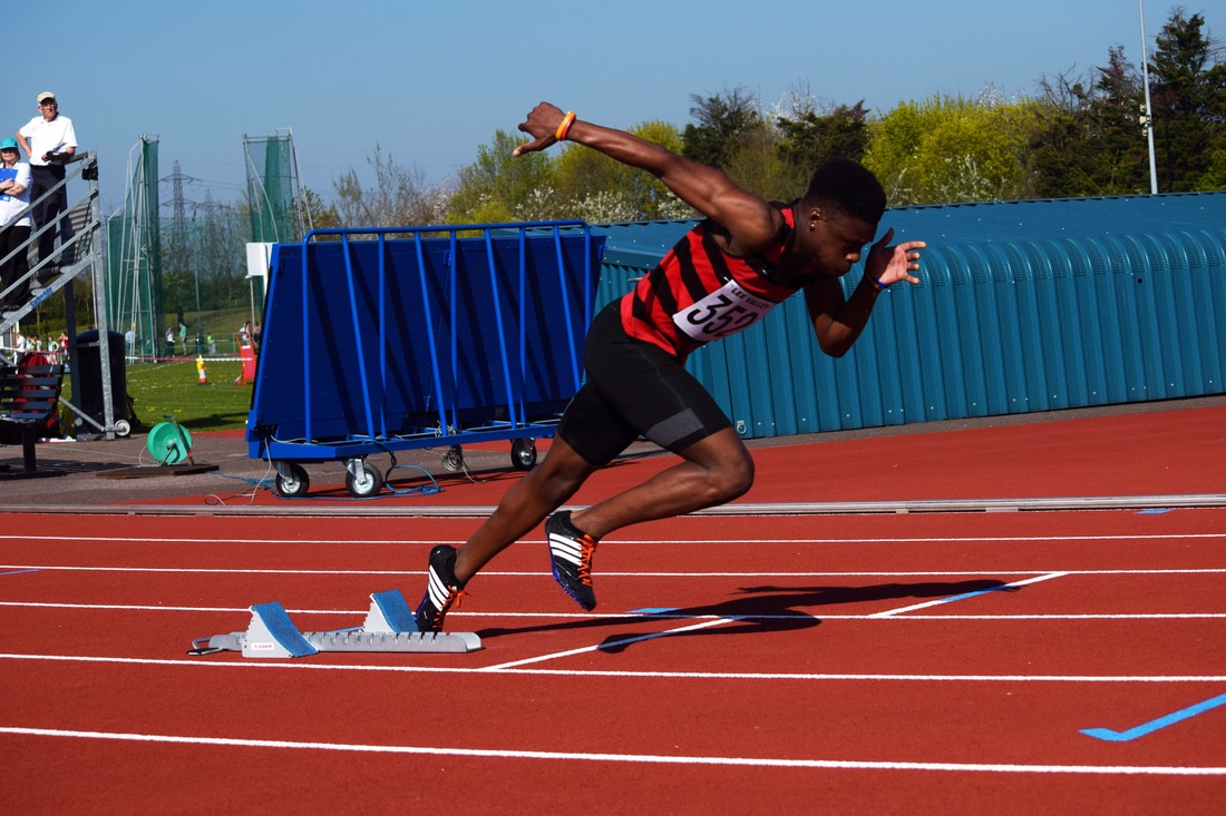
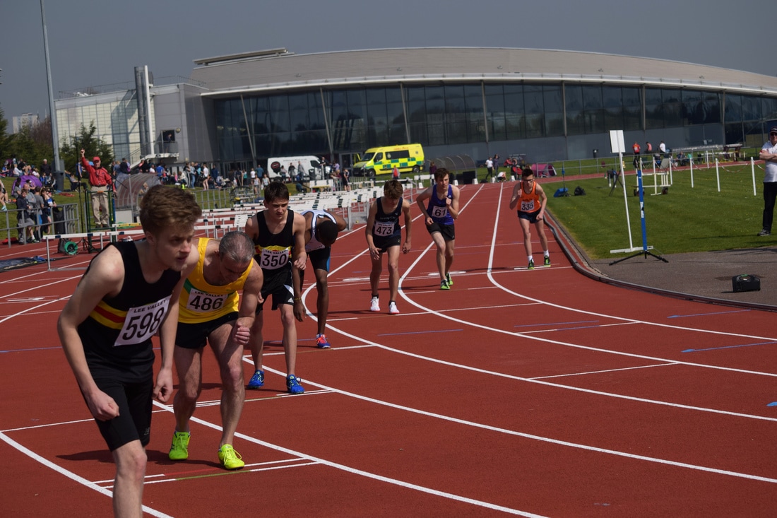
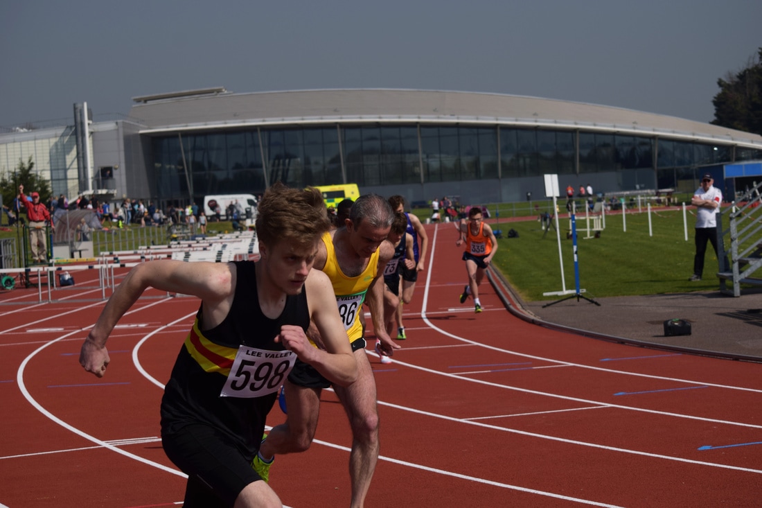
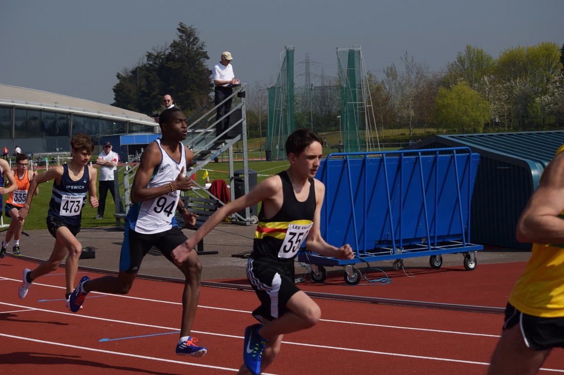
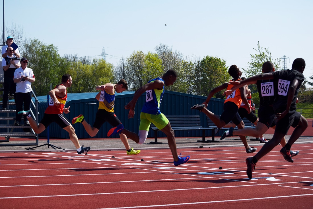
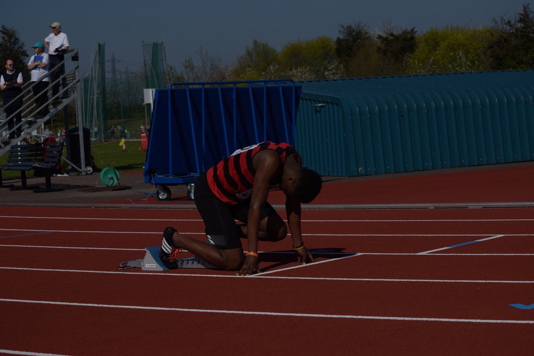
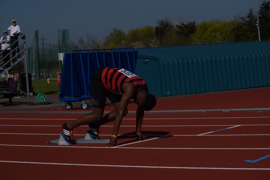
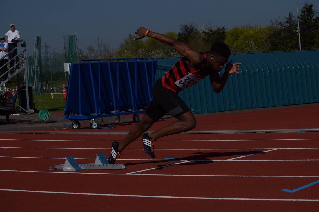
Start/ Block position
Prior to a track race the athletes have to have a good start, for many athletes blocks are used which help provide a base to push back on before launching off and starting the race and beginning the acceleration stage with the best possible technique in order to achieve a fast time. This positioning was interesting to photograph and below I have selected some of my favourite start images.
|
|
|
|
|
|
|
|
|
Best Images
The below images are the most successful in my opinion. It shows the three stages of a start in a race: get ready; set; go. The explosive power of the start is clearly demonstrated in the images and also conveys the work of Muybridge who looked at stages of an activity and how the human body looked in frames in the locomotion of leaving the blocks.
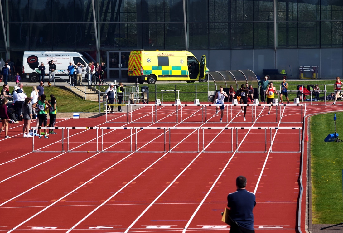
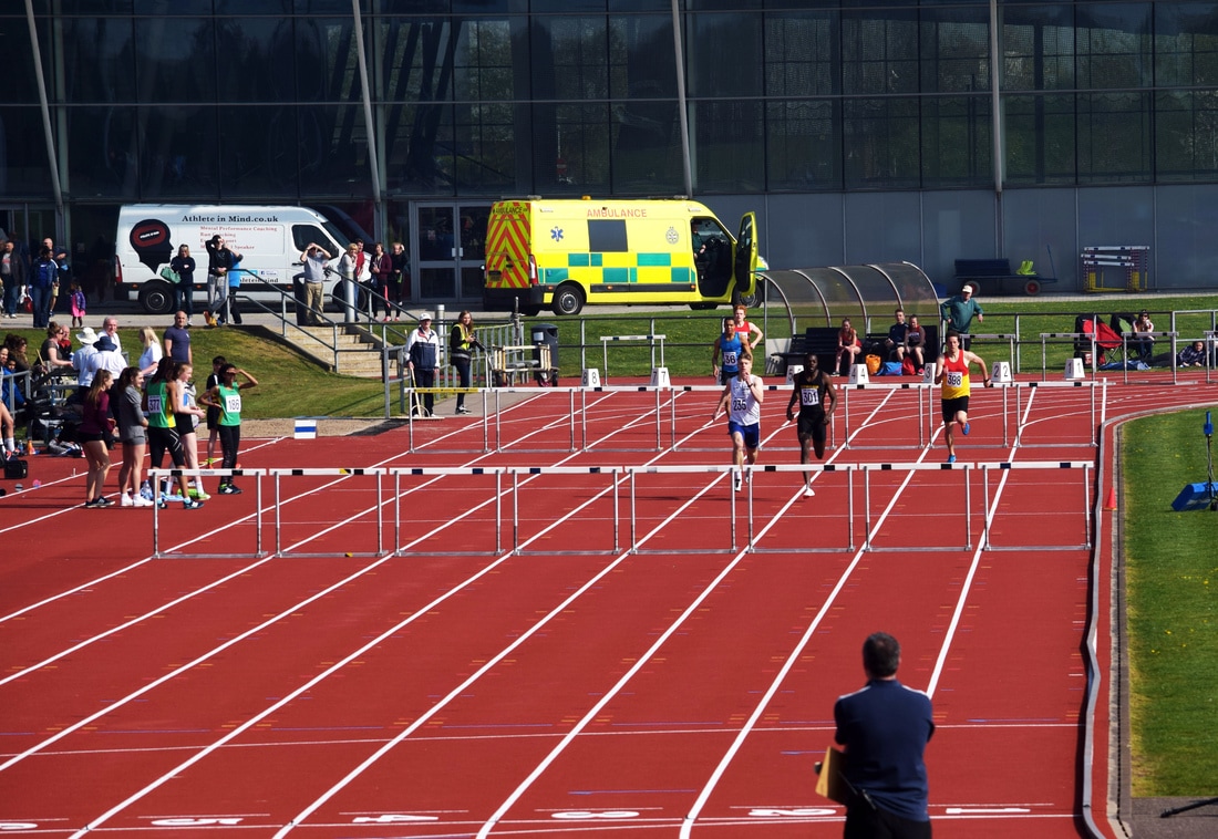
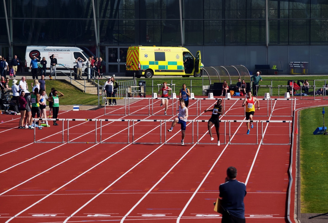
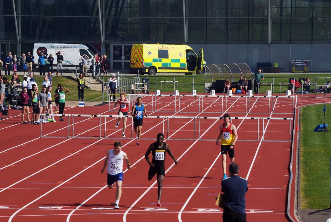
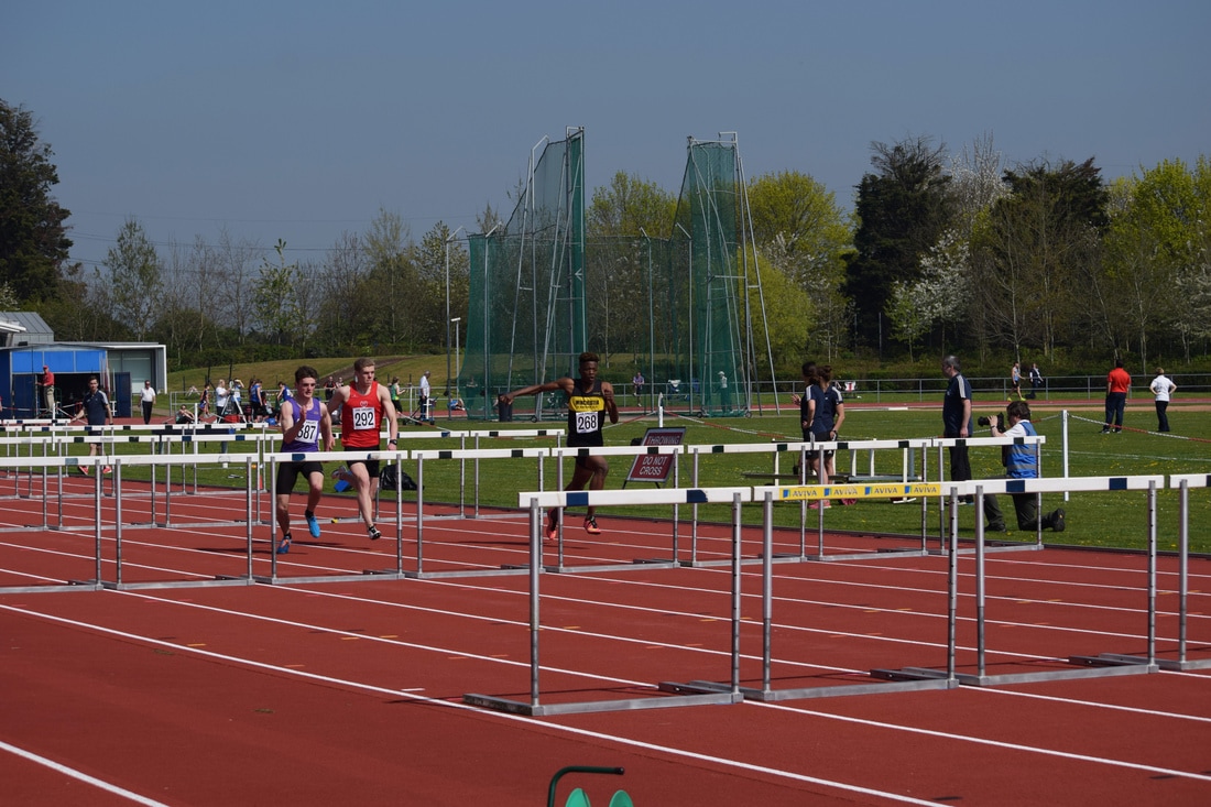
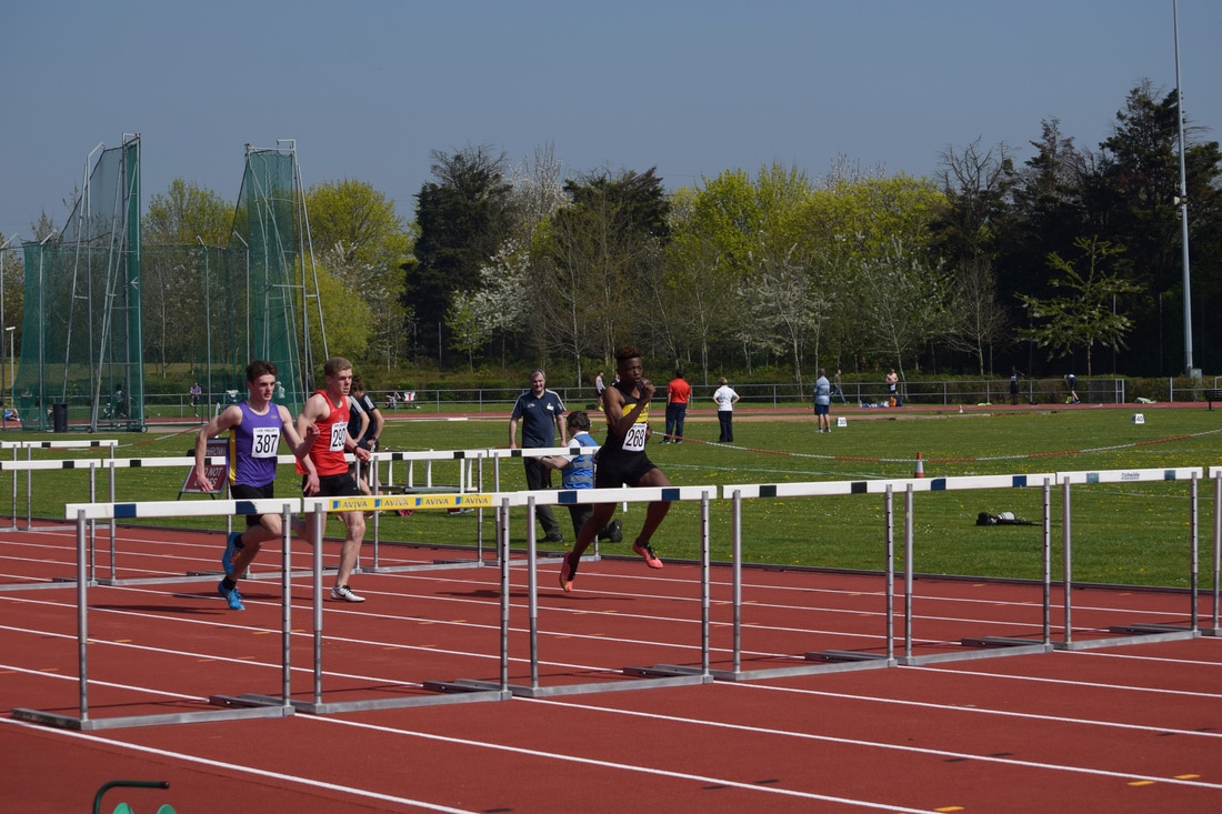
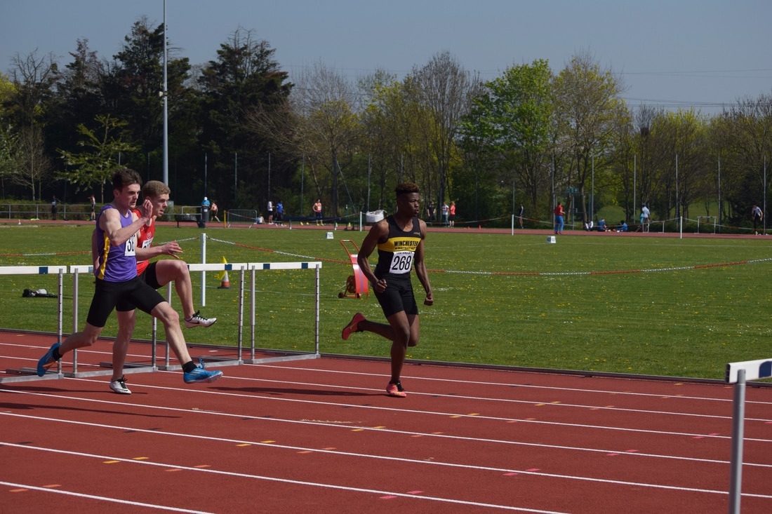
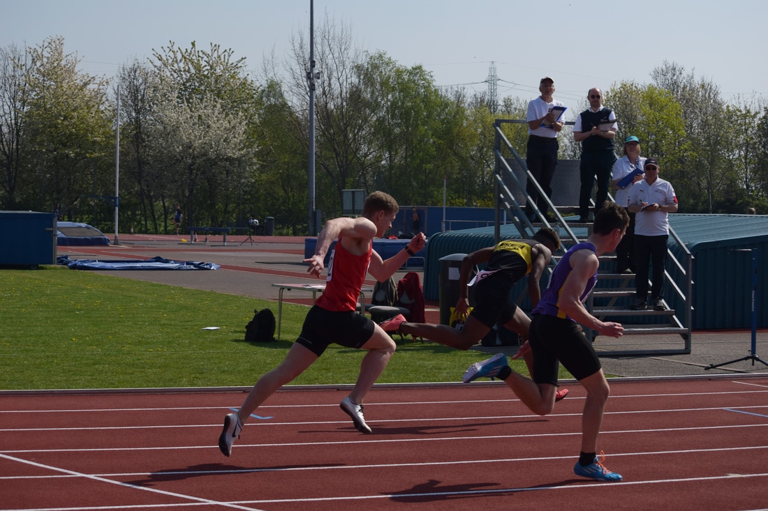
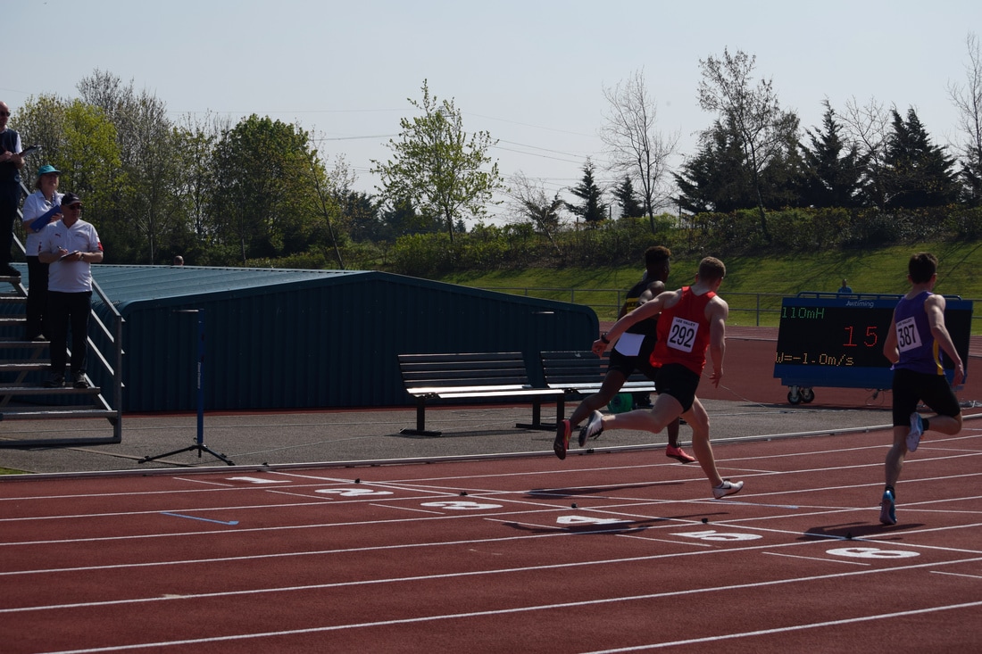
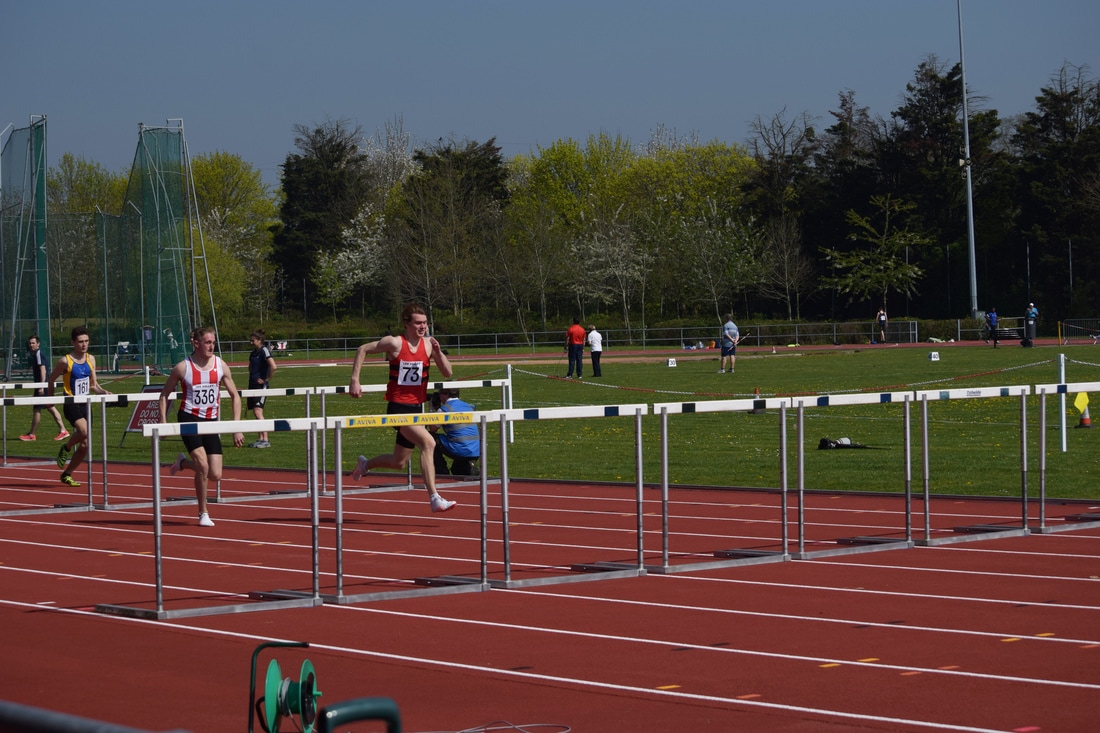
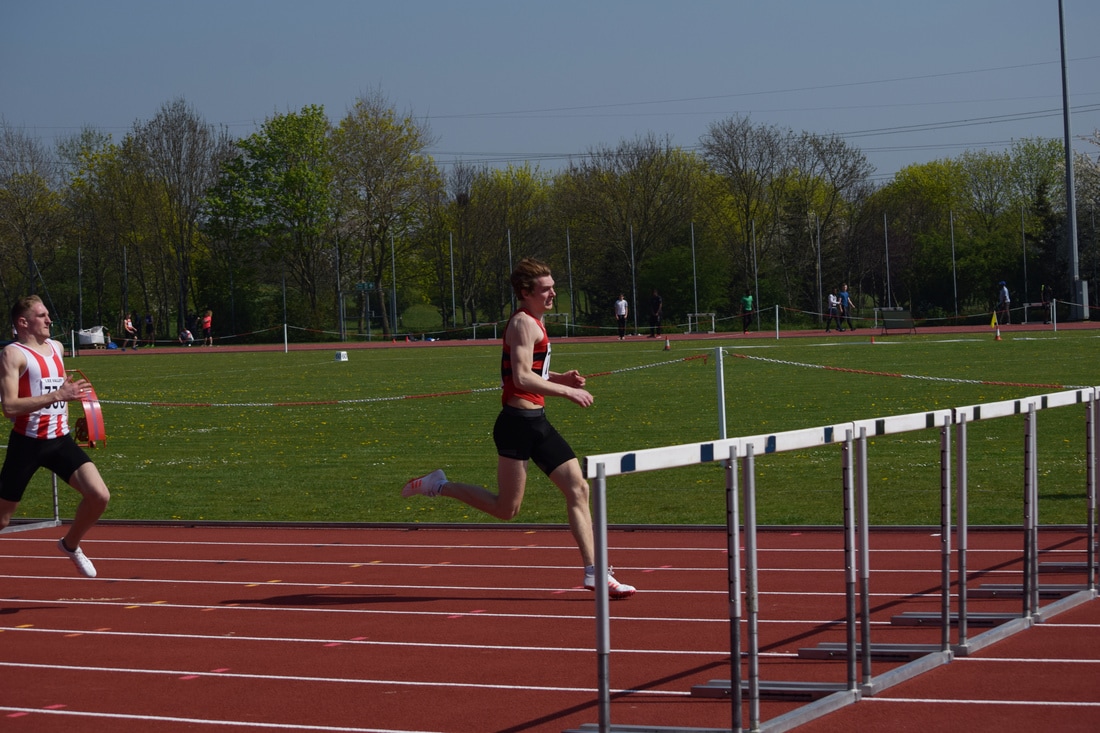
Hurdles
The first event of the day was 400m hurdles and I used a 1/3000 shutter speed to capture the movement clearly. This event provided a great prospect for capturing images of the athletes jumping over the hurdles however the area from which I was photographing the race meant that this opportunity was limited and I should have been at the level of the hurdles to the side of them to capture the lunge over them. I did move in order to capture my ideal image although capturing the right moment was difficult and a situation of chance and I had more images of the athletes before or after the jump.
The images are laid out to show the progression of certain races and the athletes within them.
The images are laid out to show the progression of certain races and the athletes within them.
|
|
|
|
|
|
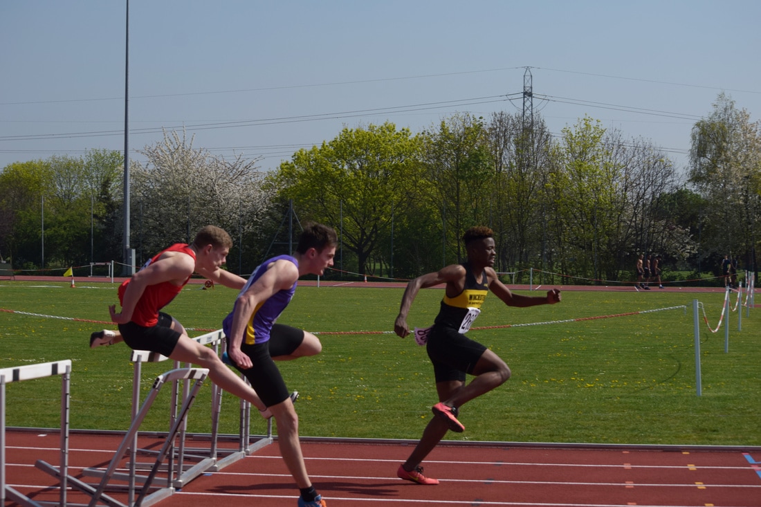
After the first race I moved down to the level of the athletes and hurdles in search of better clarity within the image as well as capturing the leap from an angle that showed both the back and front leg. I managed to get one leap image although the athlete had knocked down the hurdle and so was not as successful as I would have liked.
|
|
|
|
|
|
|
|
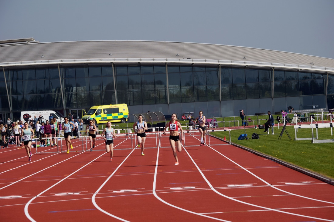
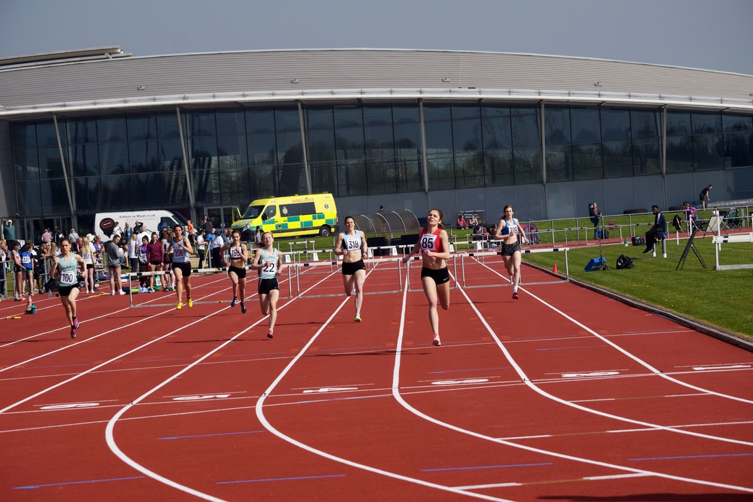
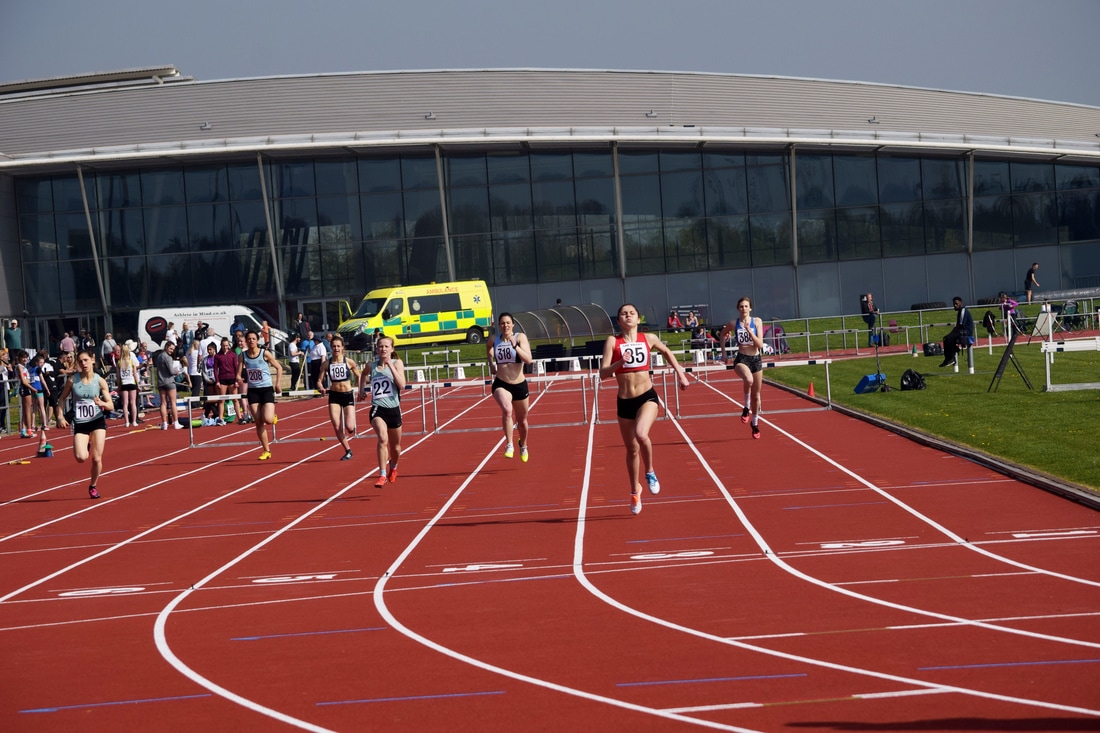
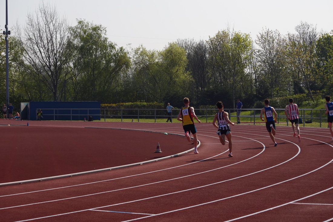
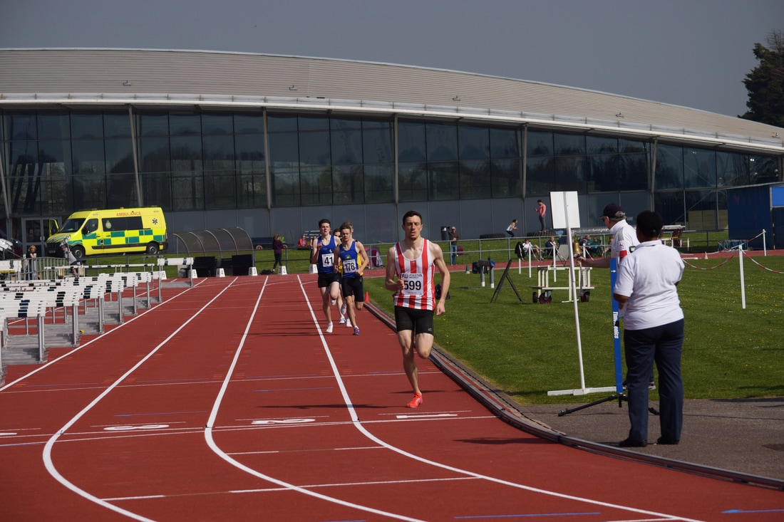
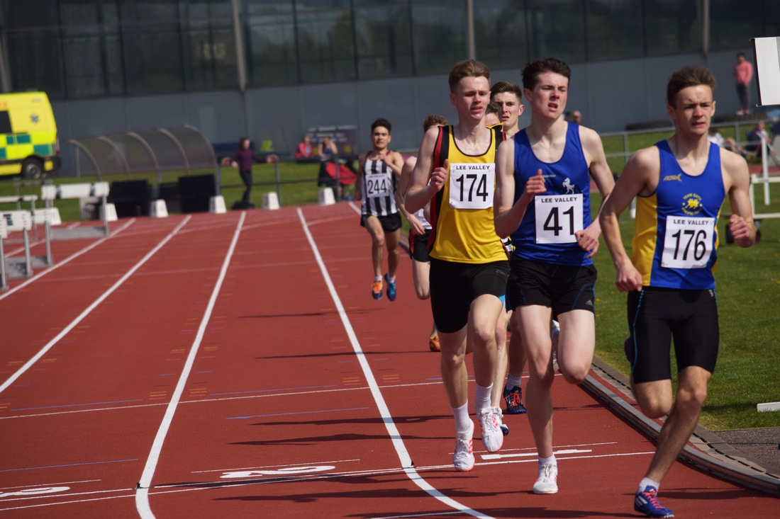
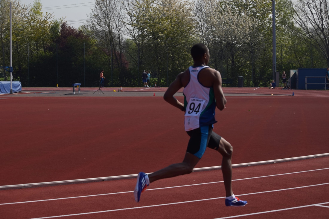
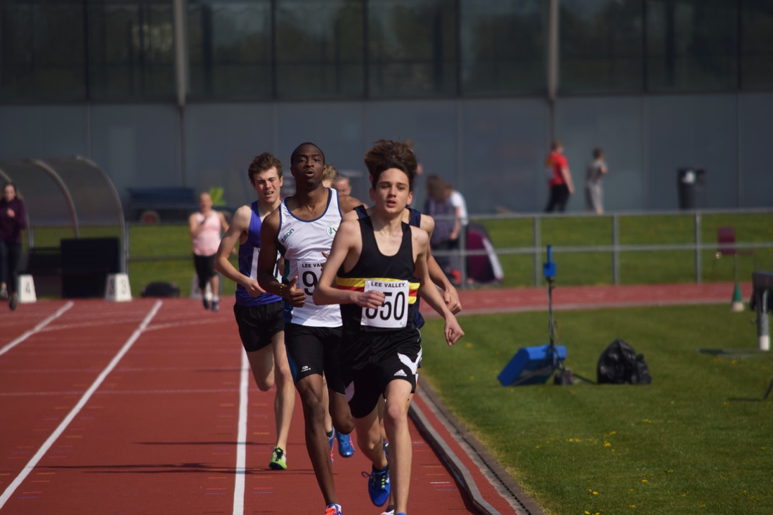
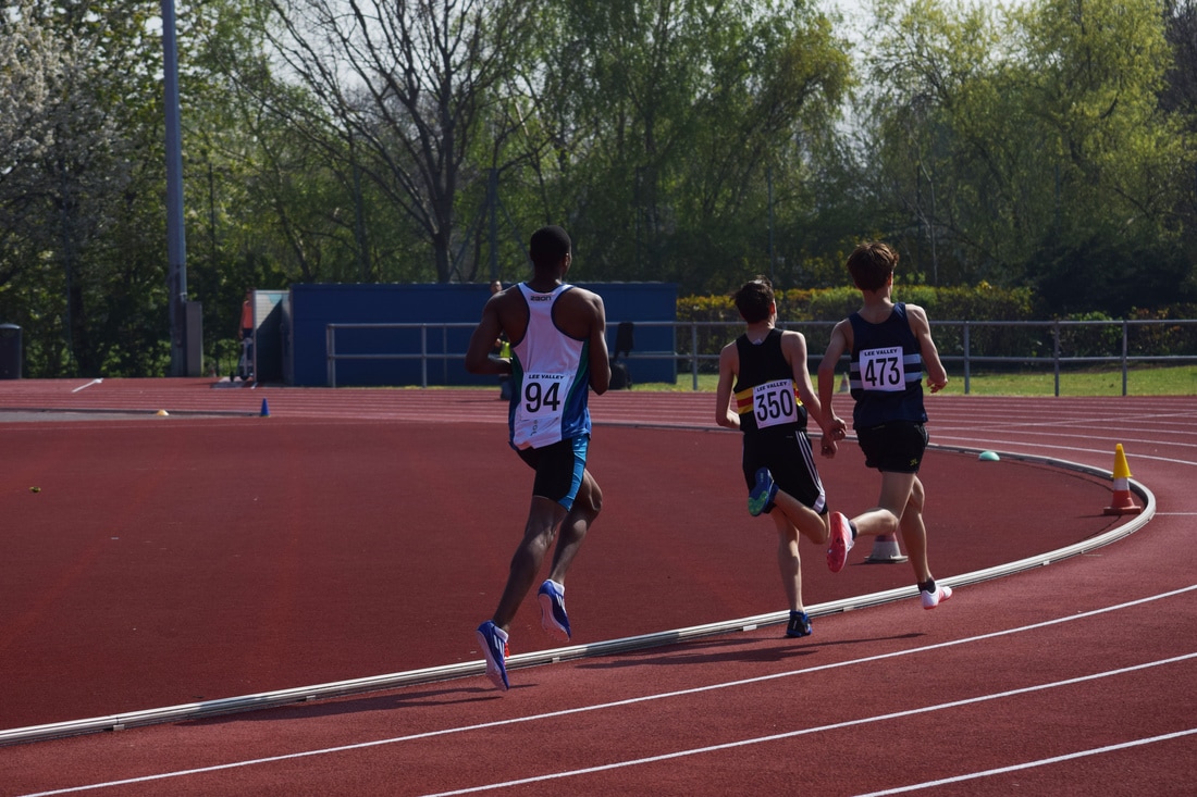
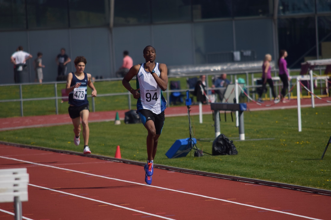
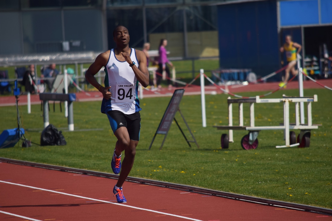
800 Metres Races
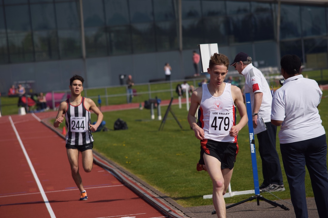
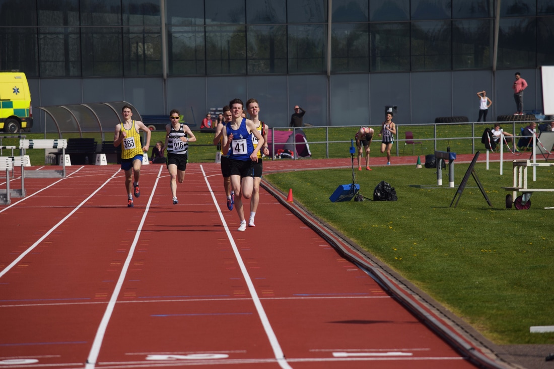
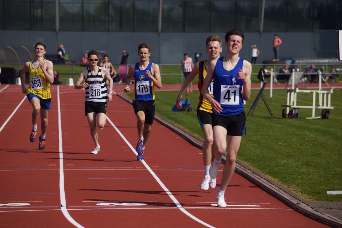
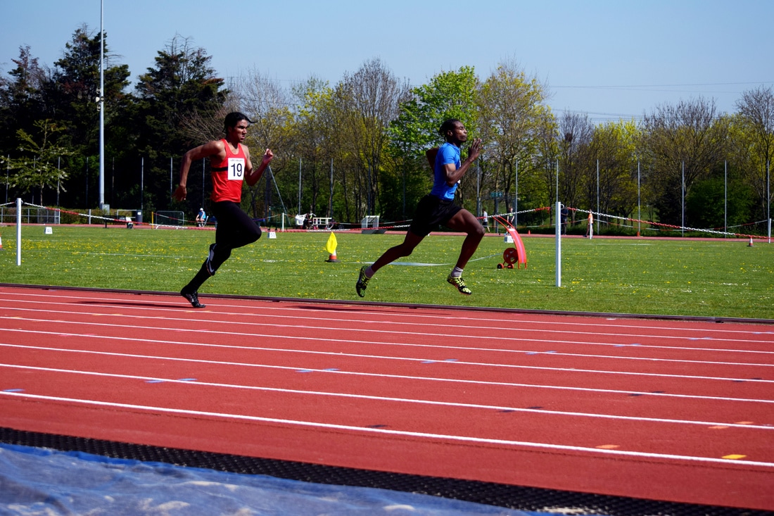
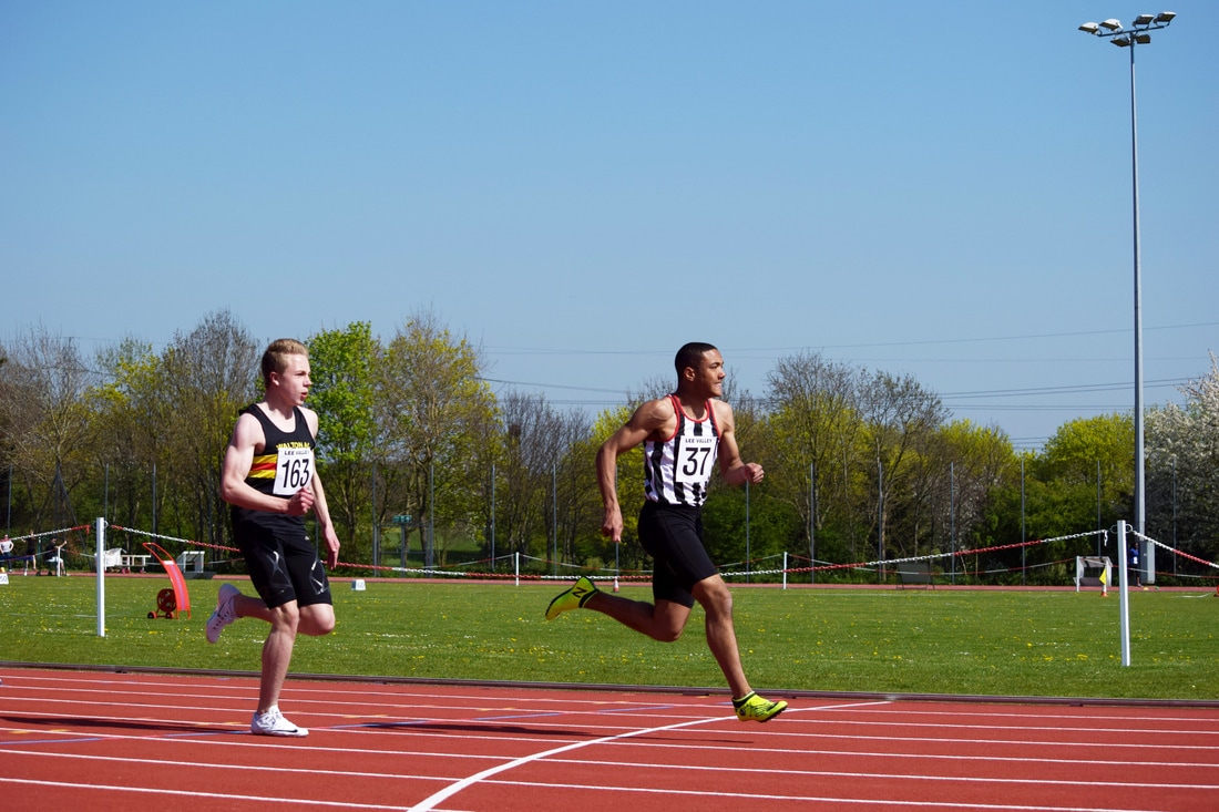
The 800m race consists of two laps of the 400m track, I used a 1/2500 shutter speed. It tends to have more uniformity as the athletes group together on the inside of the track and I captured images that displayed this when they reached the finish line by standing opposite the line to have a direct view of the runners coming up to it. These straight on images are the most successful in my opinion as the body of runners are in focus, often with one runner more in focus than the others, and the background blurred. The runners expression is clear and in direct line with the camera lens which heightens the effect of the runners effort and exhaustion being displayed.
The images are laid out to show the progression of certain races and the athletes within them.
The images are laid out to show the progression of certain races and the athletes within them.
|
|
|
|
|
|
|

|
|
|
|
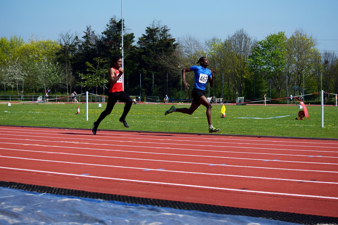
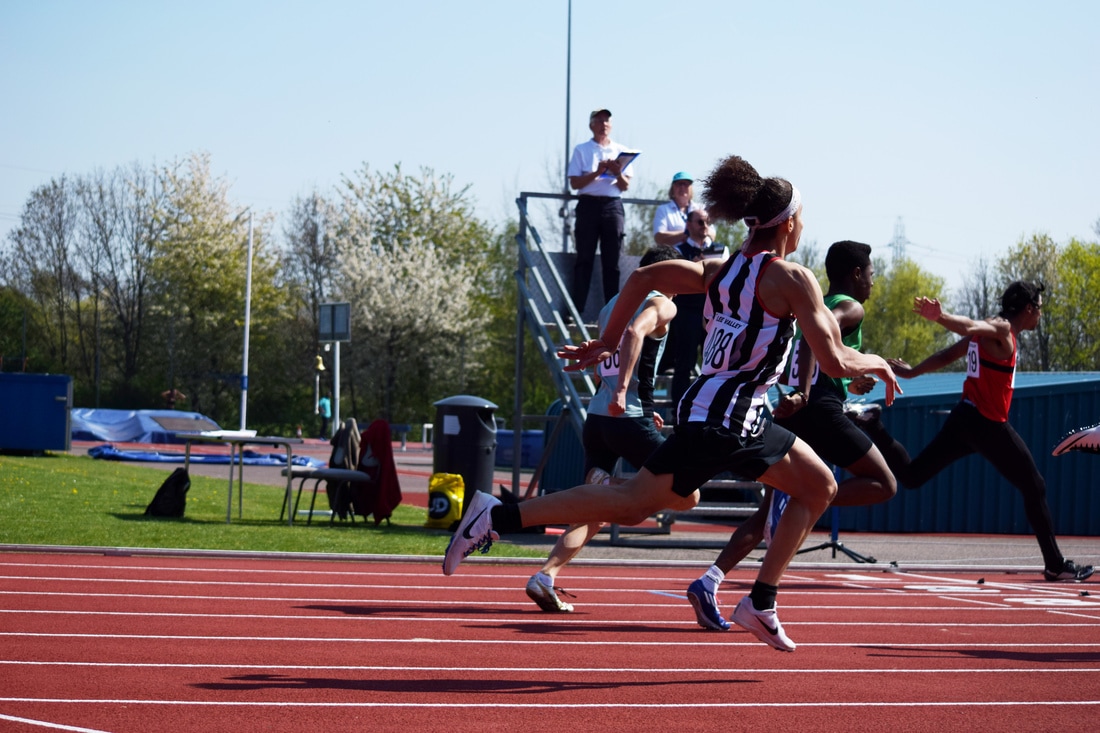
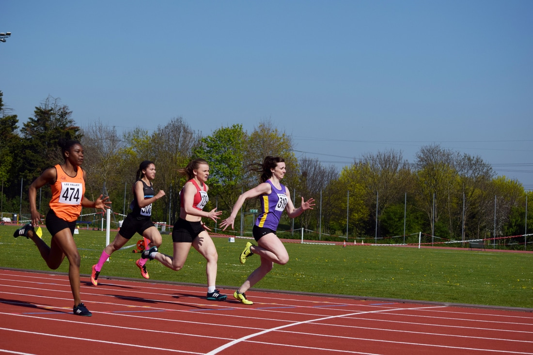
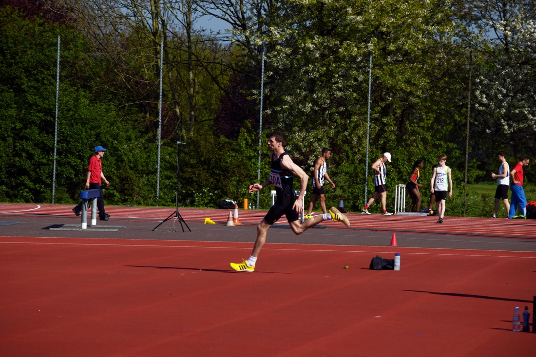
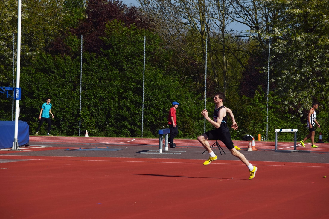
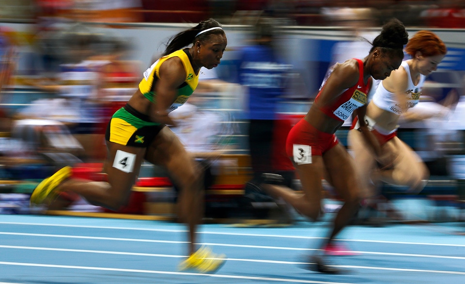
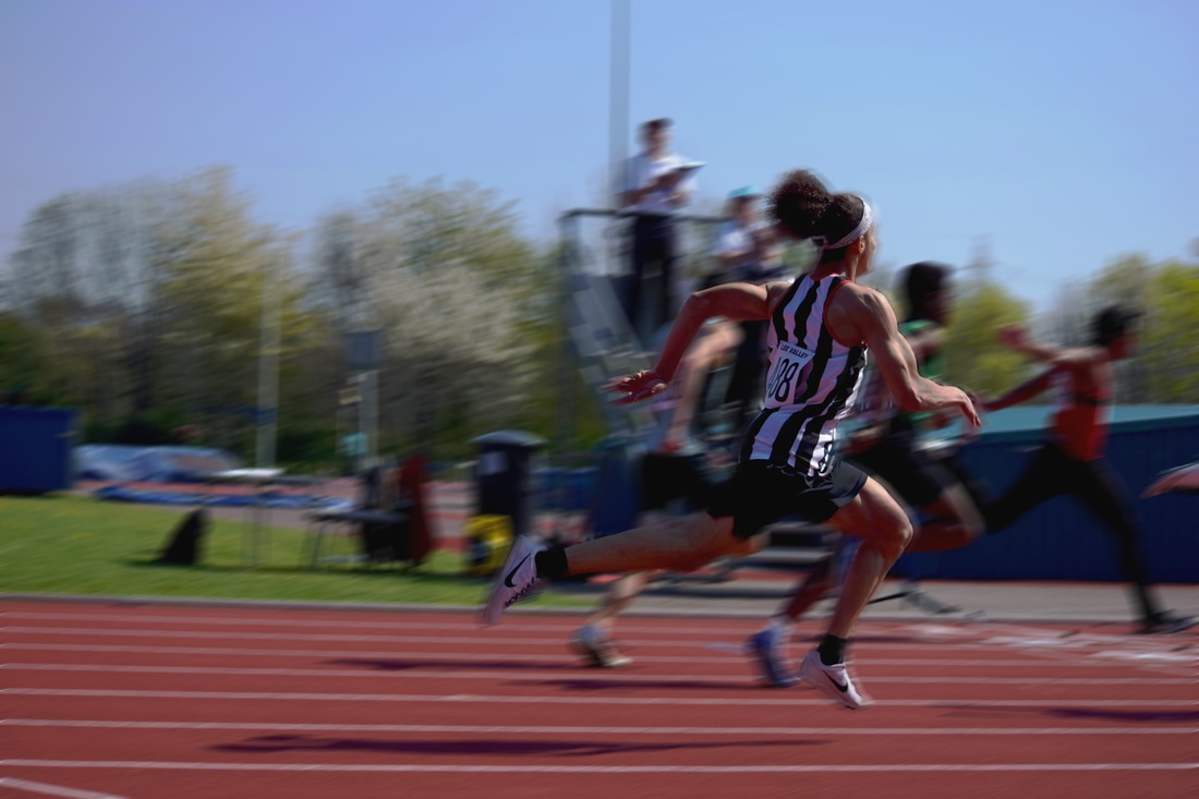
100 Metres Sprints
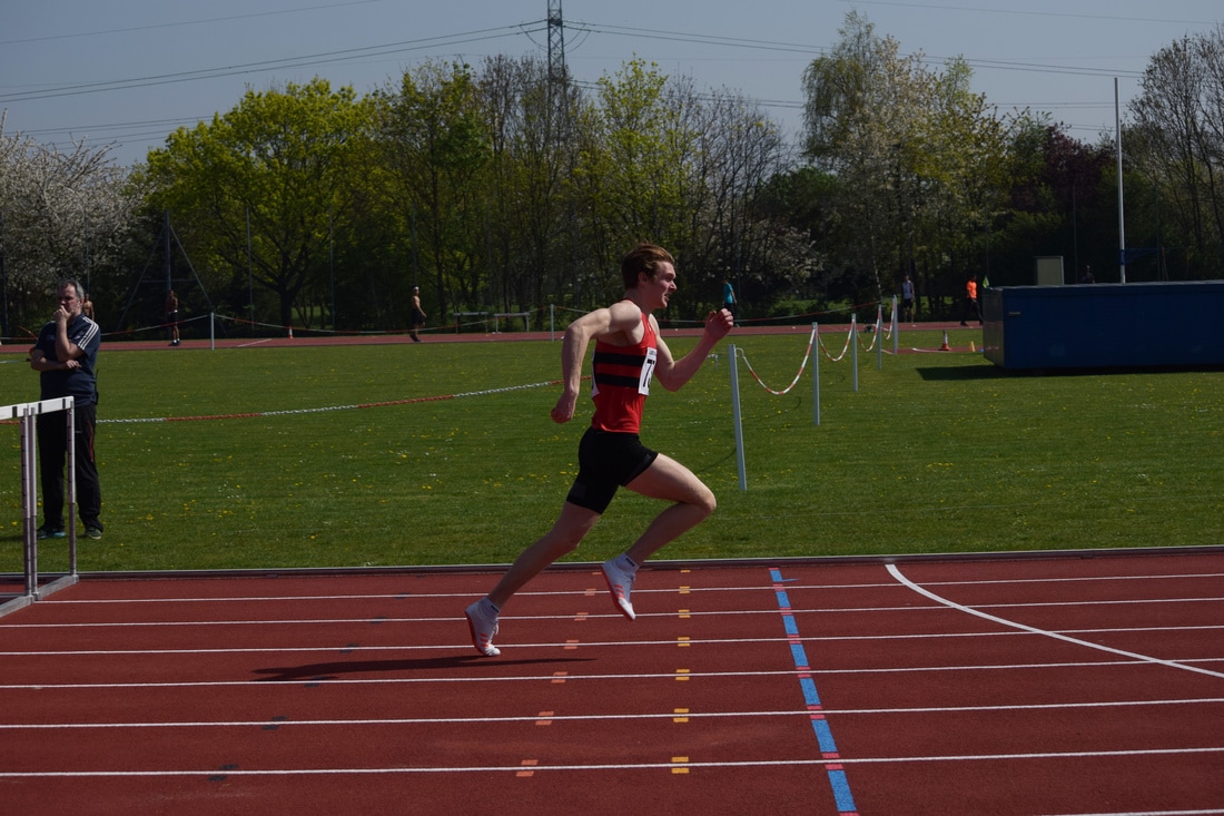
The 100 metre sprint is considered the most intense olympic race and requires immense power and maintenance of speed, because of this it is the best opportunity for defined muscle as the athletes have well built muscle and are very lean.
I used a fast shutter speed of 1/3500 to capture several frames within each race and have collated the images from my favourite race into the slideshow below. It was difficult to get a good position for the race where both beginning and end could have been seen and the speed at which the race took place made it difficult to have control over the composition.
I used a fast shutter speed of 1/3500 to capture several frames within each race and have collated the images from my favourite race into the slideshow below. It was difficult to get a good position for the race where both beginning and end could have been seen and the speed at which the race took place made it difficult to have control over the composition.
SLIDESHOW
The below slideshow shows the progression of the fastest race performed on the day.
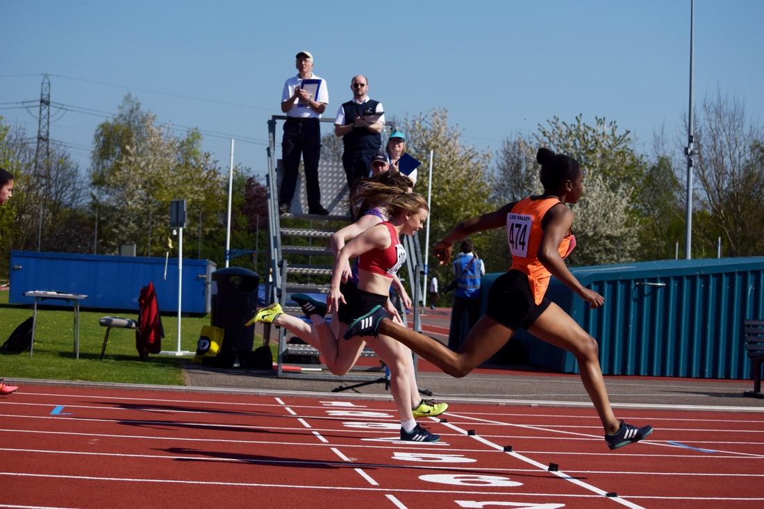
Favourite Shots from the 100m Sprint
These two images are successful because they have clear demonstrations of strides taken and paired together show how the two athletes are in different stages of strides taken and has a comparison where the viewer can imagine how the stride changed between each image frame. The athlete in blue has a very wide stride which showed his muscle and power. In the first image you can see the right angle he forms with his right arm which is essential in having explosive and fast movement for the 100m race.
|
|
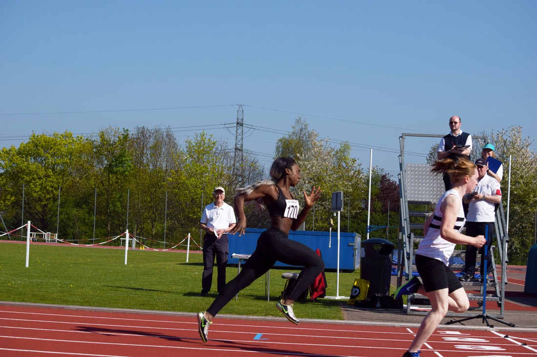
This image has great focus on the athlete in black and white and his right arm is clearly highlighted by the sun which accentuated his muscle structure; the muscle fibres are visible and each muscle group (deltoid, tricep, bicep) is distinct. His left arm forms a great right angle and his stride is broad, all of which create a great image and example of locomotion.
The finish line is the striving goal in a race and with many competitions having a photofinisher system it is very important for the athletes to launch themselves forward in an effort to increase their position and finishing time. This is demonstrated in the below image where the athletes bodies are being thrown forward.
|
|
|
|
I found this image interesting as the athlete was in the centre of the frame and her stride is a perfect exemplar to achieving speed and power through accurate technique. She is not as in focus as I would have liked however the image is strong and effective regardless in terms of her form and the moment at which the image was captured.
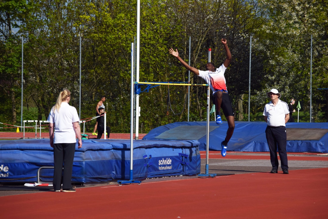
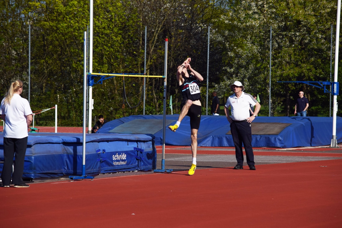
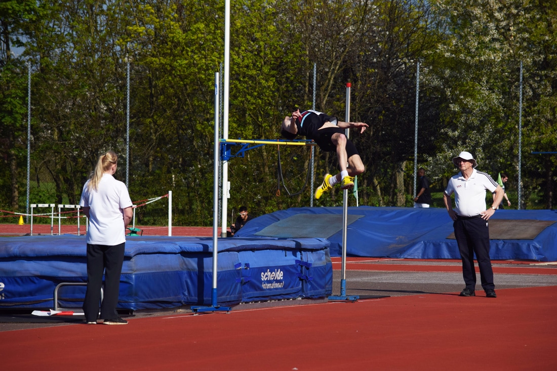
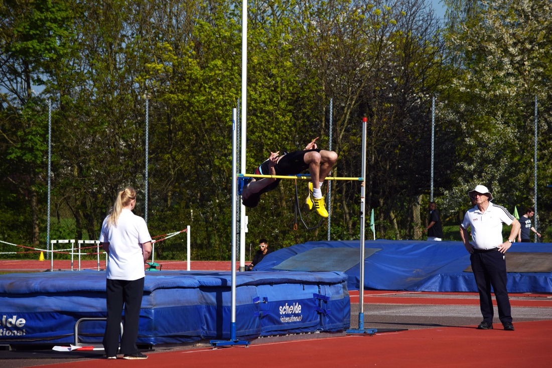
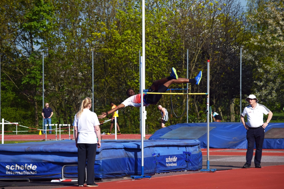
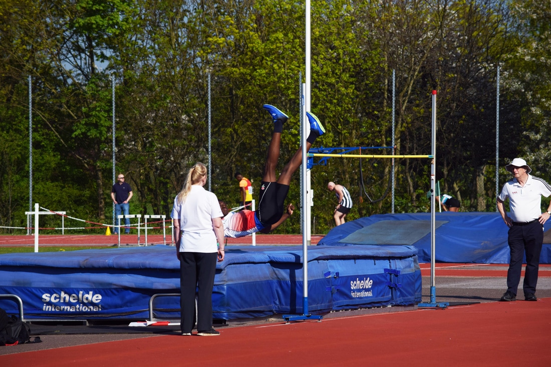
High Jump
The high jump event resulted in great action shots of the jump itself and how people contort their bodies in order to propel themselves up and over the bar. It was a great recreation of Muybridge's locomotion work although the background is slightly distracting the focus.
The images are laid out to show the progression of certain races and the athletes within them. The first set is below.
The images are laid out to show the progression of certain races and the athletes within them. The first set is below.
|
|
The second set shows a different athlete with the same technique but appears slightly different in the images as different bodies vary in their ability to perform but still achieve the same or similar effect.
|
|
|
|
|
|
Stages of the High Jump:
I broke down the third set (but with the same athlete as the first set) into stages in which the technique was broken down and demonstrated.
-Brace
-Hop
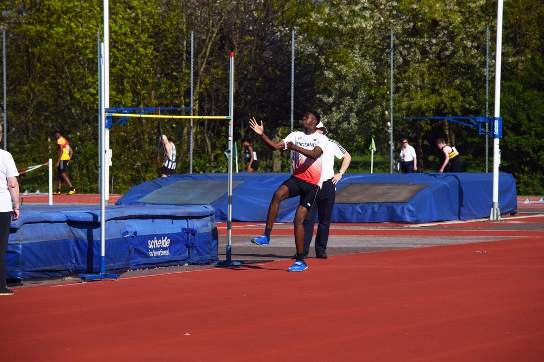
-Airborne
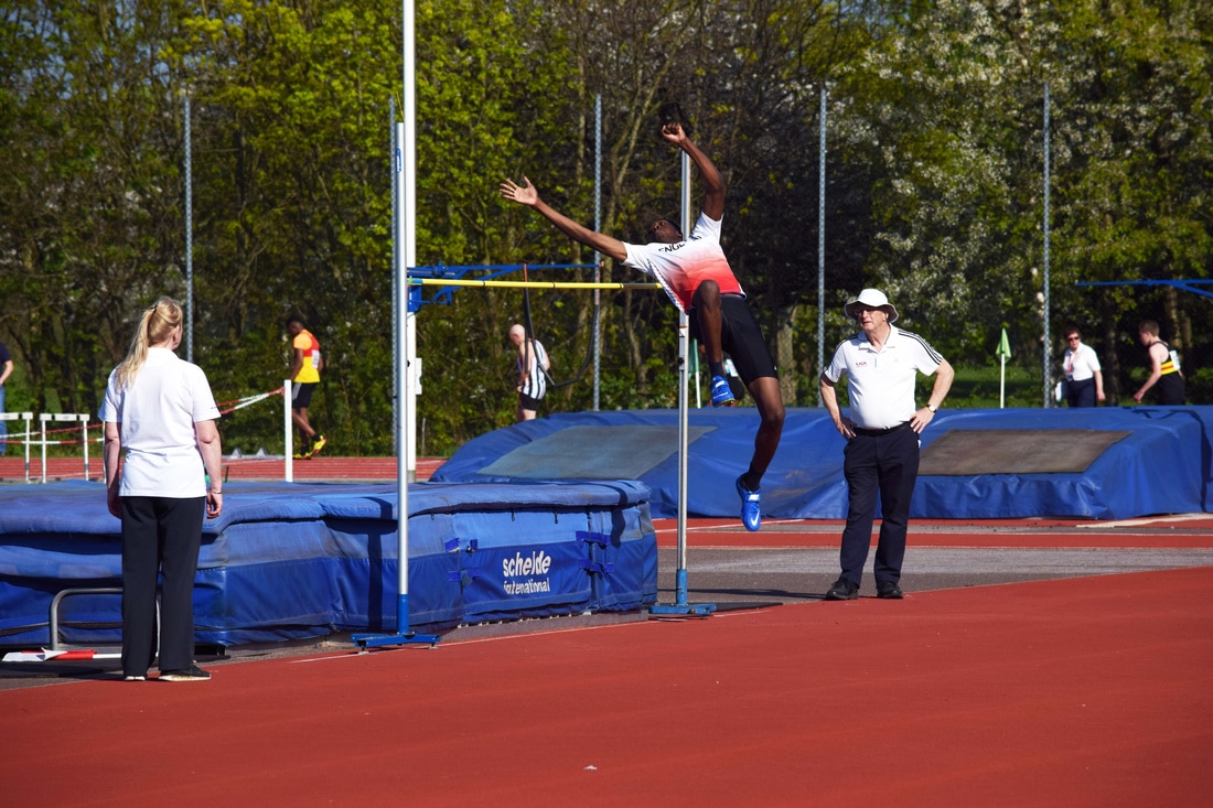
-Body Parallel to Bar
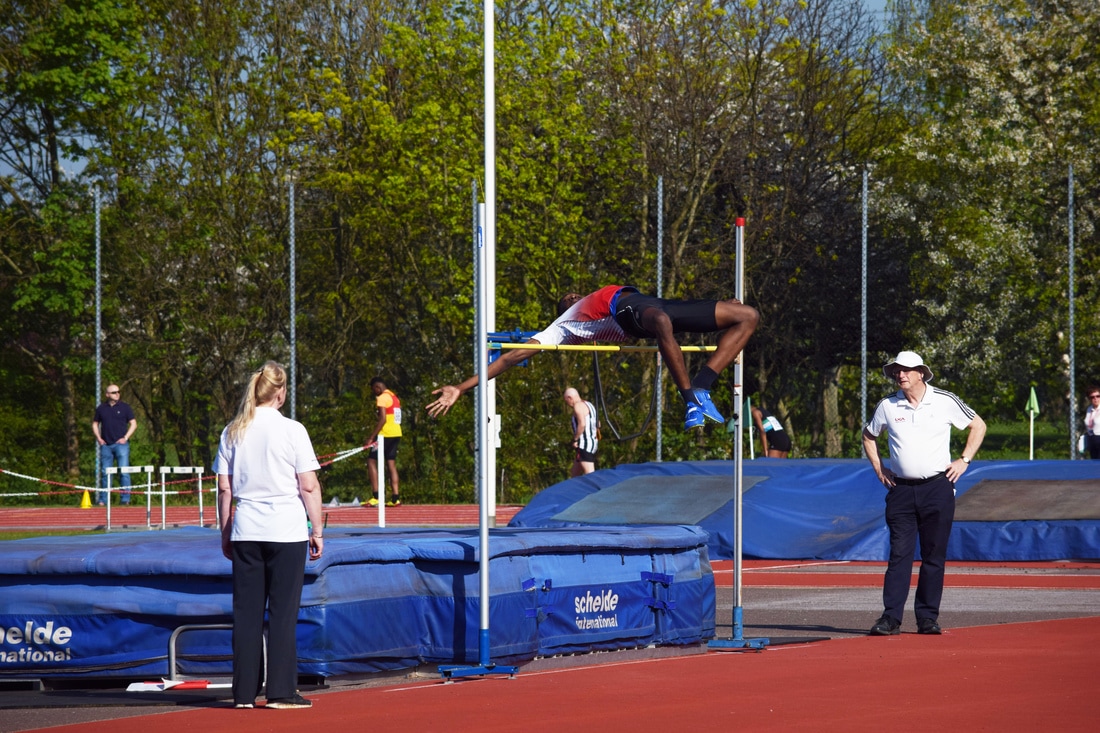
-Straighten Legs
Motion Blur
I wanted to explore the idea of presenting movement in a way that completely opposed the work of Muybridge who used single, continuous frames to show the minute change of movement throughout a motion. Instead, I decided to explore the idea of a single image that still conveys movement and so I used motion blur in Photoshop.
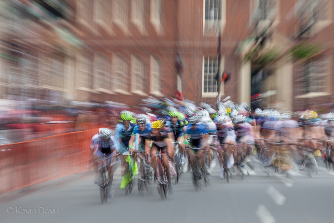
I found some inspiration on Pinterest (left) and some work by Kevin Davis (right). I preferred the left example as the runners are still in focus whereas the right image seems to lose focus and is not as effective as having the athletes (or at least one) in focus.
I found some inspiration on Pinterest (left) and some work by Kevin Davis (right). I preferred the left example as the runners are still in focus whereas the right image seems to lose focus and is not as effective as having the athletes (or at least one) in focus.
|
|
My Process
|
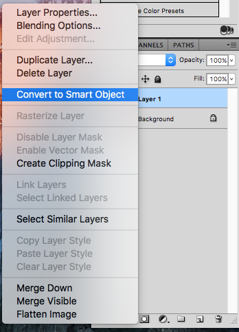
1. Convert the layer to a Smart Object.
|
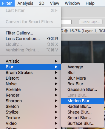
2. Go to Filter --> Blur --> Motion Blur.
|
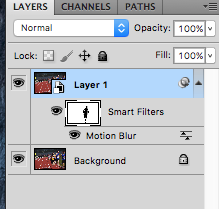
3. Use the Brush Tool with foreground set to black to highlight the runner as a clear subject matter whilst the white area (background) remains blurred.
|
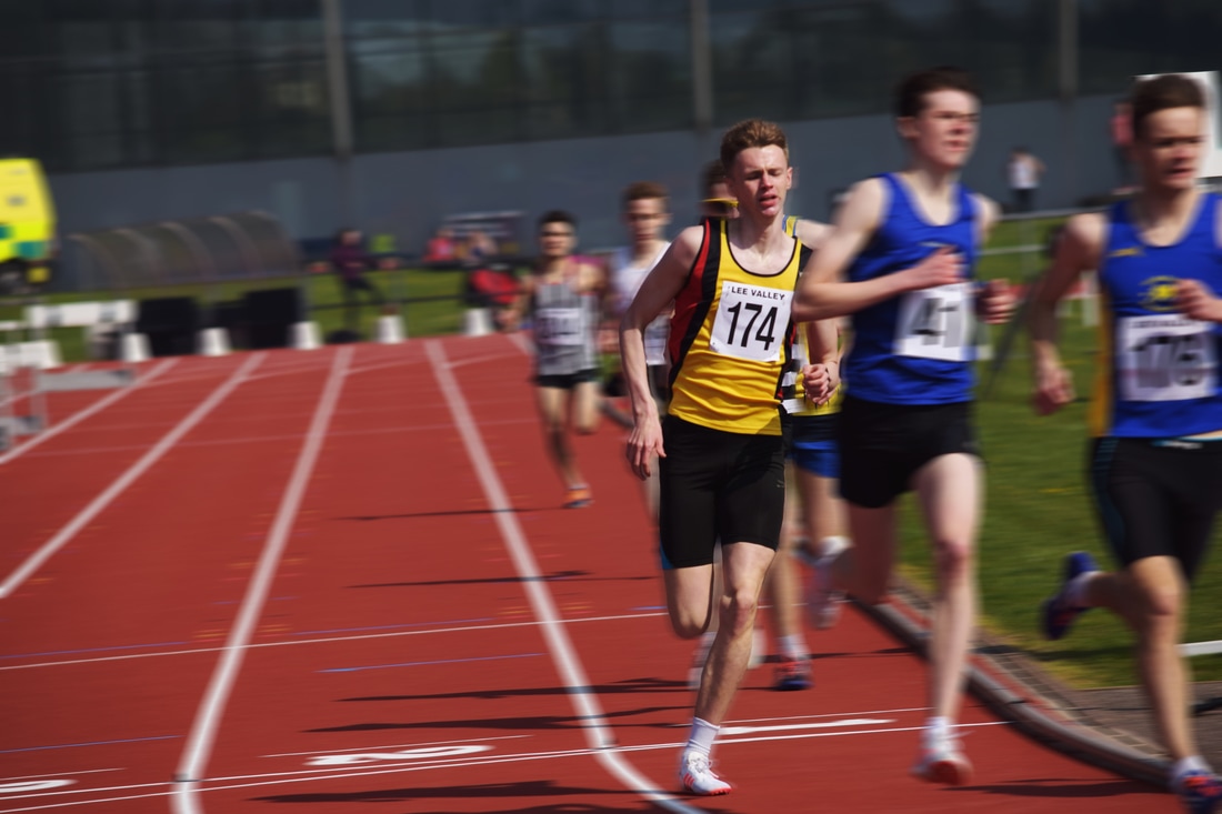
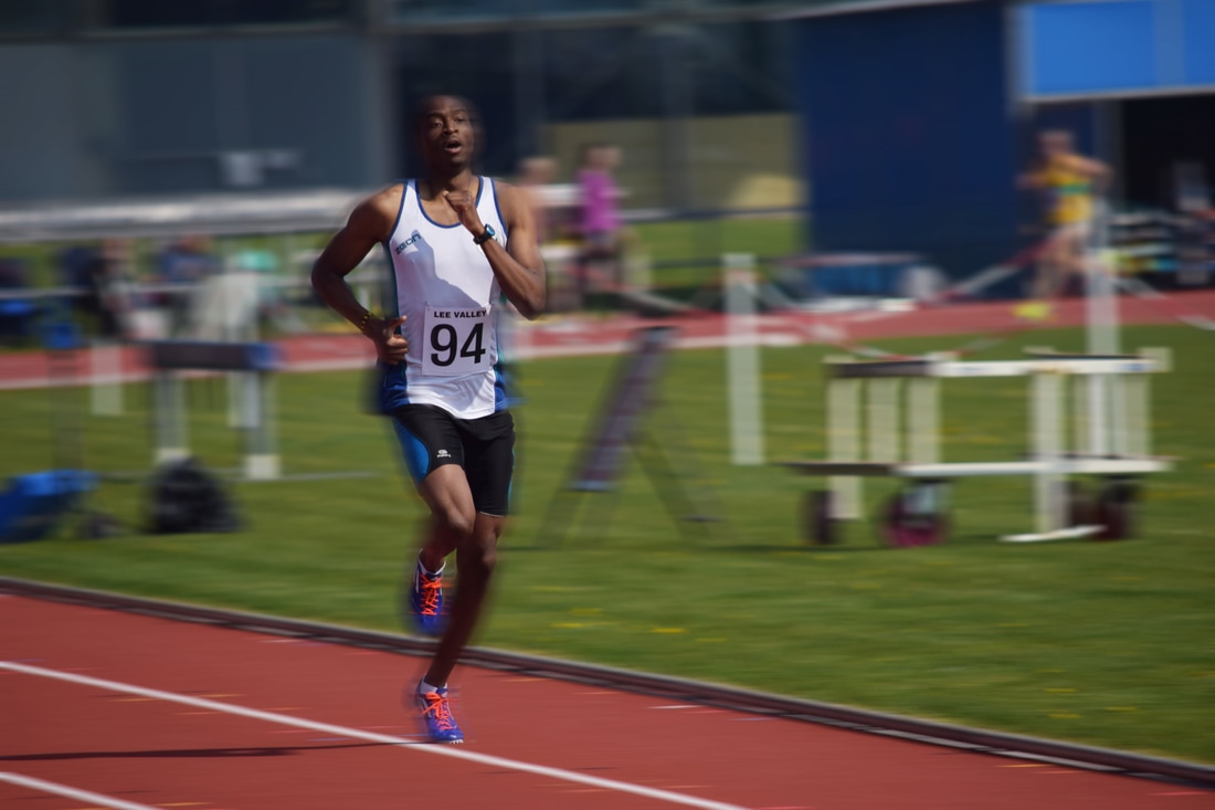
Motion Edits
For this experiment I selected images where there was sharp focus on a runner who I could then keep focused using the brush tool and leaving any other runners and the background in blurred motion.
The images were successful in isolating a runner, particularly the first image whose body was aligned with the camera as he turned the bend and he alone is highlighted amongst the crowd. The last image (bottom right) could have had a better background however the motion was still conveyed and therefore successful.
|
|
|
|
Final Piece
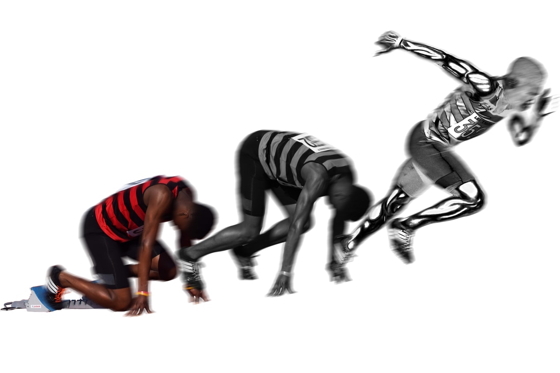
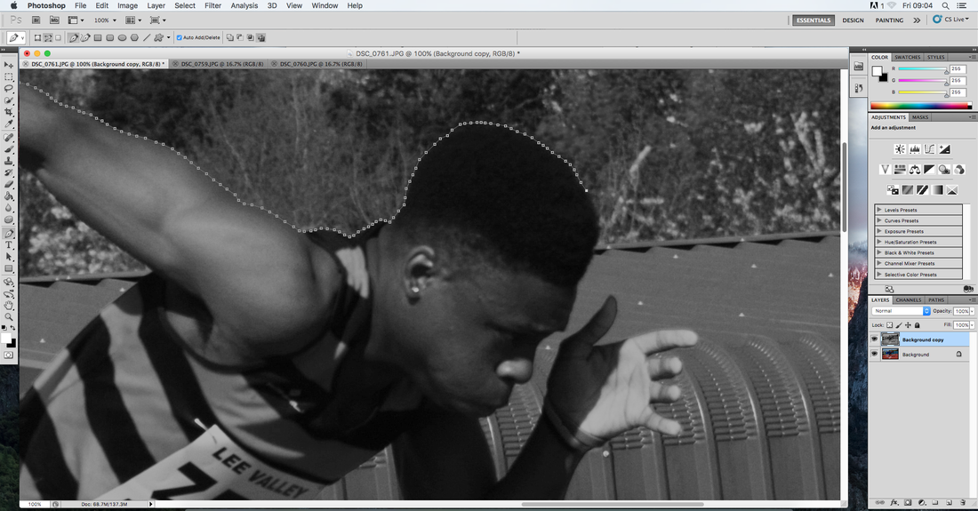
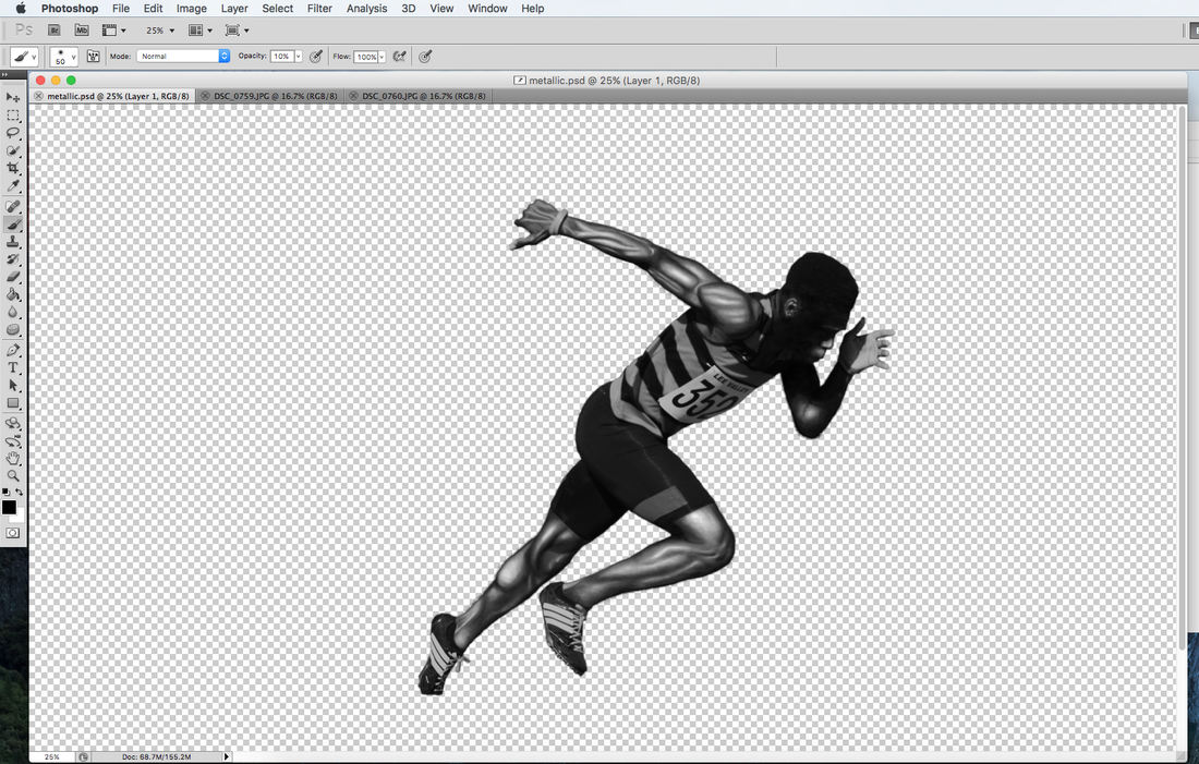
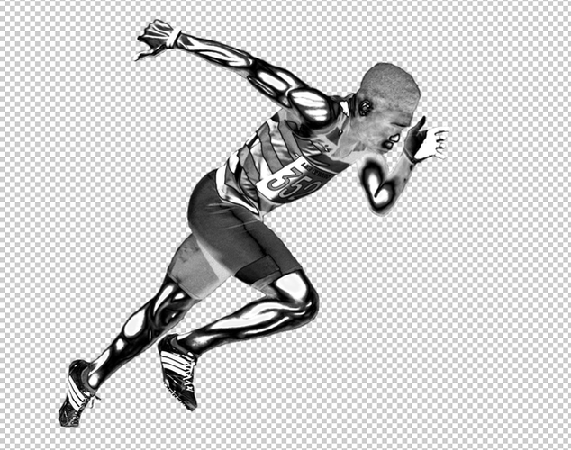
With my previous experiments about muscle structure and the photographs I had taken at Lea Valley I decided to experiment with collating some techniques to produce my final piece. My idea was to have a progression image using the athlete, who I had taken pictures of in stages leaving the blocks, and have him turn into a metal figure. The idea of metal came from thinking about how I could alter the structure of the body to increase the appearance of strength and power. Metal is one of the hardest substances and is known to be both resilient and substantial. The conversion from skin into metal through my three images exhibits my exploration into strength via a built and sturdy muscle structure working in co-ordination to form the body so that it can execute strenuous activity effectively. The metal provides an emphasis on the explosiveness of the final stage of the image.
Experiment creating metallic skin
Prior to the exam I experimented with creating a metallic structure to ensure it would work and look effective.
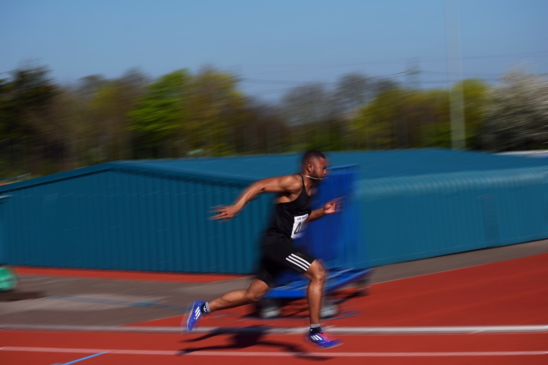
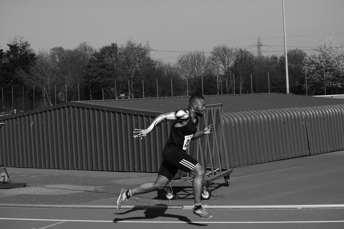
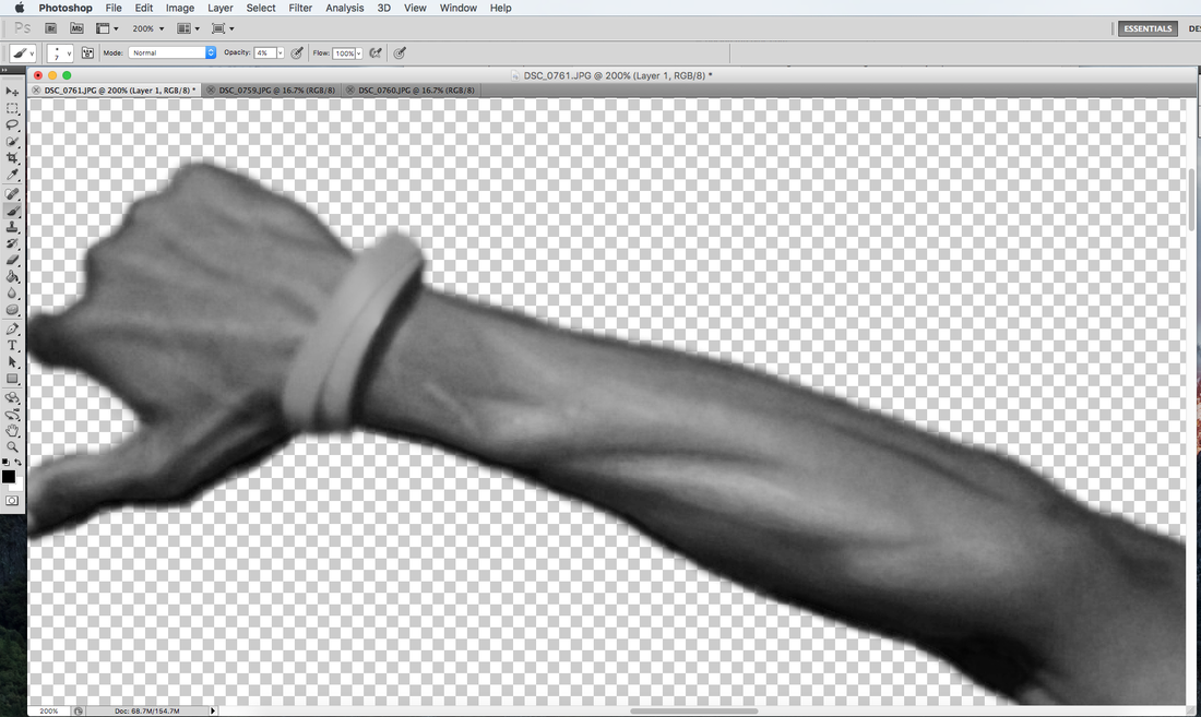
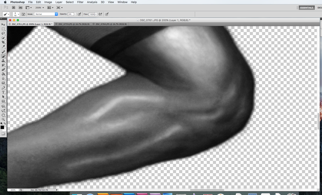
I selected an image where the arm of the athlete was defined and experimented on the arm alone however I desaturated the entire image so that it did not look so out of place.
I isolated the arm using the Pen Tool and copied it onto a new layer and then edited the Curves as shown below. The left and right sides were dragged right up to create the very white highlights of metal and to imitate how all of the metal is reflective including the darker tones. I then took the middle section right down to give shape and depth as the arm was completely white before. This creates shading and definition depth which is essential to showcase the muscle structure.
Editing Process
|
1. I opened all three images I planned to use into Photoshop and set the brightness tool to 115. Then I went to Layer --> Flatten Image.
2. The middle (image 2) and far right (image 3) image were then desaturated via Image --> Adjustments --> Desaturate. Whilst the far left image (image 1) was left in its natural colour. |
|
|
|
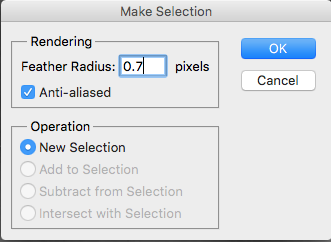
3. With all images I used the Pen Tool to make a precise selection of the runner and selected the radius to 0.7 px.
|
|
|
4. After the selection was outlined, I pressed Command-J to copy the selection onto a new layer and clicked alt and the eye icon on this new layer so that it alone was visible.
5. For image 3 I selected the Brush Tool with foreground set to black to darken the outline and to add muscle definition. I chose a soft-edged brush with 0% hardness and frequently adjusted the opacity and size to achieve my desired effect. 6. For highlights I also used the Brush Tool but with the foreground set to white and similarly with step 5 I changed the size and opacity of the soft-edged brush. The effect I was trying to achieve was a somewhat metallic resemblance and I built in the shade difference to have a stark contrast between highlights and shadows. I began to work up the highlights so that a shine could be produced which better resembles metal before adjusting the Curves. |
|
Below is the product of this contouring effect.
|
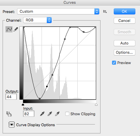
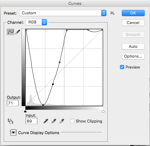
7. With the contouring effect achieved I went to Image --> Adjutments --> Curves.
The curve structure is shown on the right and were used to achieve the official metallic effect. |
|
|
8. At this point I returned to image 1 (natural colours) and image 2 (desaturated) and used the Dodge Tool and Burn Tool interchangeably in order to create greater muscle definition that was more apparent to the eye.
9. I then deleted all background layers of the 3 images and put a layer behind the runner as white.
10. At this point I made a rough selection with the Quick Selection Tool of each image and copied it into a new tab I created in Photoshop that would consist of all 3 images.
11. In this new layer I positioned my images so that there would be a progression leaving the block from the bottom left to the top right. Any white overlaps from the rough selection were removed with the Eraser Tool so that each image intersected without excess background.
12. I then flattened the image (Layer --> Flatten) and upon the background copy I converted the layer to a Smart Object.
13. Next I went to Filter --> Blur --> Motion Blur and set the angle to +7 (to convey upward movement from block) and the distance of the blur to 72 px.
14. Then I clicked on the smart filter widget, selected the Brush Tool and set the foreground colour to black. This enabled the image before the addition of motion blur to show through where I used the Brush Tool and I could adjust the opacity of this. Essentially I was maintaining focus within the runners body to retain detail but outer areas could remain blurred to convey movement.
This was the final image that I produced and I left the background white to highlight the athlete and his captured locomotion of leaving the blocks, as a result his outline is highlighted and the focus remains on him. I achieved exactly what I had intended, the Pen Tool selections were very precise and have therefore allowed the image to be more effective. Laying out the images from bottom left to top right not only helped fill out the page but also aided in demonstrating the push out from the blocks as the athlete became increasingly upright. Turning him into metal was very successful as the metal effect was clearly achieved and apparent, his muscles go from being soft but defined into what looks like a very hard and rigid structure conveying strength through the metal and power through the explosiveness of the captured position.